
A typical monthly marketing report runs to a dozen pages. Sessions, users, pageviews, bounce rate, average engagement time, impressions, followers, rankings, a domain authority score, and a chart of everything going up. Owners skim it, feel vaguely reassured or vaguely worried, and make no decision as a result. That is the clearest sign the report is measuring the wrong things: good measurement changes what you do next month.
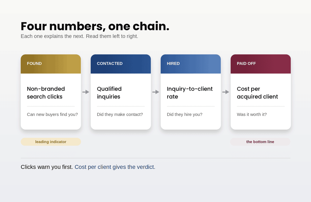
For a service firm, almost every useful marketing question reduces to four numbers. Get these right, check them monthly, and most of the rest of the report becomes optional reading.
1. Qualified inquiries, by source
The first number is how many genuine potential clients contacted you this month, and where they came from.
Note the word qualified. A form submission from someone selling you software, a job applicant, or a request for a service you do not offer is not an inquiry, and counting them flatters the number while hiding the real trend. Total form fills is easy to measure. Qualified inquiries is the number that predicts revenue.
Getting it takes two steps. First, make sure the actions that start a conversation are tracked properly. In Google Analytics 4, that means marking them as key events: form submissions, clicks on your phone number, booking confirmations, and similar. Standard properties allow up to 30 key events, which is far more than a service firm needs. Track the handful of actions that genuinely start a sales conversation and nothing else.
Second, qualify them. Analytics cannot tell a real prospect from spam. Someone has to review inquiries, usually in whatever CRM or inbox they land in, and mark which ones were real. It sounds like overhead. For most firms it is a few minutes a week, and it is the difference between a vanity count and a business number.
Then split by source: organic search, paid search, referrals, direct, social, email. The split is where decisions come from. A channel producing a quarter of your qualified inquiries on a tenth of your budget deserves more. A channel producing volume but no qualified leads is telling you something about who it reaches.
2. Inquiry-to-client rate
The second number is what share of qualified inquiries became paying clients.
This is the number most marketing reports leave out entirely, because it lives in sales rather than marketing. That separation is exactly the problem. Marketing can deliver more inquiries every month while revenue stays flat, and if nobody tracks what happens after the inquiry, the cause stays invisible.
A falling rate usually means one of three things. Lead quality has dropped, often because a channel or campaign started reaching the wrong audience. Follow-up has slowed, which is the most common and least examined cause, and the reason good marketing so often gets blamed for weak sales. Or something on the offer side has changed: pricing, availability, or a competitor.
Because service sales cycles can run weeks or months, calculate this over a rolling period, such as the trailing three months, rather than trying to match this month’s inquiries to this month’s signed clients. The trend matters more than any single month’s figure.
3. Cost per acquired client
The third number is what it cost, in marketing spend, to win each new client.
The calculation is simple: total marketing spend for the period, including agency fees, ad spend, and tools, divided by new clients won. The value is in comparing it to what a client is worth. If a typical client is worth, say, twenty times what it costs to acquire one, you may well be underinvesting in marketing. If the two numbers are close, something needs fixing before you spend more.
This number protects you from the most expensive mistake in marketing: optimizing for cheap inquiries. A channel with a low cost per lead and a terrible close rate can easily produce a higher cost per client than a channel with expensive leads that convert well. Cost per lead tells you how efficiently you bought attention. Cost per client tells you whether the business made money.
Calculate it per channel where you can, accepting that attribution is imperfect. Many clients touch several channels before contacting you, and no tool assigns credit perfectly. Rough channel-level figures, consistently calculated, are far more useful than precise figures for the wrong metric.
4. Non-branded search clicks to your service pages
The fourth number is the one that tells you whether people who do not yet know your name can find you.
Open the Performance report in Google Search Console. Filter out queries containing your firm’s name, so you are looking only at people searching for what you do rather than who you are. Then filter to your service and location pages, excluding the blog. The resulting click count is a clean measure of how well your site captures new demand for your services.
It is the leading indicator among the four. Inquiries and clients lag behind, sometimes by months. A sustained decline here is an early warning that something has changed in search before it shows up in revenue, and a sustained rise tells you investment in content and pages is reaching new buyers.
It also separates two things a single traffic number blurs together. Branded searches reflect reputation and referrals. Non-branded searches reflect your ability to win buyers who have never heard of you. Both matter, but they respond to completely different work, so they should never be reported as one number. And with AI search absorbing a growing share of informational clicks, clicks to commercial pages are a far more reliable signal of health than total search traffic.
What to stop treating as a result
Some figures in a standard report are useful diagnostics. None of them are outcomes, and treating them as outcomes is how reports grow long without becoming useful.
Total sessions and users. Traffic is a means, not an end. A month with more visitors and fewer inquiries is a worse month, whatever the chart says.
Bounce rate. It is worth understanding what it now means. In Google Analytics 4, bounce rate is simply the inverse of engagement rate: the share of sessions that lasted under ten seconds, viewed one page, and triggered no key event. That makes it a useful way to spot a specific page that is failing visitors, and a poor way to judge marketing overall. It is also easily distorted. Mark an automatic event such as a page view as a key event and engagement rate rises toward 100% overnight without anything real changing.
Average time on site. Longer is not better. A buyer who finds what they need and contacts you in ninety seconds is a success. A confused visitor wandering for eight minutes is a failure. The same number describes both.
Impressions and rankings. Useful for diagnosing search problems. Not a result, because ranking for terms nobody searches, or terms that do not lead to clients, produces nothing.
Follower counts and social engagement. Meaningful only if you can connect them to inquiries, which for most service firms you usually cannot.
Domain authority and similar scores. These are estimates produced by third-party SEO tools, not metrics Google uses. They can be helpful for comparing sites roughly. Reporting them as a goal confuses a tool’s estimate with an outcome.
Reading the four together
The four numbers are most useful in combination, because the pattern tells you where to look.
Inquiries up, close rate down: lead quality or follow-up has slipped. Look at which channel the new volume came from, and how quickly inquiries are being answered.
Inquiries flat, non-branded clicks falling: a search problem is building that has not reached revenue yet. Investigate now, while it is still cheap to fix.
Non-branded clicks rising, inquiries flat: people are finding your pages but not acting. That points to the pages themselves, which is very often a service page problem rather than a traffic problem.
Cost per client rising, everything else stable: you are paying more for the same outcome. Check ad costs, agency spend, and whether any channel’s efficiency has drifted.
All four stable or improving: the system is working. Resist changing it for the sake of activity.
Building the monthly view
None of this needs a dashboard project. A single shared spreadsheet with one row per month and a column for each number, split by channel where relevant, is enough for most firms. Fill it in at the same time each month from the same sources, using the same definitions, and keep a short note column for anything that explains a change: a campaign launch, a site update, a seasonal slowdown.
Two disciplines make it work. Keep the definitions fixed, because changing what counts as a qualified inquiry or which events are key events breaks every comparison with the past. And make sure each review ends in a decision, even if the decision is to change nothing. A report that does not change what anyone does next month is decoration.
The numbers
Marketing reports grow long when nobody has decided what success means. For a service firm, success means qualified inquiries, converted at a healthy rate, at a sensible cost, with a steady flow of new buyers finding you. Four numbers capture that. Everything else in the report is there to explain them, not to replace them.