
Shoppers do not make decisions the way store owners assume they do. Here is what behavioral science actually says about online buying, and the line between persuasion and the practices regulators now prosecute.


Shoppers do not make decisions the way store owners assume they do. Here is what behavioral science actually says about online buying, and the line between persuasion and the practices regulators now prosecute.

Adoption is near universal. Value realization is not. The gap is rarely a modeling problem, and decision intelligence platforms only close it when the organizational work is done first.
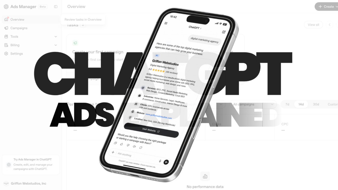
A new advertising platform went from pilot to a billion-dollar run rate in under 200 days. Here is how it actually works, and the honest answer on whether it deserves your budget this quarter.

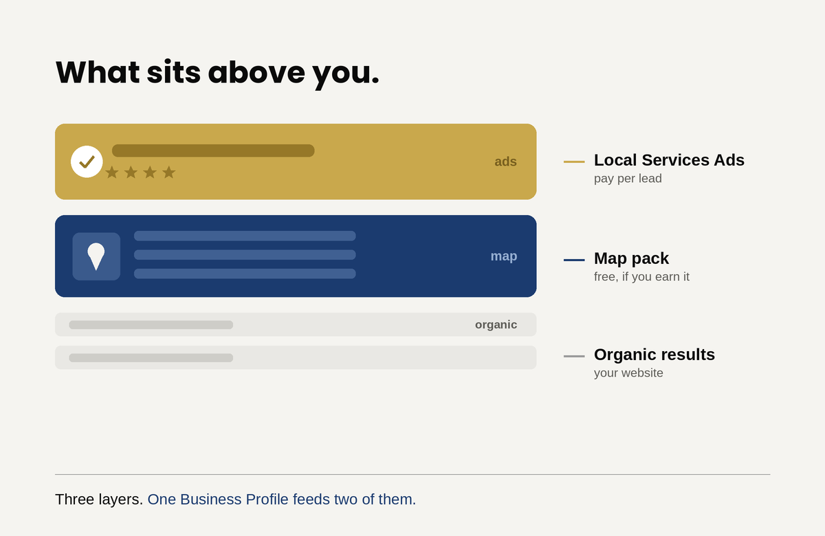
There is a stack at the top of every local search result, and most business owners have never looked at it as a stack. Local Services Ads sit at the very top, above everything. The map pack sits below them. Organic results sit below that. Three layers, three different sets of rules, and one business trying to appear in all of them.
Here is what changed, and why it matters more than any individual optimization tip. Those layers used to be separate projects with separate inputs. They are not separate anymore. A verified Google Business Profile is now mandatory to run Local Services Ads at all, and your Business Profile reviews have become your Local Services Ads reviews. There is no separate review system. The free listing you may have half-configured and forgotten now determines whether your paid ads run, where they rank, and what each lead costs you.
That single change reorders the priorities. If your Business Profile is weak, you cannot buy your way past it.
Google states plainly that local results rest on three factors: relevance, distance, and prominence. Understanding what each one means, and which you can influence, saves a great deal of wasted effort.
Relevance is how well your profile matches what somebody searched. This is the most directly controllable factor and the most commonly neglected. Google matches on the information you give it, so an incomplete profile is a profile Google cannot match confidently.
Distance is how far your business sits from the person searching. This is the uncomfortable one, because it is largely outside your control, and it explains the question owners ask most often: why do I rank in one neighborhood and disappear in the next? Proximity is why. A competitor two miles closer to the searcher has an advantage you cannot optimize away. You can offset it with stronger relevance and prominence, but you cannot eliminate it, and any agency promising uniform rankings across a wide metro is overselling.
Prominence is how well known your business is, and Google names reviews and links from other websites as inputs. This is the slow compounding factor, and the one with the highest ceiling.
The work here is unglamorous and mostly consists of filling things in completely and then keeping them current.
Categories. Your primary category carries more weight than almost anything else on the profile. Choose the most specific one that describes your core service rather than a broad one, then add relevant secondary categories. Businesses routinely pick something vague and wonder why they do not surface for their actual specialty.
Complete every field. Services with descriptions, hours including holiday hours, attributes, business description, products where applicable. Each field is a signal Google uses to judge relevance, and empty fields are silence.
NAP consistency. Your name, address, and phone number must match exactly across your website, your profile, and every directory listing. Inconsistent details are a common and quiet drag on local visibility.
Photos, and more of them than you think. This matters twice over now. Photos affect user preference in the map pack, and Google’s Local Services documentation states that higher quality profiles, including those with images, may rank higher and may pay lower costs per lead. That is a rare case of a free action lowering a paid cost.
Reviews, continuously. Not a burst of ten and then nothing for two years. Volume, recency, rating, and your responses all feed prominence. This is also the single highest-leverage habit in this entire article, for reasons the next section makes clear.
Service areas set honestly. Listing every town within fifty miles does not extend your reach. It dilutes your signals. List where you actually work.
Local Services Ads work unlike anything else Google sells. You pay per lead rather than per click, so a person who sees your ad and does nothing costs you nothing. There is no keyword bidding and no ad copy. Google verifies your license and insurance before your ads run at all, which is why setup takes days to weeks rather than an afternoon.
Several things changed in late 2025 that make most older guides unreliable. Google consolidated the Google Guaranteed, Google Screened, and License Verified badges into a single Google Verified blue checkmark. The associated money-back guarantee was discontinued. And the connection to your Business Profile became mandatory rather than optional: an unverified or suspended profile means your ads do not run.
If you are working from a checklist written before this, parts of it are wrong.
Google’s own documentation on Local Services ad rankings lists what feeds the auction, and the list rewards operational discipline more than budget.
Your bid and budget matter, but they are not the whole story. Google explicitly names responsiveness, noting that missed calls may negatively affect it. Profile quality is a named factor and includes your rating, your number of reviews, your average response time, your use of high quality images, and the verification checks you have completed. Search context and how relevant your business is to the specific query round it out.
Read that list again with the earlier point in mind. Reviews and response time appear in both systems. The work you do on your Business Profile is simultaneously the work that improves your paid ad ranking and lowers your cost per lead. That is the argument for treating them as one project rather than two.
Budget is set weekly rather than daily, and Google’s documentation on how leads work explains that you can exceed the weekly average in a given week but never the monthly maximum. Size it against capacity: decide the most you will pay for a lead, multiply by the number of jobs you can actually service in a week, and start there rather than guessing high.
Set your service area conservatively at first. Paying for leads outside your profitable radius is the fastest way to conclude the channel does not work.
Answer the phone. This is not a soft recommendation. Responsiveness is a scored ranking factor, missed calls hurt your position, and every unanswered lead you already paid for is pure loss. Enabling message and booking leads gives customers a way to reach you outside business hours, which Google notes can increase lead volume during nights and weekends.
Dispute invalid leads every month. Spam calls, wrong numbers, and contacts outside your service area can be reported, and credits reduce your real cost per lead. Most businesses never do this, which means most businesses overpay.
Keep asking for reviews. Since your Business Profile reviews now drive your ad ranking, review generation stopped being a reputation exercise and became a media buying lever.
Everything above assumes the leads become customers, and that assumption is where the money usually disappears. You can win the top of the local stack, appear above every competitor, and still lose the job, because what happens after the lead arrives is a separate system entirely.
This is more punishing with Local Services Ads than with almost any other channel, because you paid for that lead directly. A missed call is not just a lost opportunity, it is a purchased opportunity you threw away, and it damages your ranking on top of that. In LSAs, slow follow-up costs you twice.
The same applies to where the traffic lands. Your profile and ads can be immaculate while the site they lead to fails to convert, and no amount of local visibility fixes that.
The order matters, because these build on each other.
Claim and verify your Business Profile if you have not, since nothing else works without it. Complete every field properly, with the correct primary category and honest service areas. Build a real review habit, meaning a consistent process for asking rather than an occasional push. Add photos, generously. Only then evaluate Local Services Ads, because a weak profile makes them expensive and a suspended one makes them impossible.
That sequence saves money. Businesses that skip to the ads while their profile sits half-finished pay more per lead for worse placement, then conclude the channel is broken.
The free listing and the paid ads are no longer separate projects. Your Business Profile is the foundation of your organic local visibility and the input that determines your paid ad ranking and cost. Fixing it improves both at once.
Most local businesses have a profile somebody set up years ago and nobody has touched since. That profile is now doing more work than they realize, and doing it badly. Start there, before you spend a dollar on ads.

Ask a business owner about site speed and you get a shrug. Ask them about losing half their prospects before the page finishes loading and you get a different conversation. Those are the same conversation. Core Web Vitals is the name Google gave to a set of measurements, and because it sounds technical, it lands on a developer’s task list and stays there, competing with features that feel more urgent. The framing is the problem. These are not developer metrics. They are a measurement of how many people give up on your business before they have seen anything you offer.
This article is about the money, not the code. What the metrics actually measure, what the evidence says they are worth, how to work out the cost for your own business, and how to decide whether fixing it is worth what it costs.
Google measures three things about the experience of a real visitor loading a real page.
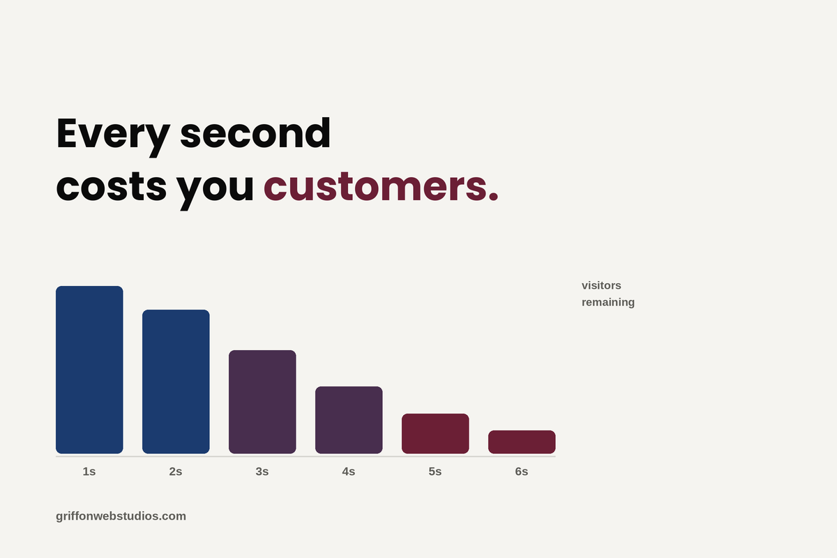
Speed: The first is how long it takes for the main content to appear. Not the first pixel, not a spinner, but the thing the visitor actually came to see: the headline, the hero image, the product. Google calls this Largest Contentful Paint, and the threshold for a good experience is 2.5 seconds.
Engagement: The second is how quickly the page responds when someone interacts with it. They tap a button, open a menu, start typing, and the page either reacts immediately or sits there. Google calls this Interaction to Next Paint, and the threshold is 200 milliseconds. This one replaced an older responsiveness metric, and plenty of sites that comfortably passed the old one fail this one, because it measures the full interaction rather than just the first moment of it.
User Experience: The third is whether the page holds still. Content loads in stages, and if a late-arriving image or ad shoves everything down the screen, the visitor loses their place or taps the wrong thing. Google calls this Cumulative Layout Shift, and the threshold is 0.1.
Two details matter for interpreting your own numbers. Google grades you at the 75th percentile, meaning three quarters of your visits must meet the threshold, so a good average can still be a failing grade. And it grades on field data collected from actual Chrome users rather than on a test you run yourself, which is why a flattering score in a speed testing tool can coexist with a failing assessment. Your visitors’ phones and networks are the measurement, not your office wifi.
The most reliable numbers come from businesses that ran controlled tests rather than from vendors selling optimization. Google maintains a collection of these, and the pattern across them is consistent enough to be useful even though the magnitudes vary wildly by industry.
Rakuten’s Japanese storefront ran an A/B test between an optimized landing page and the original, identical in every other respect, and reported a 53.37% increase in revenue per visitor and a 33.13% increase in conversion rate on the optimized version. That is a large number from a large site, and no small business should expect to replicate it. What travels is the direction and the mechanism, not the multiple.
Google’s own collection of business impact case studies shows the same shape repeatedly across different industries: measurable improvements in conversion, engagement, and revenue following performance work. Notably, several report gains in the low single digits to low double digits rather than in the fifties, which is the more realistic expectation for most businesses.
Two things are worth being careful about here. Numbers in this space get inflated and repeated without sourcing, and a meaningful share of what circulates traces back to studies on enormous ecommerce sites where a fractional percentage is worth millions. Correlation is also doing some work in these studies: faster sites often belong to companies that invest more in everything, so not all of the gain is attributable to speed alone. The honest version of the claim is that performance improvements reliably move conversion in the right direction, that the effect is larger on mobile and on ecommerce than elsewhere, and that anyone promising you a specific percentage before looking at your site is guessing.
You do not need industry benchmarks to price this. You need four numbers you already have.
Take your monthly visitors, your current conversion rate, your average value per conversion, and your close rate if you sell a service rather than a product. That gives you the revenue your site produces now. Then model a conservative improvement, say a one to two percentage point lift in conversion rate rather than a fifty percent one, and rerun the arithmetic. The difference is your annual opportunity, and for most businesses it is dramatically larger than the cost of the work.
For example, A service business gets 5,000 monthly visitors, converts 2% into inquiries, closes a third of those, and averages $3,000 per job. That is 100 inquiries, about 33 jobs, roughly $99,000 in monthly revenue. Move the conversion rate to 3%, which is a plausible outcome of removing real friction rather than an aggressive one, and you get 150 inquiries, 50 jobs, and about $150,000. The gap is meaningful, it recurs every month, and it exists whether or not anyone ever fixes it.
Run this with your own numbers before you commission any work. It tells you both whether the project is worth doing and how much it is rationally worth paying for.
Most of your traffic is on a phone, on a cellular connection, often on a device several years old. Your website looks fast to you because you are testing it on good hardware and a fast connection, frequently with the page already cached. That experience is not representative of anyone else’s.
This is also where the gap between test scores and reality opens up. A testing tool runs a simulation on a specified connection and gives you a lab score. Google’s assessment uses field data from real Chrome users on real devices. When those two disagree, the field data is the one that describes your customers. A green score in a speed test and a failing Core Web Vitals assessment can be true simultaneously, and if you only ever look at the score, you will conclude the problem is solved when it is not.
Google has said clearly that page experience is a ranking consideration and equally clearly that it is not a dominant one. Content relevance and quality matter far more. The practical read is that Core Web Vitals behaves like a tiebreaker: when two pages are otherwise comparable, the better experience has an edge.
That should change how you value the work but not whether you do it. If you are pursuing performance purely for rankings, you are chasing the smaller of the two prizes and you will probably be disappointed. The conversion effect on the visitors you already have is the larger and more immediate return, and it arrives in days rather than the months a ranking shift would take. Search visibility and on-site conversion are different jobs, and performance work pays into the second one first.
Most slow sites are slow for a short list of reasons, and none of them are exotic.

Oversized images are the most common single cause, particularly on WordPress sites where full-resolution uploads get displayed at a fraction of their size. Modern formats and correct sizing frequently solve the largest share of the problem on their own.
Plugin and script accumulation is the second. Every tracking tag, chat widget, popup tool, and abandoned plugin costs something on every page load, and almost nobody audits what is still installed. Third-party scripts are also the usual culprit behind poor interaction responsiveness, because they occupy the browser precisely when a visitor is trying to do something.
Cheap hosting shows up as slow server response, which delays everything downstream no matter how well the rest of the page is built.
Heavy themes and page builders load large amounts of code for features a given page never uses.
And layout instability almost always comes from images, ads, or embeds that arrive without reserved space, plus web fonts that swap in late and reflow the text.
The order matters. Images and hosting usually deliver the largest gains for the least money, and it is worth exhausting the cheap fixes before anyone proposes a rebuild.
The decision is a straightforward comparison once you have run your own numbers. Compare the annual revenue opportunity from a conservative conversion improvement against the cost of the work. For most small and mid-sized businesses, image optimization, a plugin audit, and better hosting land well under the value of a handful of additional jobs a year.
Two cautions. Diminishing returns are real: getting from awful to good is where the money is, and getting from good to perfect is usually a poor use of budget. And if you are planning a redesign anyway, handle performance as part of that project rather than paying twice, because a redesign is also the moment performance most often regresses when a heavier theme ships without anyone checking.
Core Web Vitals is not a technical scorecard to satisfy Google. It is a measurement of how many people your website loses before it has a chance to sell anything, and it has a dollar value you can calculate from numbers already sitting in your analytics. Calculate it. If it is small, deprioritize the work honestly. If it is large, you now know what you are losing every month you leave it alone.

A redesign is the most common way a business quietly wrecks its own search traffic. The damage is almost always preventable, and it comes down to what you preserve, not what you change.
The new site launches. Everyone admires the cleaner look. Six weeks later organic traffic has fallen off a cliff, the leads have thinned out, and nobody connects the two events, because the redesign was a triumph and this is just some unrelated slump. It is not unrelated. A redesign is the single most common way a healthy website destroys its own search performance, and it happens for a simple reason: a redesign gets treated as a visual project when it is also, invisibly, a technical SEO project.
The site ends up looking better and ranking worse. (If your traffic has already dropped after a relaunch, diagnosing exactly what broke is a separate and solvable problem. This article is about not getting there in the first place.)
The good news is that almost none of this damage is necessary. Prevention is straightforward, and it is far cheaper than recovery. Here is how redesigns kill rankings, and how to keep yours intact.
The root cause is rarely technical. It is organizational. The people designing the new site and the person responsible for its search performance usually never talk. The designers optimize for how the site looks and feels, which is their job. Nobody is assigned to protect what already ranks. So the things that carry your search equity, your URLs, your content, your internal links, and a stack of technical signals, get changed or discarded as a side effect of making the site prettier. The client finds out when the traffic craters, by which point the cause is weeks old and hard to trace.
That single gap produces three failure modes. Each is common, each is preventable, and each stays invisible until it gets expensive.
This is the most catastrophic and the most common. Every page that ranks lives at a specific URL, and everything that gives that page its ranking, Google’s index and every backlink pointing at it from across the web, is attached to that exact address. A redesign, especially one that moves to a new CMS or restructures the navigation, frequently changes those addresses. The product page that lived at one path now lives at another.
If the old URLs are not redirected to their new equivalents, every old address becomes a 404, the rankings attached to those addresses evaporate, and years of accumulated link equity is severed in an afternoon. The reassuring part, and the part most people have backwards, is that the redirect itself costs you nothing: Google is explicit that a permanent (301) redirect does not cause a loss in ranking signal. The danger is never the redirect. It is the missing redirect.
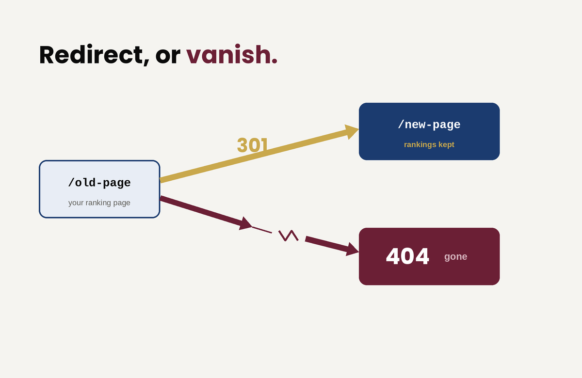
So before launch, crawl the existing site, inventory every URL that earns traffic or holds links, and map each one to its new destination with a permanent redirect. Two traps wait here. The first is redirect chains, where an old URL points to a second URL that points to a third; Google recommends redirecting straight to the final destination and keeping any chain short. The second is worse and oddly common: redirecting every old URL to the new homepage. Google warns against this directly, because it collapses the distinct topical signals of all those pages into one, and that topical equity does not transfer, it disappears. A page about a specific service has to redirect to the equivalent page, not to the front door.
The safest move of all is to not create the problem. If your URLs can stay the same through the redesign, keep them. The lowest-risk redesign changes the design and leaves the addresses alone.
Redesigns love whitespace and brevity. The instinct is to trim copy, replace blocks of text with imagery, and simplify pages down to something that breathes. The problem is that the text being trimmed is frequently the exact text that ranks. Google ranks a page on its content, so strip a page of the words it ranked for and it stops ranking for them. Replacing indexable copy with text baked into an image makes it worse, because Google reads that text poorly if at all.
This is not an argument against clean design. Good design and substantive content are not in conflict; a page can be clear, spacious, and still carry the words that earn its traffic. But before anyone cuts, someone has to know which content does the earning. Preserve the real copy on pages that rank, keep the heading structure and the terms those pages are known for, and never bury indexable text inside graphics. A cleaner design does not require less content. It requires better-organized content.
The third failure is a bundle of smaller ones that ship together on launch day. The most infamous: a developer correctly blocks the staging site from search engines, the new site goes live, and that block ships straight to production, telling Google to ignore the entire site. Google’s own guidance tells you to clear every temporary crawl block before the move, yet teams skip that step constantly.
The rest of the bundle stacks up fast. A new build regenerates your title tags and meta descriptions into bland theme defaults and wipes out the optimized ones.
And it flattens your internal linking until the architecture that once distributed authority across the site disappears. Almost none of this shows on the front end: a human visitor sees a flawless site, while a crawler sees a broken one. That gap is exactly why “it looks fine to me” is not a verdict on SEO.
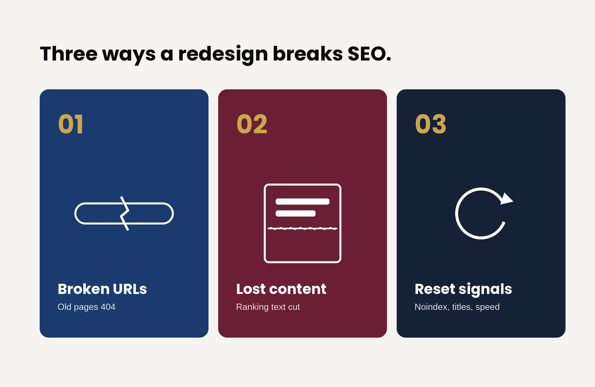
The fix is a pre-launch checklist that carries every optimized signal across to the new build, and a post-launch crawl that catches whatever slipped through anyway.
A redesign that protects search equity follows an order. It is not complicated, but it has to be deliberate.
Benchmark before you touch anything. Record current rankings, organic traffic, your top pages, and your most-linked URLs. You cannot tell whether you broke something if you never wrote down what working looked like.
Build on a staging environment that is blocked from indexing but crawlable by you, so you can test the full site privately, and put removing that block on the launch checklist so it does not ship live.
Map every URL one-to-one. Keep the addresses that can stay, redirect the rest to their true equivalents with permanent redirects, allow no chains, and never funnel everything to the homepage.
Preserve the content and on-page signals that earn rankings: the substantive copy, the headings, the title tags and meta descriptions, the canonicals, the structured data, and the internal links.
Submit the new sitemap through Search Console, request indexing of your key pages, crawl the live site to catch 404s, redirect chains, stray noindex tags, and broken canonicals, and then watch Search Console daily for the first couple of weeks and weekly after that.
One discipline saves more grief than any other: do not stack everything at once. Google’s standing advice is to change one thing at a time, because combining a redesign with a domain change and a content overhaul makes it almost impossible to tell which one broke things when something inevitably wobbles. If you can phase the work, phase it. (And if the redesign does involve moving to a new domain, that move has its own requirements, including Google’s Change of Address process.)
Finally, expect a temporary dip even when you do everything right. Google says plainly that rankings fluctuate during a move and that a medium-sized site can take weeks to fully settle in the index. That wobble is normal. Hold steady and resist the urge to start frantically changing things, because panic edits during the settling period only muddy the signal you need to read.
If you take nothing else from this: do not change URLs unless you have to, and redirect every single one you do change. Keep those redirects live for at least six months, and longer while they are still receiving any traffic from search. That one discipline, applied properly, prevents the large majority of redesign disasters before they start.
The new site can look nothing like the old one and still keep every point of search equity it had. The two goals only conflict when nobody is responsible for the second one. The fix is not more technical skill on launch day. It is assigning someone to protect the site’s search performance from the very first mockup. It is treating that protection as a requirement of the project rather than a question raised after the traffic falls.
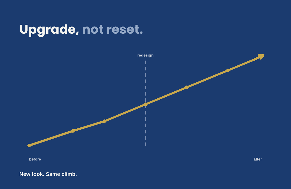
A redesign that respects both the design and the SEO is entirely achievable. You just have to plan it that way from the start.

“Time on site” is a vanity metric that confuses engagement with confusion. Here is what design actually does to move a visitor from landing to converting, and the handful of elements that decide whether they stay long enough to.
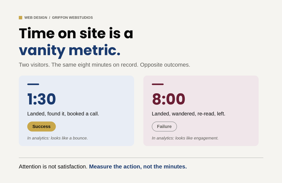
“How do we keep people on the site longer?” is one of the most common questions a business owner asks about their website, and it is the wrong one. A visitor who lands, instantly finds what they came for, and books a call in ninety seconds is a triumph, and in your analytics their short session looks almost identical to a bounce. Meanwhile, a visitor wandering your site for eight minutes, clicking back and forth, re-reading the same page because they cannot find what they need, racks up the engagement numbers everyone celebrates and then leaves without doing anything. Time on site measures attention. It does not tell you whether that attention was satisfaction or confusion, and for most business websites those are opposite outcomes.
The goal of design is not to detain people. It is to move them: to confirm in seconds that they are in the right place, build enough trust to act, and remove every reason to leave before they convert. The visitors who “stay” in the way that matters stay because the design earned it, not because it trapped them. Here is what actually does that work.
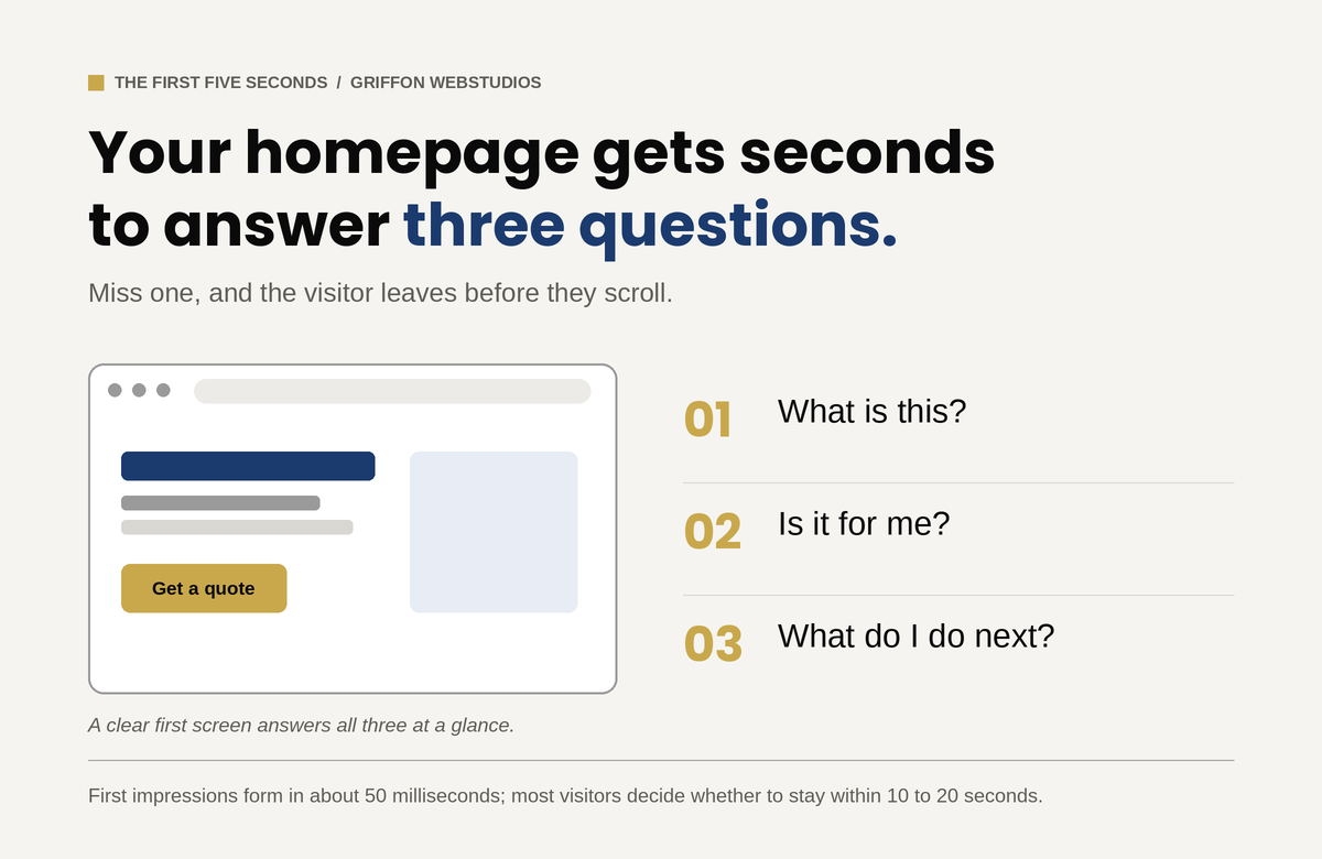
A visitor forms an impression of your site in well under a second. Research summarized by the Nielsen Norman Group puts the first visual judgment at roughly 50 milliseconds, and NN/g’s own behavioral data shows that users routinely leave a page within 10 to 20 seconds unless something gives them a reason to stay. In that window they are answering three questions, fast and mostly subconsciously: What is this? Is it for me? What do I do next? If your homepage’s first screen does not answer all three, they leave, not because the rest of the site is bad, but because they never got a reason to scroll to it.
This is where clever loses to clear. A hero section with a vague slogan and a stock photo of people pointing at a laptop answers none of the three questions. A hero that states plainly what you do, who it is for, and what to do about it answers all three before the visitor has to think. The single highest-leverage design decision on most websites is not a color or a font. It is whether the first screen confirms relevance instantly. Everything downstream depends on the visitor getting past it.
Before a visitor can judge your design, the design has to load. Google’s research found that as page load time climbs from one second to three, the probability of a bounce rises by 32%, and that 53% of mobile visitors abandon a page that takes longer than three seconds. The ones who leave do so before they have seen a single thing you built. You can have the best-designed site in your market and lose most of its visitors to a delay they never forgave. Google’s own Core Web Vitals thresholds put the target for loading the main content at under 2.5 seconds.
But raw speed is only half of it. Perceived performance, meaning how fast the site feels, matters as much as the number on a speed test. A page that renders its above-the-fold content first feels instant even while the rest loads. A page where content jumps around as images and ads load in feels broken, and visitors do not trust broken. That specific problem has a name and a metric: Cumulative Layout Shift, one of the signals Google uses to score visual stability. Layout stability, progressive loading, and rendering what matters first are design and engineering decisions that directly determine whether anyone stays long enough to engage at all.
Engagement is not decoration. It is whether the design tells a visitor where to look and what to do next. The human eye scans a page in predictable patterns, and good design works with them: the most important thing is the most visually prominent thing, contrast pulls attention to the action you want, and whitespace gives the eye somewhere to rest instead of drowning it.
The enemy here is equal weight. A page with ten things shouting at once (five calls to action, three pop-ups, a slider, a chat bubble) gives the visitor no idea what matters, and a visitor who cannot tell what matters does nothing. More options slow people down, and more competing elements dilute each other until none of them win. One clear primary action per screen, supported by a hierarchy that makes the path obvious, moves people. Clutter freezes them.
Each form field you ask for, each decision you force, each ambiguous label is a small tax on the visitor’s effort and patience. The more choices and the more steps, the slower and less likely the action. Research from the Baymard Institute found that what actually drives form abandonment is not the number of steps but the number of fields: the average checkout asks for around 12 form fields when 7 or 8 would do, and trimming the excess measurably lifts completion. The same logic applies to any form on any site. A contact form with twelve fields converts worse than one with three, not because the visitor could not fill out twelve, but because each field is another moment to reconsider whether it is worth it.
The design that keeps people engaged is the one that asks the least of them. This is partly about respecting the visitor’s cognitive load: every extra element to process is mental effort, and mental effort is what makes people quit. Strip the form to what you actually need. Defer the complex stuff until after the visitor is committed. Make labels unambiguous so nobody has to guess. The instinct to add (another field, another step, another option) is almost always the wrong one. Subtraction is the underrated design skill.
For a business website, the thing that keeps a visitor from leaving usually is not an animation or a clever interaction. It is whether they believe you. Visitors abandon sites that feel untrustworthy faster than they abandon sites that are merely plain, and design communicates trust before a word is read. Real photos instead of stock, visible reviews and credentials, clear and present contact information, and professional polish all act as proxies for competence: the visitor cannot evaluate your work directly, so they judge the signals around it.
This is why a clean, credible, slightly plain site routinely outperforms a flashy one that feels off. The flash raises a question the visitor cannot quite articulate: can I trust these people with my money? Design that answers yes, through evidence and polish rather than spectacle, is what keeps a serious buyer on the page long enough to act.
More than half of all web traffic is now mobile, and a design that engages on a desktop monitor and falls apart on a small screen loses the majority of its visitors. Tap targets too small to hit, text that requires zooming, a primary call to action stranded where a thumb cannot reach, a layout that scrolls sideways: each of these is an exit. The engagement question is a mobile question first and a desktop question second. Designing for the big screen and hoping the phone version survives is designing for the minority of your traffic.
If time on site is the wrong metric, what is the right one? The path, not the duration. Did the visitor scroll far enough to see what matters, which scroll depth tells you. Did they move toward the action, which the conversion path tells you. Did they come back and search again, which is the quiet signal that they did not find what they came for the first time. Getting the right visitors to the page is the job of search visibility; turning them into customers once they arrive is the job of design, and the two require different work.
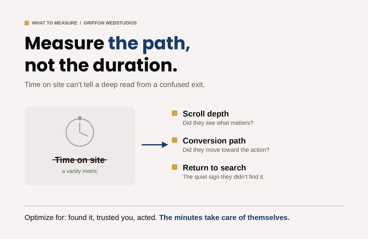
A visitor reading deeply because your content is genuinely engaging and a visitor clicking around lost because your design is confusing can produce nearly identical time-on-site numbers. The first is success and the second is failure, and only by watching where attention goes, and whether it ends in an action, can you tell them apart. This is the same trap that catches businesses chasing raw traffic: more visitors rarely fix a problem that lives between the click and the contract. Optimize for the visitor finding what they came for, trusting you, and acting. The minutes take care of themselves.
“How do we keep people on the site longer?” assumes attention is the goal. It is not. Attention is the cost a visitor pays to find out whether you can help them, and the best design spends as little of it as possible before delivering the answer and the next step. If your traffic is healthy but your site is not converting, the fix is rarely more visitors and almost always a website built to convert. And if the traffic itself has fallen, that is a separate diagnosis entirely. Stop trying to hold people. Earn the action that matters, remove every reason to leave before it, and the visitors worth keeping will stay exactly as long as they need to.
A busy website that doesn’t convert isn’t a marketing win — it’s an expensive billboard. The problem is almost never the amount of traffic. It’s the gap between arriving and acting.
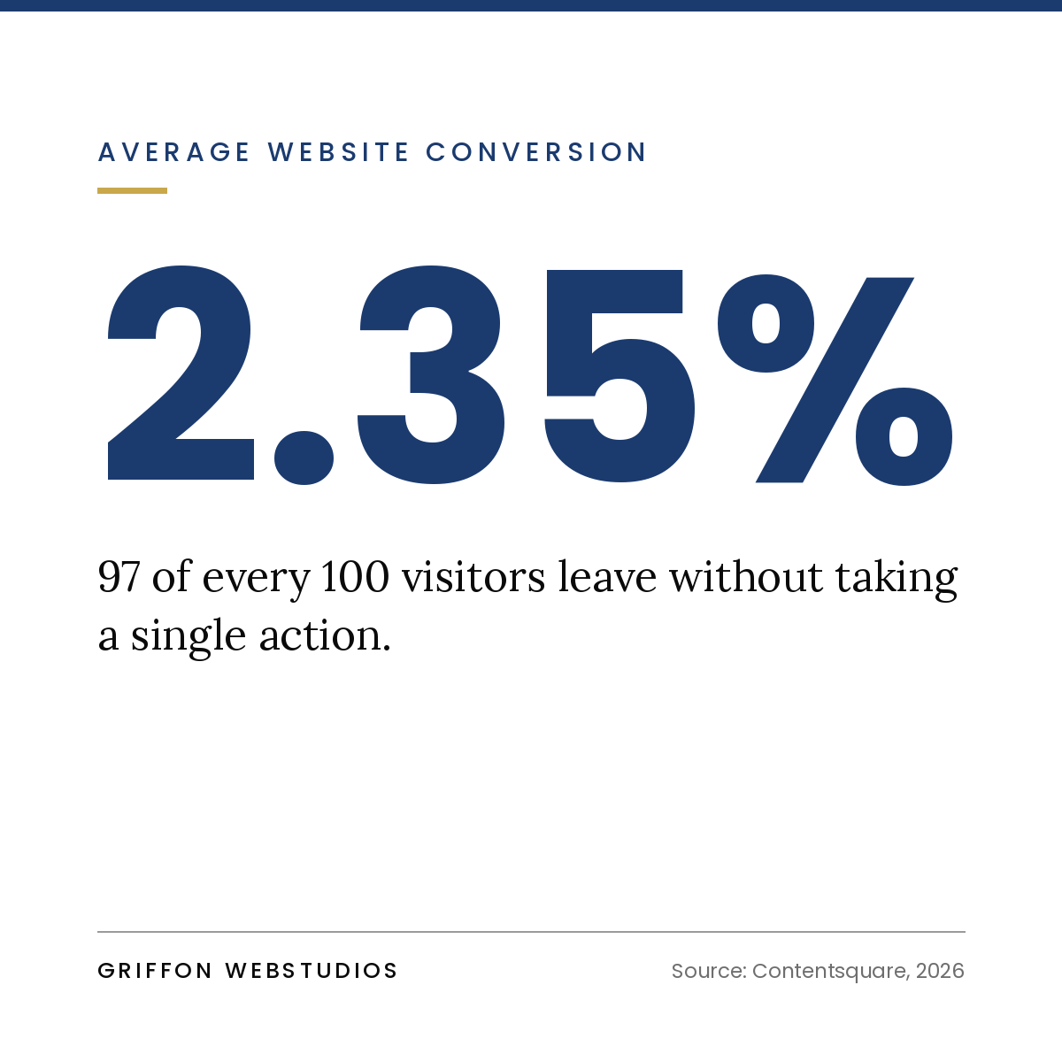
There’s a particular kind of frustration that shows up once a firm finally gets its marketing working. The analytics look healthy. Visitor numbers are climbing. The SEO is paying off, the ads are running, and the content is landing. And yet the one number that pays the bills — qualified inquiries — barely moves.
It’s a confusing place to be, because every instinct says get more traffic. So firms spend more on ads and publish more content, pouring water into a bucket without noticing the hole in the bottom. More traffic to a site that doesn’t convert just means a more expensive way to lose the same percentage of visitors.
The uncomfortable truth is that traffic is a vanity metric. The real question was never “how many people came?” It’s “how many people did we give a clear, compelling reason to act?” That’s a design and strategy problem, not a volume problem — and it’s almost always fixable.
When a site gets visitors but no leads, the cause is usually one or more of seven specific failures. Read these as a diagnostic checklist for your own site.
When someone lands on your homepage, they make a snap judgment: Is this for me? Do these people solve my problem? If your headline is a clever tagline, a vague mission statement, or a wall of “we’re passionate about excellence,” the answer defaults to no, and they leave.
Premium clarity beats clever every time. The strongest service-firm headlines say plainly who you help and what outcome you deliver. The visitor should feel recognized — “this is exactly my situation” — within seconds, before they’ve consciously decided to keep reading.
Many sites are beautifully designed and completely directionless. A visitor finishes reading, feels mildly interested, and then… finds nothing compelling to pull them forward. No clear call to action, or a timid one buried in the footer, or five competing buttons that each point somewhere different.
A high-converting page is built around one primary action, repeated at natural decision points as the visitor scrolls. When everything is a call to action, nothing is. Decide what you most want a visitor to do, and make that path impossible to miss.
A “Request a Quote” form with eleven fields is a wall, not a door. You’re asking a stranger who’s known you for ninety seconds to commit time, share detailed information, and brace for a sales pitch, all at once. Most won’t.
Friction is the silent killer of conversion. Every extra field, every unnecessary step, every moment of “wait, what happens after I click this?” sheds a percentage of people who were genuinely interested. Ask for the minimum you need to start a conversation, and make the commitment feel small.
Service firms sell something invisible: expertise and judgment a prospect can’t inspect before they buy. That makes trust the entire game, and trust has to be built on the page, fast.
Sites that convert show proof rather than just claim it: real results and outcomes, client names and logos, specific testimonials that name a situation rather than gush vaguely, credentials, and the faces of the actual humans a prospect would work with. A site with no proof asks visitors to take a leap of faith, and most people don’t leap.
Sometimes the traffic genuinely is the problem, not the amount, but the fit. If your content and ads pull in people browsing for free advice, students, or buyers far outside your price range, no amount of conversion polish will turn them into clients, because they were never prospects.
This is where measurement and conversion connect. If you can’t tell which channels bring your best clients versus your most clicks, you may be optimizing your whole site for the wrong audience. (We dig into this in Marketing Attribution After Cookies.)
A site that loads slowly, jumps around as it renders, or falls apart on a phone bleeds conversions before a visitor reads a word. The majority of your traffic is likely on mobile (take a mobile friendly test), and patience there is measured in seconds. Every second of delay and every awkward tap-target is a quiet exit.
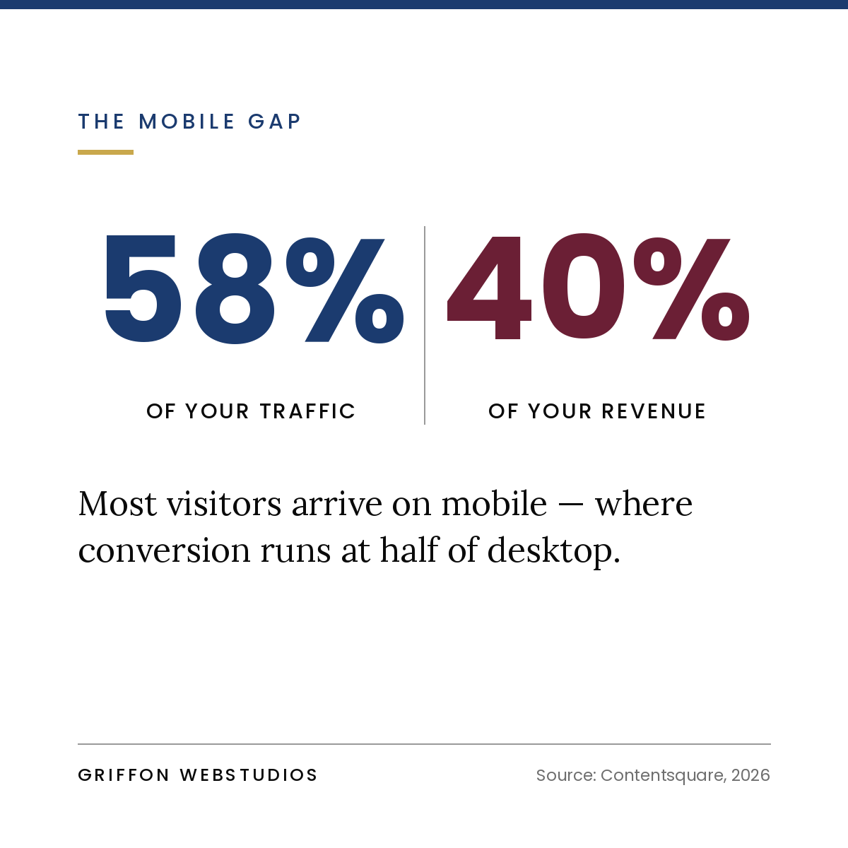
Performance isn’t a technical nicety, it’s a revenue input. A premium brand undermined by a sluggish, fiddly experience reads as careless, and carelessness is the opposite of what a service buyer is looking for.
Most visitors aren’t ready to book a call on their first visit. If your only call to action is “Contact Us” or “Get Started,” everyone who’s interested but not yet has exactly one option: leave and probably never return.
High-converting sites give the not-ready visitor a lower-commitment way to stay in your orbit, a useful guide, an assessment, a checklist, or a short email series in exchange for an email. You convert a fraction of cold visitors into known leads you can nurture, instead of losing 100% of them to the back button.
Notice that almost none of those problems are about how the site looks. They’re about how it’s built to move someone — from arrival to recognition to trust to a small first commitment to a conversation.
That’s conversion architecture: designing the journey rather than decorating the pages. It treats every section as a step with a job to do — earn attention, build trust, handle an objection, reduce friction, prompt action — and arranges them in the order a real human actually makes a decision. Aesthetics still matter enormously, especially for a premium brand, but beautiful and persuasive are different skills, and a site needs both. A gorgeous site that doesn’t convert is a portfolio piece, not a business asset.
You can pressure-test your site without any tools:
If your website gets traffic but no leads, resist the urge to buy more traffic. You’d just be paying more to lose the same people at the same leak. The leverage lies in the conversion gap — the distance between a visitor arriving and a visitor acting — and closing it is a matter of clarity, trust, friction, and a deliberately designed path.
Get that right, and the traffic you already have starts producing leads it never did before. That’s not a bigger marketing budget. That’s the same budget finally doing its job.
At Griffon Webstudios, we design websites as conversion systems, not just beautiful pages — built around the journey from first visit to qualified inquiry. If your site is busy but quiet, let’s find the leak and fix it.
The third-party cookie never died on schedule — but your ability to track what’s working quietly fell apart anyway. Here’s how to rebuild attribution you can actually trust.
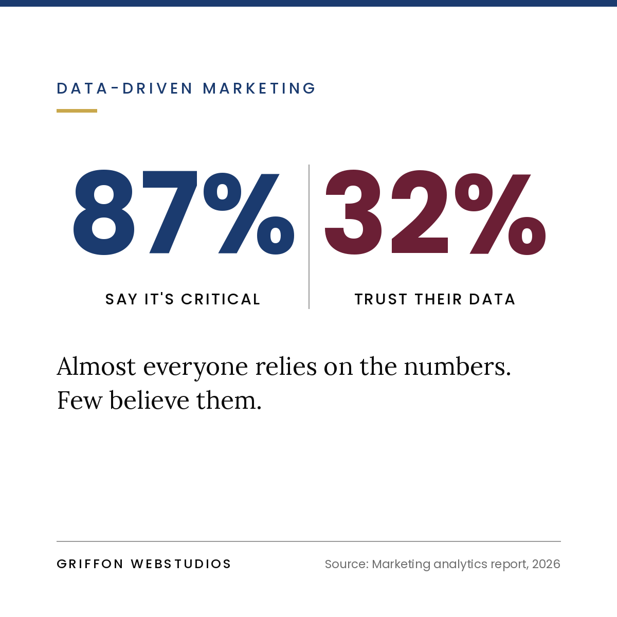
Ask most service-firm owners which marketing channel brings in their best clients and you’ll get a confident answer. Ask them how they know, and the confidence evaporates. The honest version is usually some mix of a dashboard they half-trust, a gut feeling, and the last thing a client happened to mention on a call.
That was always a little shaky. It’s now genuinely broken and the reason is one of the most misunderstood stories in marketing.
For years the industry braced for a single deadline: the day Google would switch off third-party cookies in Chrome and the old tracking model would end. That day never came. Google officially abandoned its forced cookie-deprecation plan in July 2024, and in 2026 Chrome still doesn’t block third-party cookies by default — it simply hands users a privacy choice and lets them decide.
A lot of business owners read that as a reprieve. It wasn’t. It was a slow leak that had already been draining the tank for years.
Here’s what actually happened while everyone watched Chrome’s shifting timelines. Safari has blocked third-party cookies by default since 2020. Firefox has done the same since 2019. Privacy-first browsers like Brave and DuckDuckGo reject trackers out of the box. Add widespread ad-blocker use and the growing share of Chrome users who actively choose enhanced privacy, and a large portion of your web traffic was already invisible to legacy tracking long before any official “deadline.” There is still no universal replacement for the third-party cookie.
So the cookie technically survived but the data it produces has quietly become partial, inconsistent, and unreliable. Your analytics didn’t break with an error message. It just started lying to you politely.
If you’re still relying on the default setup most firms have, here’s what’s going wrong under the hood:
You’re only seeing the trackable minority. Every visitor on Safari, Firefox, a privacy-first browser, or with an ad blocker is partially or fully invisible. Your reports show you the slice of your audience that happens to be trackable and present it as the whole picture. Decisions made on that data are decisions made on a biased sample.
Last-click takes all the credit. The default model hands 100% of the credit to the final click before conversion — usually a branded Google search or a direct visit. So your analytics tells you “Google” and “direct” are your best channels, when in reality those are just where people land after the podcast, the referral, the LinkedIn post, or the months of content actually did the convincing.
Dark social is invisible. When a prospect copies your link into a private message, a Slack channel, or a WhatsApp thread to a colleague, that traffic shows up as “direct” with no source attached. For service firms, where word-of-mouth and private sharing drive a huge share of good leads, this is an enormous blind spot.
The buying journey is long and multi-device. A prospect discovers you on their phone during a commute, reads more on a work laptop, and inquires from a third device a month later. Cookie-based tracking treats those as three unrelated strangers. Your most considered, highest-value clients are exactly the ones the old model fails to connect.
The net effect: you’re likely over-crediting the channels that capture intent and under-crediting the channels that create it — and then shifting budget in exactly the wrong direction.
The fix isn’t a clever new tool you bolt on. It’s a shift from renting visibility through third parties to owning your data directly. Four pillars do the heavy lifting.
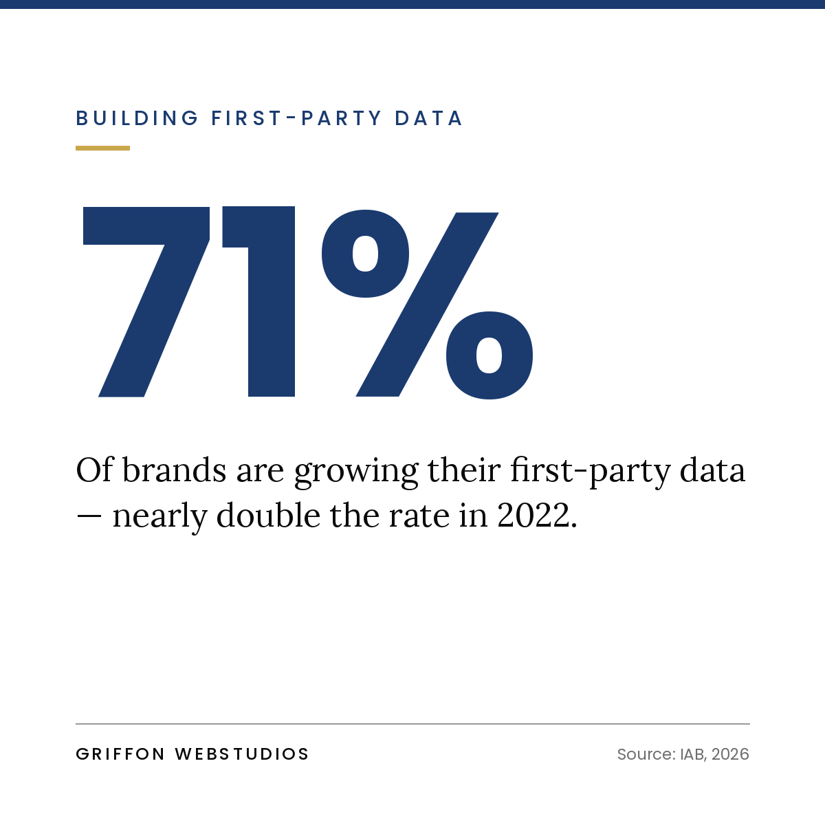 First-party data is information your prospects give you directly through forms, accounts, downloads, bookings, and your CRM. Unlike third-party cookies, it doesn’t depend on a browser’s permission to exist, and it’s far more durable and accurate. The firms that will measure clearly over the next few years are the ones building a deliberate first-party data foundation now: capturing the right information at the right moments and storing it where it connects to actual revenue.
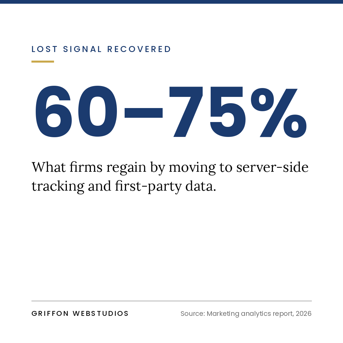 Most tracking still runs in the visitor’s browser, which is precisely where ad blockers, privacy settings, and browser restrictions intercept it. Server-side tracking moves that measurement to your own server, so the data is collected more reliably and you control what’s captured and shared. It’s more technical to set up, which is exactly why it’s become a real competitive edge for firms that bother to do it, and a permanent blind spot for those that don’t.
Privacy law and browser design now mean tracking and permission are inseparable. A sloppy consent banner doesn’t just create legal risk, it actively destroys your data, because every visitor who bounces off a bad prompt or silently opts out becomes a gap in your reporting. A well-designed consent experience, integrated with your tracking, is the difference between measuring most of your audience and measuring a frustrated fraction of it.
The most underrated tool in the post-cookie era is a single question on your contact or booking form: “How did you hear about us?” For service firms with longer sales cycles and fewer, higher-value conversions, this human signal often beats any tracking pixel. It captures the dark-social referrals, the “I’ve followed you for a year” relationships, and the word-of-mouth that no script can see. Combined with your CRM, it turns soft impressions into a pattern you can actually read.
Most attribution advice is written for high-volume e-commerce, where thousands of transactions make statistical models reliable. Service firms operate in the opposite world: fewer leads, longer consideration periods, larger deal values, and trust built over months.
That changes the strategy. You don’t need to track every micro-interaction across a million sessions. You need to know which sources produce your best clients — not your most clicks — and you need a clean line from a lead’s first touch to the revenue it eventually generated. That means leaning hard on first-party data, self-reported attribution, and a CRM that captures the full journey, rather than chasing pixel-perfect tracking of anonymous traffic. For a service business, a connected CRM is the real analytics platform; the website and ad tools just feed it.
A few patterns show up again and again when we audit firms’ measurement:
You don’t need to rebuild everything at once. A sensible sequence:
The post-cookie era didn’t arrive as a dramatic shutdown. It crept in while everyone waited for a deadline that kept moving. The firms still relying on default tracking aren’t getting a clear picture — they’re getting a confident-looking report built on a shrinking, biased sample, and steering real budget by it.
Knowing what’s actually working again isn’t about a smarter dashboard. It’s about owning your data: first-party information, server-side measurement, clean consent, and a CRM that connects marketing to money. Get that foundation right and your reporting stops being a guess dressed up as a number.
At Griffon Webstudios, we build that foundation — first-party data capture, server-side tracking, consent that protects your data instead of breaking it, and the CRM integrations that finally connect your marketing to your revenue. If your reporting feels more like a hunch than a fact, let’s take a look at your setup.

Digital advertising is one of the most powerful levers a business can pull. But it is also one of the most misunderstood. Between Google Ads, Meta Ads, attribution models, bidding strategies, and a dashboard full of acronyms, it is easy to lose the plot. This guide changes that.

Tell us what you're looking for, our team will get in touch with you.