The Decline of the Homepage as a Decision-Making Tool

The Decline of the Homepage as a Decision-Making Tool

For a long time, the homepage was seen as the most important part of a website. It was where visitors landed first, got a sense of the brand, and decided what to do next.

The original belief, once valid, is slowly fading. These days, a lot of people never even see the homepage. And when they do, it usually doesn’t do what businesses expect. Most people don’t start on the homepage anymore. Traffic comes in from all over, not just through the front door.

People land on:

  • product pages
  • service pages
  • blog articles
  • comparison pages
  • links shared in messages, search results, or AI summaries

People get to deeper parts of a site through search, social media, ads, or AI-driven links. The homepage is often skipped entirely. If you design only your homepage as the main place for decisions, you’re building for a path most people don’t take.

Decisions before loading

Even if someone does land on the homepage, they’ve usually started making decisions before they get there. By the time someone arrives, they often already know:

  • what problem they’re trying to solve
  • what type of solution they want
  • how much effort they’re willing to invest
  • whether they’re generally interested or just validating

The homepage is no longer the place where curiosity begins. It’s where expectations are either confirmed or challenged.

Homepages are still important

This doesn’t mean the homepage isn’t important. Its role has changed. Now, people judge homepages on just a few key things instead of expecting them to explain everything.

  • clarity in seconds, not minutes
  • whether they match what the visitor already believes
  • how fast they show if the site is relevant or not

Users don’t read homepages word-for-word. They scan for quick confirmation. If they don’t find what they need right away, they leave before exploring further. The homepage now acts more as a place to verify information than as a starting point for exploring the site.

The “everything page” approach no longer works

Many homepages try to be all things at once:

  • brand story
  • service overview
  • credibility builder
  • navigation hub
  • conversion driver

The result is often a cluttered homepage, which makes it hard for users to find what they need.

A homepage that tries to show everything at once usually fails to present any information clearly. Today’s users don’t want a full introduction to the business. They want to quickly see if the site matches their needs.

Internal priorities often shape homepage

Organizations often miss out on their homepage’s potential by making choices that reduce its effectiveness. Different teams want different things featured:

  • Leadership wants brand story
  • Sales wants offers
  • Marketing wants campaigns
  • Design wants creativity

The homepage often becomes a place for internal debates, instead of focusing on what users need. But users don’t care about internal structure. They care about answers.

When internal priorities take over, the homepage stops being useful to visitors. People leave.

Decision-making has moved downstream

Decisions now happen across many different touchpoints, not just on the homepage.

  • AI summaries
  • search result snippets
  • review platforms
  • social proof
  • specific landing pages

The homepage is usually just one stop along the way, not the starting point.

Homepage first impressions are formed in just 50 milliseconds, with 94% of that perception driven by design.

Their job has shifted to:

  • a trust validator
  • a clarity filter
  • a brand consistency check

People are more likely to convert on pages built for their specific needs, not on general introduction pages.

What this means for website strategy

The point isn’t to ignore your homepage. Just don’t overdo it.

  • Each core page on your site should work on its own.
  • Your messaging should show up across all pages, not just the homepage.
  • Homepage content should match what users have already seen or learned elsewhere.

The homepage doesn’t have to do everything anymore. Every page can be an entry point.

The quiet shift many businesses are missing

Many teams still aren’t sure what will actually improve homepage performance. A better question is: “What role should the homepage actually play now?”

Griffon Webstudios sees this shift frequently in website redesigns and UX reviews. Businesses get better results when they focus less on the homepage and more on the real places users land and act. A site’s performance depends more on its overall structure than on the homepage alone.

The homepage hasn’t disappeared. It’s just been demoted.

Don’t treat the homepage as the only decision point. Make sure each key page can stand on its own. Keep your messaging consistent across the site so it aligns with what people have already seen elsewhere. Use the homepage to provide clarity and build trust, not to explain everything.

How to Know If It’s Time to Redo Your Website

How to Know If It’s Time to Redesign Your Website

Is It Time to Redesign Your Website?

Do your analytics show a drop in engagement and conversion rates? Is it harder to get new leads than before? If your website is showing signs of poor performance, it needs your attention right away.

When things slow down and leads drop off, it can be frustrating. Even if your website seems to work fine on the surface, technical or design issues might be holding it back. For example, if you see a significant drop in inquiries, that’s usually a sign the site needs attention.

Redesigning a website isn’t just about new colors or trends. The real question is whether your site still fits how your customers interact and make decisions. Here are a few signs it might be time for an update.

1. Your Website Gets Traffic, but Leads Don’t Convert

This is one of the most common red flags. If people are visiting your site but not contacting you, buying, or taking action, the issue usually isn’t traffic. It’s clarity.

Ask yourself:

  • Is it immediately obvious what you do?
  • Can visitors understand your value in 5 seconds?
  • Is the next step clear without scrolling endlessly?

Most people scan websites quickly and decide just as fast. If your site takes too much effort to understand, even interested visitors may move on. The key point here is that your website should guide users clearly without making them work for it.

2. Your Website Was Built for How People Used the Internet Years Ago

User behavior has changed dramatically.

Today:

  • People decide faster
  • Attention spans are shorter
  • Mobile use dominates
  • AI and search previews shape opinions before users visit

If your site was built years back, it might technically function, but it’s probably weighed down by old habits: endless scrolling, dense paragraphs, sluggish menus, and confusing layouts.

A modern website needs to:

  • Communicate value instantly
  • Load fast on mobile
  • Confirm decisions, not educate from scratch

When your site’s structure clashes with how people browse today, a redesign isn’t just a nice-to-have; it’s a necessary fix.

3. You’re Embarrassed to Share Your Website

This one is simple but important. If you hesitate before sharing your website:

  • In a sales call
  • On social media
  • In email signatures
  • With partners

That pause is a sign of disconnect. Maybe your site no longer aligns with your expertise, standards, or brand. Your website should boost your reputation, not quietly chip away at it. If your business has evolved but your site is stuck in the past, it’s time for a refresh.

4. Your Website Is Hard to Update or Scale

If every small change requires:

  • Calling a developer
  • Breaking something else
  • Avoiding updates out of fear

Your website should be a launchpad, not a roadblock. Modern websites should be flexible:

  • Easy to update content
  • Easy to add new services or products
  • Easy to improve conversion elements
  • Easy to integrate with tools (CRM, analytics, email, ads)

When your site becomes brittle or inflexible, a full redesign is often the wiser investment than endless repairs.

5. It Doesn’t Support Your Marketing Anymore

Your website is not a brochure. It’s the foundation of all your marketing. If you’re running ads, SEO, email campaigns, or social media, and thinking:

  • The traffic is fine, but the results aren’t
  • People don’t seem to understand us
  • We’re spending more to get the same results

Your website could be the silent culprit holding back your results. A modern website should:

  • Match ad and search intent
  • Reinforce trust instantly
  • Make conversion frictionless
  • Support analytics and measurement

At Griffon Webstudios, this is often where we uncover the real issue, not weak marketing, but a website that wasn’t built to convert modern traffic.

6. Your Competitors’ Websites Feel Easier to Use Than Yours

This doesn’t mean competitors look cooler. It means they feel clearer, faster, and more intuitive. If customers are comparing options and your competitors’ sites:

  • Explain things more simply
  • Feel more confident
  • Answer questions faster

Then your website is quietly costing you opportunities. Redesigning isn’t about imitation; it’s about meeting the new standards your customers expect.

7. Your Website Doesn’t Reflect How Decisions Are Made Today

Today, many users:

  • Read summaries before clicking
  • Arrive with decisions mostly formed
  • Expect confirmation, not persuasion

If your site treats every visitor like a blank slate, it’s missing the mark in today’s world.

A modern redesign focuses on:

  • Fast confirmation
  • Strong trust signals
  • Simple messaging
  • Clean structure

A website stuck in the past can fail you, even if everything seems to function just fine.

So… Is It Time to Redo Your Website?

If you recognized yourself in more than one of these points, the answer is probably yes. Redesigning a website isn’t about starting over. It’s about realigning your digital presence with

  • How customers behave now,
  • How decisions are actually made,
  • and where your business is headed.

Ready to turn your website into a powerful asset? Contact Griffon Webstudios today to start your redesign and drive your business forward.

The Rise of Micro-Interactions in Web Design

The Rise of Micro-Interactions in Web Design

Micro-interactions sound like a small deal, but they’re quietly shaping how users judge your brand in the first three seconds. These tiny moments like a button pulse, a subtle hover shift, a progress cue, a cart confirmation bump guide how people feel, understand, and move through your site. Most businesses obsess over the big pieces of design: layouts, color palettes, hero images. What they miss are the small signals that actually influence decisions.

Here’s the thing: humans rely on micro-feedback when interacting with anything digital. When your site feels alive and responsive, users stay longer, trust the experience more, and convert at higher rates. Let’s break it down.

Micro-interactions explain what’s happening without words

Good design reduces friction. Micro-interactions do this by giving users instant clarity. A field glows green when the input is valid. A password meter tightens its grip as complexity improves. A loading element shifts from left to right so users don’t feel stuck.

These are small touches, but they solve a giant problem: uncertainty. And uncertainty is the fastest way to lose a customer.

They create emotional confidence

People don’t convert because a site is “pretty.” They convert because the experience feels trustworthy. Micro-interactions deliver a steady stream of reassurance.

    • Add to cart? The product nudges toward the cart icon for half a second. That’s confirmation.
    • Navigation hover? The menu responds instantly and smoothly. That’s competence.
    • Form submitted? A quick success animation replaces the fear of “did this go through?”

These micro-moments build a sense of control and control leads to confidence. Confidence leads to checkout.

They guide behavior without forcing it

Most conversion problems come from unclear pathways:

    • Where should I click?
    • Is this clickable?
    • Is the page still loading?
    • Did my action work?

Micro-interactions remove guesswork. Without them, your interface feels static and unforgiving. With them, it becomes intuitive.

Interactive elements can boost engagement by 50%

Think about the difference between a dead button and one that subtly responds when hovered. One feels questionable. The other feels alive and intentional.

They make your brand feel modern and premium

Today’s users compare every experience to the best apps and sites they’ve ever used. That means your competition isn’t just other businesses in your industry it’s Apple, Airbnb, Spotify, and every polished digital product out there.

Micro-interactions bridge that gap. They give your website the same micro-polish people subconsciously expect. And when a site feels premium, users assume the business behind it is too.

The conversion impact is bigger than you think

You don’t need a redesign to see results. Just improving micro-interactions can boost:

    • Time on page
    • Form completion rates
    • Add-to-cart activity
    • Perceived load speed
    • Trust signals
    • Return visits

When a site responds exactly when and how users expect, their mental load drops. They move faster. They hesitate less. That’s conversion gold.

94% of designers agree good design builds trust, and micro-interactions provide crucial feedback that builds user confidence, reducing abandonment.

Where to start

Micro-interactions may look small, but they’re the silent engine behind a website that feels intuitive, trustworthy, and genuinely enjoyable to use. They guide attention, reduce friction, and create the kind of seamless flow that turns casual visitors into committed customers. Most brands overlook these details, but the ones who get them right consistently see higher engagement and stronger conversions.

If you want a website that doesn’t just look good but performs at a higher level, this is the layer you can’t afford to ignore. At Griffon Webstudios, we build these micro-moments into every design, not as decoration, but as a deliberate strategy to increase conversions and elevate the overall user experience. This is where modern web design is headed, and it’s a shift worth embracing.

How We’re Building a Scalable Travel Web App

How We’re Building a Scalable Travel Web App

When travelers plan a journey, they’re not just booking flights or hotels, they’re investing in moments, stories, and memories. But too often, the process that gets them there feels fragmented: scattered forms, scattered payments, scattered communication.

That’s the problem our client, a safari travel company wanted to solve. And that’s where stepped in.

Griffon Webstudios is building a custom web portal that reimagines the travel experience from the first click to the final itinerary, merging design elegance, automation, and empathy into one seamless digital platform.

Designing for Effortless Experience

The first goal wasn’t just to code, it was to understand how travelers think. Every button, every section of the interface needed to make sense at a glance.

We started with a foundational MVP focused on clarity and flow. Secure authentication, a clean client dashboard, and a simple booking list view formed the spine. Built on React and Django REST Framework, it’s fast, scalable, and intuitive.

But beyond the tech stack, the purpose was human: to make booking feel easy, not like filling a form. Travelers can now log in, see their trips, and instantly know where they stand.

Reimagining Onboarding and Communication

A great user experience doesn’t end with a login. It begins when users start engaging with the platform.

That’s why our second release focused on interaction and participation with dynamic checklists, digital forms, and document uploads. Instead of endless email threads, travelers can upload passports, sign waivers, and track progress in one dashboard.

A progress tracker visualizes completion, while automated email reminders keep everyone aligned. Admins can view all client activity in real time, cutting down manual work and improving responsiveness.

Turning Transactions into Experiences

Payment is usually the most stressful part of any booking. We wanted it to feel seamless, secure, and transparent.

In our third milestone, we integrated Venmo, Stripe and PayPal for instant payments, added receipt generation, and connected itineraries so users can view their detailed travel plans without leaving the portal.

Imagine booking your safari and immediately seeing your full itineraries such as destinations, lodges, flight details, all in one beautiful interface. That’s the kind of cohesion travelers remember.

Building for Continuity and Engagement

Even after a trip is booked, the experience doesn’t stop. The final phase of the project focuses on long-term engagement and trust.

Admins can now generate monthly reports, log notes, and audit actions; clients can access FAQs, receipts, and packing lists, all from the same platform. The clean, consistent design ensures familiarity no matter the section.

But here’s the key: this portal isn’t just an internal tool, it’s a branded extension of the client’s business. Every interaction strengthens the traveler’s relationship with the company.

What’s so special?

What makes this project stand out isn’t the codebase, it’s the intent behind it. Every feature was designed around the traveler’s journey, not the developer’s convenience. For travelers, it means confidence. For administrators, it means clarity. For the brand, it means loyalty.

By integrating smart automation, intuitive design, and a unified experience, we’re not just building software, we’re redefining what a digital travel experience can feel like. Because in the end, great design isn’t about technology. It’s about connection. And that’s exactly what this portal was built to create.

How Personalization is Shaping Modern Website Experiences

How Personalization is Shaping Modern Website Experiences

Websites used to have a static content before the advent of modern tech. Every visitor saw the same homepage, call-to-action, and the same user journey. Today, that approach feels outdated. Customers expect brands to recognize their preferences, anticipate their needs, and deliver tailored experiences.

The future of digital design will be influenced by website personalization which serves as the solution to this problem.

89% of digital businesses are investing in personalization. (Forrester)

What Is Website Personalization?

Website personalization means adapting the content, layout, and interactions of a site based on who the user is and what they’re likely looking for. The digital version of a salesperson functions as a system which remembers your name and previous buys to suggest products that match your preferences.

Your website can now function as a dynamic system which provides customized offers and messages and pathways to users in real-time.

Why Personalization Matters

The digital world presents people with strong competition while their ability to focus remains short. If your site doesn’t speak directly to the visitor, they’re gone in seconds. Personalization delivers three fundamental advantages to users.

  1. The content becomes more interesting to visitors when they stay longer because it aligns with their interests.
  2. A particular call-to-action generates superior results than the typical “Contact Us” option.
  3. The customer experience builds stronger customer loyalty because website visitors experience understanding and appreciation which results in trust and repeat business.

In short, personalization turns passive browsers into active participants.

How Personalization Works in Web Design

Modern web design has the tools to deliver this at scale. The following personalization methods are widely used:

Location Based: Delivers content based on location by displaying different offers to visitors who are in New York vs Los Angeles.

Behavior Driven: Product recommendations through behavior-driven suggestions which use customer click and purchase history data.

Dynamic CTAs: Changes between new visitor and returning client interactions.

Segmentation: Serves different content selection focusing on who the visitor is, the industry they belong to, roles and buying stage.

The field of design has evolved past visual appearance because it now focuses on creating adaptive user experiences.

79% of consumers are willing to share relevant information about themselves for personalized product recommendations. (Salesforce)


How Website Personalization Works Behind the Scenes

The development approach to website personalization allows organizations to use data signals for delivering customized content to users. The website experience transforms through developer implementation of personalization engines and APIs and custom logic which adapt to user identity and past actions and current location.

Here’s how it typically works:

  1. The website monitors user information through cookies and IP addresses and device types and browsing activities and CRM data when users access their accounts.
  2. Users are grouped into segments which include first-time visitors and returning customers and enterprise clients and retail shoppers.
  3. The personalization engine uses rules or AI Models to generate recommendations based on user location rules (Texas users see Houston office information) or AI-driven recommendations (users who view drilling equipment see performance motor case studies).
  4. The site serves content variations in real time. The changes include basic headline swaps and advanced page structure reorganization.

Developers make this possible with tools like:

CMS platforms that enable personalization through their features: WordPress with plugins and HubSpot CMS and Sitecore and Adobe Experience Manager.

AI personalization engines (Dynamic Yield, Optimizely, or custom-built solutions).

The frontend frameworks React and Next.js and Vue allow components to change their visual appearance based on user context.

What Different Users Actually See

From the visitor’s perspective, personalization feels seamless. Users cannot see the website transformation but they can feel its impact through their direct website interactions.

Example 1: Location-based

A user in Texas lands on an oil and gas services site. Instead of a generic homepage, they see “Serving Clients Across Houston & Midland” with local office details. Someone visiting from Dubai would see regional messaging tailored for the Middle East.

Example 2: Industry-based

An architect visiting a design services website might see case studies of modern office interiors, and CAD resources and material details to an architect visiting the site. A contractor who visits the same site would view different content that shows project timelines and construction support services and cost-efficient solutions.

Example 3: Behavior-based

The real estate investor who uses property tokenization services receives customized information through ROI calculators and case studies about fractional ownership. A first-time homebuyer on the same site might instead see beginner-friendly guides, FAQs, and simplified call-to-actions about getting started.

In practice, this creates a choose-your-own-adventure experience but it’s invisible. Each user feels like the site was designed just for them, even though the same backend is powering all versions.

The Role of AI in Website Personalization

Artificial intelligence enables users to receive personalized services through its advanced capabilities. AI tools process extensive user data to generate predictions about future actions which enable real-time website adjustments.

For example: An e-commerce platform shows low-stock items to customers who frequently shop and premium products to visitors who usually choose high-end items. Service-based businesses can use AI chatbots to guide users to the right service page based on the questions they ask.

The website becomes a living system through this approach because it allows users to interact with content in ways that extend past simple information presentation.

Challenges Businesses Face

Of course, personalization isn’t without hurdles. Some common challenges include:

Privacy: People desire tailored experiences yet they maintain a strong need to protect their individual information.

Complexity: The process of creating a customized website depends on obtaining suitable tools and specialized knowledge.

Finding the balance: Overdoing it can become creepy instead of being helpful.

That’s why the best personalization strategies are transparent, ethical, and designed with the user’s comfort in mind.

The Future of Website Personalization

Personalization will achieve enhanced operational intelligence in the coming years. The future will bring more AI integration and voice search optimization and real-time experience customization based on time and device usage.

AI search engines that provide direct answers to users make websites that deliver personalized and adaptive experiences stand out as they will achieve success in this environment.

How Griffon Webstudios Can Help

The website design at Griffon Webstudios produces visually appealing interfaces which automatically adjust to match user needs. Our team supports business online sustainability through AI-based development of smart FAQs and knowledge hubs and website personalization solutions.

How to Create a High-Converting Website Design for Your Niche

How to Create a High-Converting Website Design for Your Niche

Your website is not just an online identity; it serves as a lifeline to your business. It influences online presence, conversion and a strong initial point of contact.

The website design for each industry requires a specific approach for high performance. Each sectors have unique audience, expectations, brand tone and functional specifications. This article investigates strategies across major industries to create functional website designs that deliver high engagement and conversions.


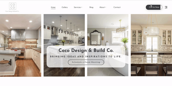
1. Architects & Interior Design

A Visual Showcase of Precision and Taste

Professional architects and interior designers use their website to create a strong portfolio which serves as their digital identity for showcasing their creative designs. It also conveys their style, design approach and refined aesthetic sense.

Strategy:

The website should have a minimalist design with white space to let visual content stand out and use high-resolution images and 3D renderings to dominate the homepage. Dynamic project galleries, virtual walkthroughs and before-and-after sliders function as strong tools to display work dynamically. The brand requires a “Meet the Designer” section together with studio profile integration to establish trust and create human connection. The content remains the primary focus but smooth transitions and animations create an elegant effect.

Interior design portfolio

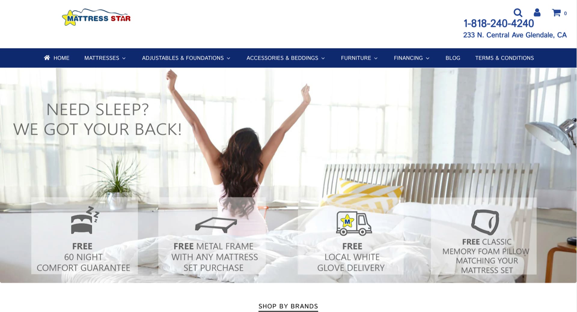
2. E-commerce businesses

Focus on Conversions and Seamless UX

The success of e-commerce websites depends on their simplicity combined with quick performance and trusted user experience. The design needs to organize products in a way that guides users directly to check out with few steps. The combination of filtering tools and AI-based search bars and visually appealing category pages creates a seamless user experience for finding products.

Users need mobile optimization for the website while product pages should feature user-generated content including reviews and ratings along with videos.

The website’s fast loading speed combined with clear action buttons (“Buy Now” and “Add to Cart”) and an efficient checkout process helps decrease cart abandonment rates. The addition of loyalty programs together with Wishlist and dynamic product recommendations enables better user engagement which drives increased sales.

3.  Events & Non-Profit

Emotional Connection and Clear CTAs

A website designed for events and non-profits must connect emotionally with visitors through its design yet guide them seamlessly toward taking action. Trust and emotional engagement in visitors depend on the combination of storytelling videos with testimonials and hero images and bold visuals.

Prominent call-to-action (“Get Involved”, “Donate Now”) should be placed above the fold. Event countdowns together with registration forms and donation modules should remain user-friendly while maintaining compatibility with mobile devices. The combination of transparent impact statistics with financial reports enhances donor trust and blogs with social media links work together to keep donors engaged.
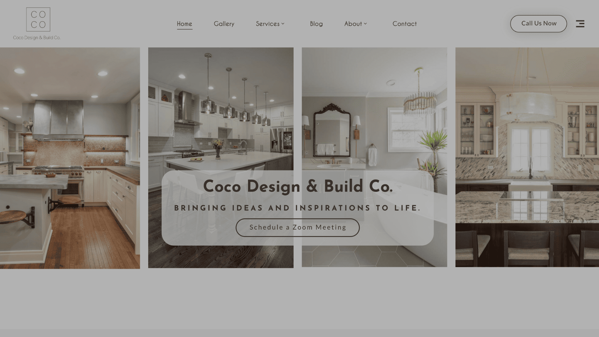
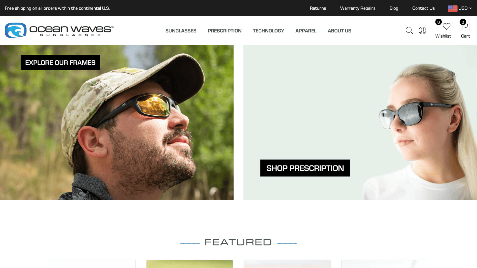
travel-website

4. Fashion & Retail

Design Meets Attitude

Fashion websites unite sophisticated visual design with operational features that allow customers to shop. The design needs to match the brand personality by being either simple, expressive or innovative.

Lookbooks along with parallax scrolling effects and stylized photography work together to create magazine-style storytelling on websites. The product page interface must display fabric information alongside size measurements with images that show lifestyle moments. Social commerce features such as Instagram feed integration and TikTok product video addition help brands targeting younger audiences enhance their user participation. A straightforward layout that allows the style and brand story to breathe is essential for visitor retention and converting visitors into buyers.

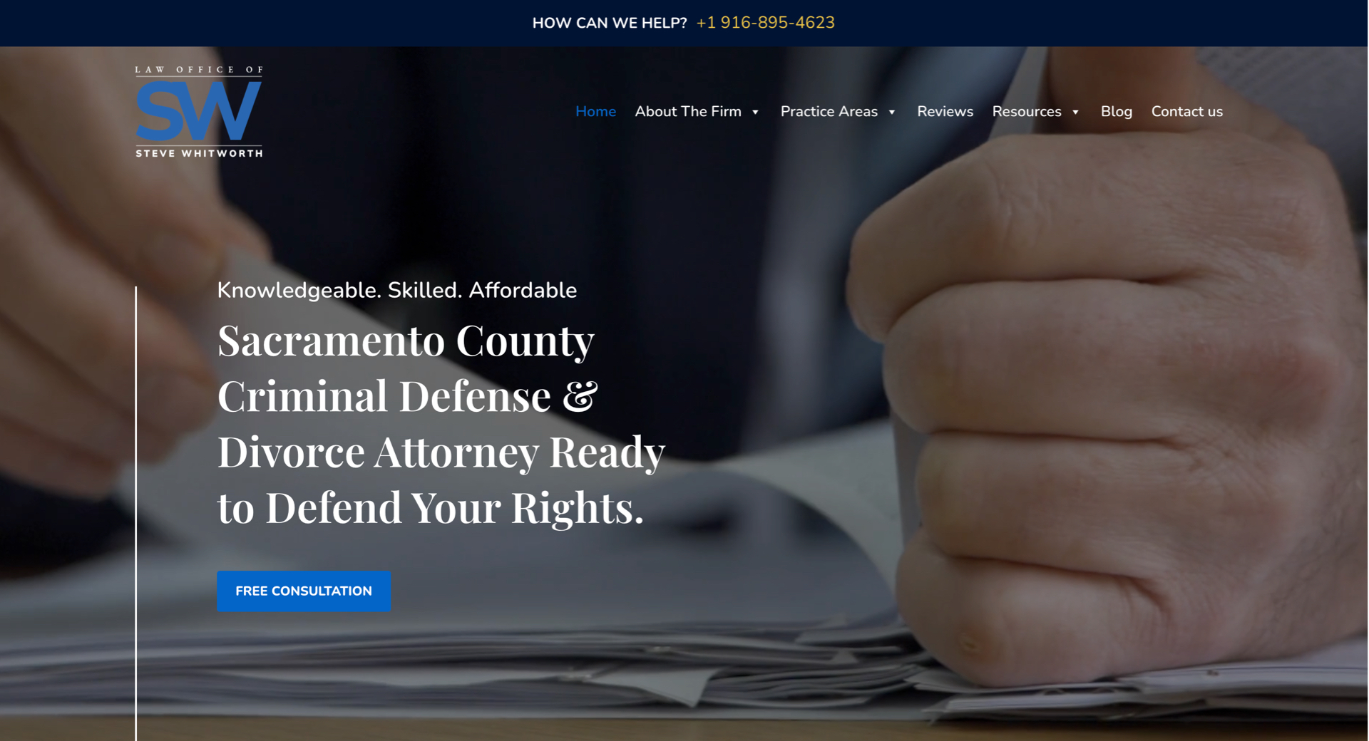
5. Finance & Law Firms

Build Trust Through Clarity and Authority

The websites serving financial and legal services need to establish trust alongside professional and expert qualities for their users. The website structure should emphasize straightforward lines together with traditional fonts alongside neutral color choices which include blue, gray and white tones.

The website structure should include service pages that allow users to locate specific legal or financial information through straightforward navigation. Attorneys or advisors should display complete detailed bios which demonstrate their credentials to establish trust and showcase their experience. The credibility of a website relies on testimonials as well as recognitions and client logos. Security-enhanced client interaction portals along with scheduling tools and document submission systems enable operational efficiency and better user experience.

law firm website

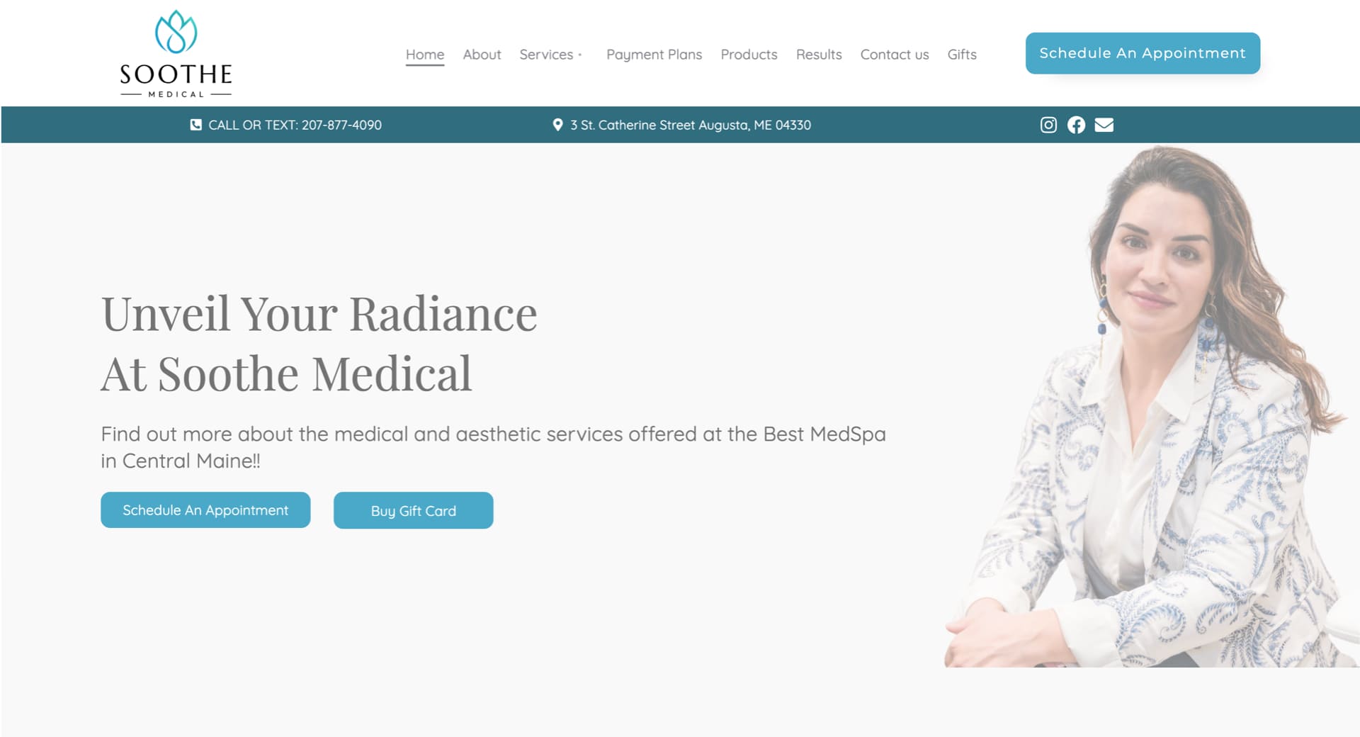
6. Health & Wellness

Calm, Accessible, and Reassuring

The design of websites serving this sector must establish an atmosphere which makes users feel comfortable and safe. The experience becomes soothing when using pastel tones or soft earth colors with organic shapes and plenty of whitespace in a calm inviting color palette.

The main focus of the website should be appointment booking systems together with wellness service listings and client testimonials. A wellness-focused blog section serves both search engine optimization and customer participation goals. Accessibility remains the highest priority in this sector because users need fonts that are easy to read and high contrast settings with navigation systems designed for all age demographics. The practice depends on practitioner bios along with affiliations and certifications to establish trust with patients.

7. Home Improvement

Demonstrating Skill and Reliability

A website for contractors and home improvement companies needs to display practical experience through visual content that builds trust with viewers.

Project galleries combined with time-lapse videos and before-and-after sections create stronger visual messages than textual content. The important pages must contain a straightforward quote request function alongside detailed service descriptions presented through icons or brief bullet points. The establishment of reviews together with licenses and warranty coverage and financial options creates confidence for clients. Local business leads can be captured through both geographic-specific SEO techniques and Google Maps integration. The website needs to demonstrate both expert technical abilities and pleasing visual aesthetics.
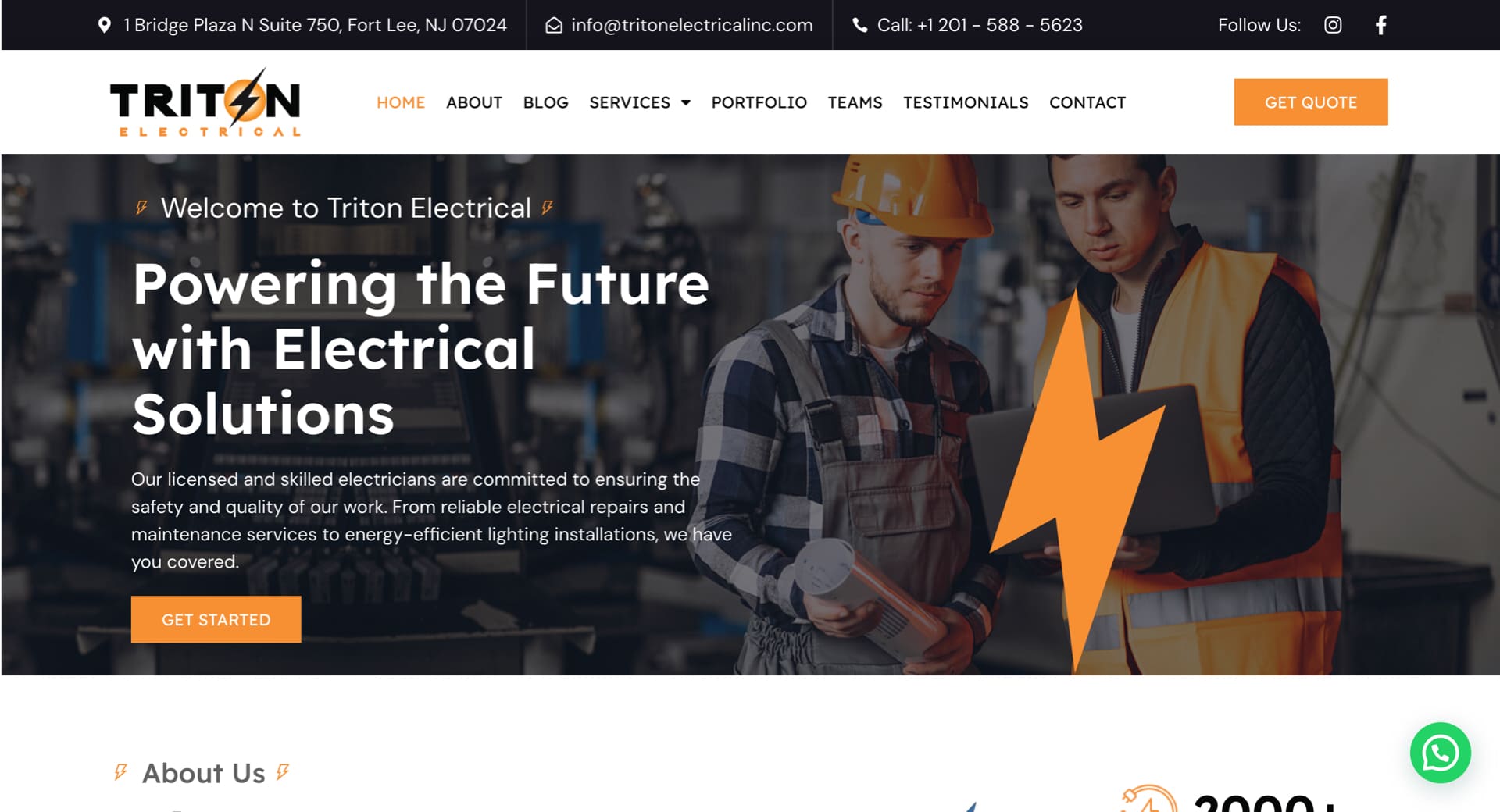
8. Industrial

Clean Structure for Complex Information

B2B clients who need immediate access to specific information use industrial websites. The site must achieve maximum clarity together with simple navigation. The design structure should include collapsible sections and tabs together with downloadable technical documents that include PDFs and spec sheets.

The logical organization of product or service categories often follows an industry or application structure. Users benefit from seeing machinery operations through video content and interactive diagram systems that demonstrate the offerings. The credibility of the company strengthens through both case study presentations and client reference listings. A formal tone must prevail throughout the website yet it needs to maintain a modern responsive design for all devices.

industrial website

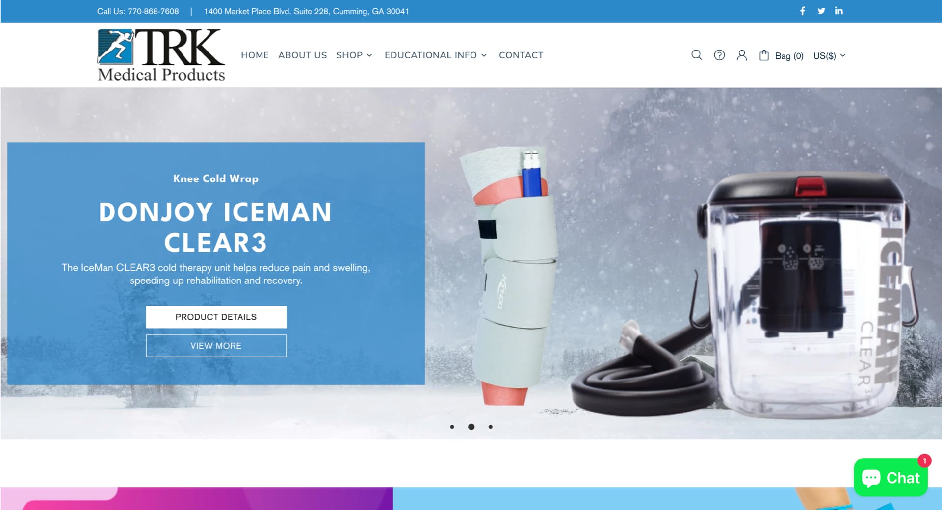
9. Medical Products & Services

Precision with Compliance

Medical websites need to follow rigorous rules to present both trustworthy content and efficient product performance. Medical websites achieve trustworthiness by using clean layouts with medical pictures together with trust indicators and official certifications like FDA or ISO.

Product pages need to provide full details about specifications and usage instructions with downloadable documentation. Lead capture benefits from three essential features which include live chat support together with contact forms and demo request functionality. All medical websites require HIPAA-compliant contact forms together with secure portals that serve both distributors and healthcare providers. The design should emphasize clarity above creativity while regulatory language needs to remain accurate.
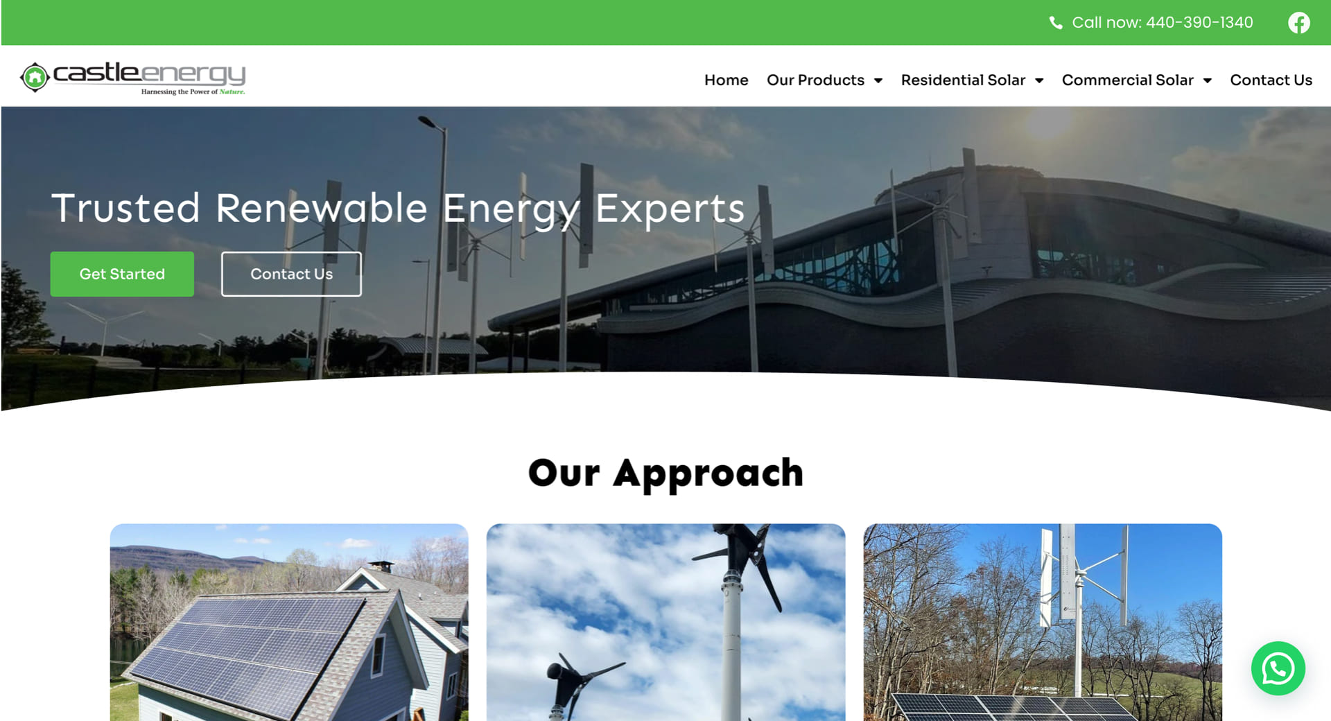
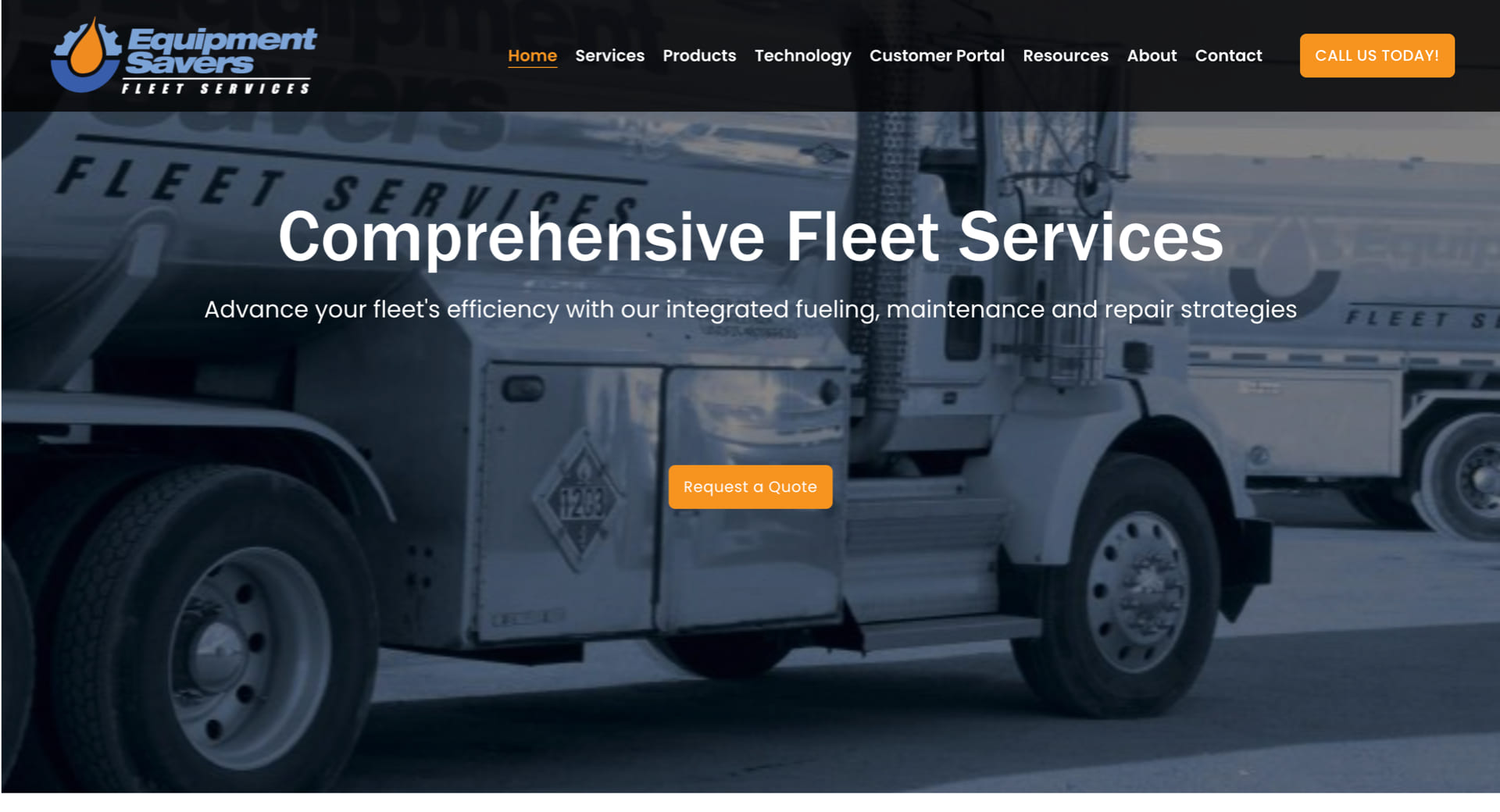
10. Oil and Gas

Enterprise-Grade Presence with Technical Focus

Websites serving oil and gas companies need to display their operational capabilities alongside their global presence. The design should emphasize strength and dependability, often with large background visuals of rigs, operations, or teams at work.

The website structure should incorporate sections that present service verticals together with safety standards and environmental initiatives and investor relations information. Technical animations together with process diagrams help stakeholders understand complex operational procedures. The website becomes more useful through interactive maps together with downloadable reports and career sections designed for engineers and field professionals. Companies with worldwide operations need a content management system which supports multiple languages.

oil and gas websites

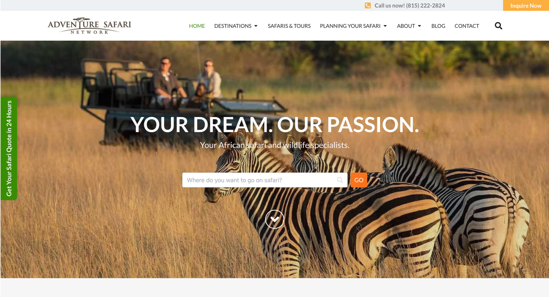
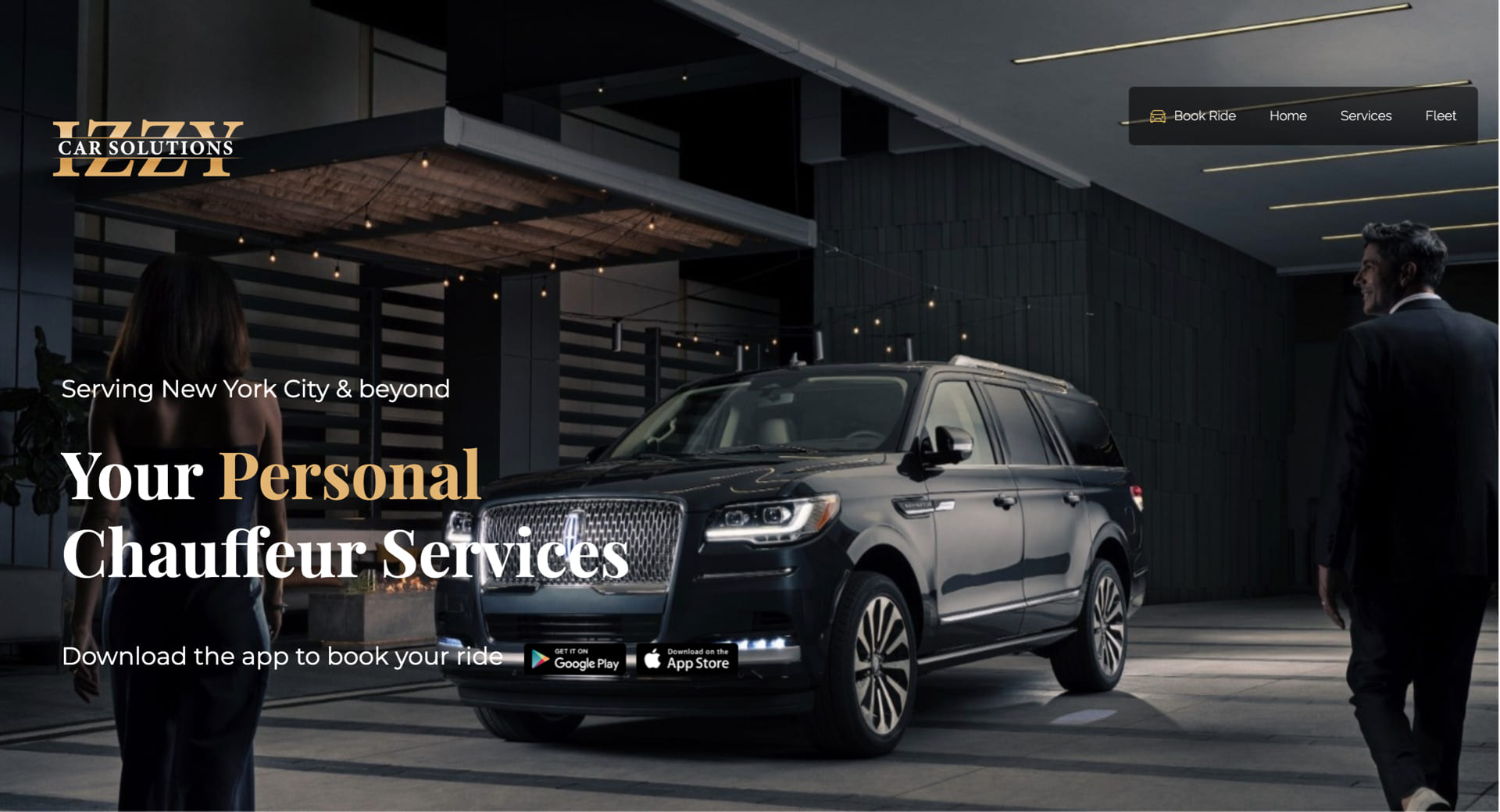
11. Transportation & Logistics

Speed, Scale, and Service Coverage

The core features of this industry include speed along with efficiency which need to be reflected throughout the website design. A website for this industry must deliver simple navigation with instant quote or shipment tracking capabilities and user-friendly contact options.

The website needs to include service area maps as well as industry certifications and fleet images to demonstrate operational scale to clients. Visual timelines and animated flows simplify the explanation of complicated supply chain services to users. Real-time client interactions become possible through the integration of client portals or CRM systems. The website needs to have fast loading speeds and be accessible on mobile devices since logistics managers and drivers need to access it during their movements.
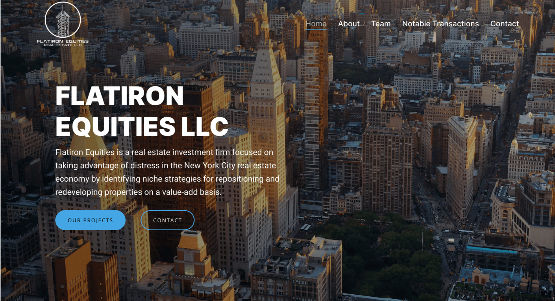
12. Real Estate

Driving Leads with Interactive Experiences

Real estate websites need to prioritize lead generation through interactive features that allow users to explore available listings.

A website requires a clean design which integrates MLS data and provides property filtering options through location and price and size criteria. The combination of high-quality photographs with virtual tours and video walkthroughs makes listings more engaging for users who spend more time on the site. The combination of map-based search tools with mortgage calculators and “Schedule a Tour” CTAs enhances user experience while generating more conversions. Agent profiles with client testimonials and neighborhood guides establishes trust and delivers additional value to both buyers and sellers. Commercial real estate websites should include specific sections for investment opportunities and downloadable brochures and leasing options to attract serious potential buyers.

real estate websites

Tailored Web Design Backed by Industry Expertise

Griffon Webstudios has developed and optimized websites for various industries that both look great and drive growth. We dedicate to grasp market-specific details to create websites with customized elements including layout and visuals, user journey and conversion funnels that target your audience.

Our team can deliver product-focused online stores to service-based platforms and brand presentation sites that establish trust. Curious how we bring ideas to life? Check out our website portfolio.

DESIGN TO CODE-1

Turning Stunning Web Design Into Flawless Code

Web development reaches its crucial stage when designers transfer their work to developers through the design handoff process. The phase marks the point where abstract concepts turn into concrete reality while transforming creative plans into functional user interactions. The transformation from design to development during this phase produces numerous obstacles that threaten to ruin carefully designed projects. This article examines the major challenges that developers face while presenting effective solutions to overcome them.

The Chasm Between Design and Development

A designer invests their time for multiple weeks to develop an aesthetically pleasing interface that perfectly represents brand values through pixel-perfect design. The development team receives this design from the designers with the understanding that they should produce code that perfectly matches the original design. The developers start analyzing the design files only to discover unclear specifications together with missing assets and ambiguous elements. The result? The final product drifts away from its initial design which produces negative reactions from designers and developers.

This failure to connect design with development occurs frequently throughout the industry instead of being an isolated exception.  The main cause stems from specification miscommunications and insufficient asset sharing and most importantly from poor designer-developer coordination.

Bridging the Communication Gap

Communication represents the fundamental hurdle which causes most handoff problems. Designers and developers share a single objective but maintain separate spaces where they use communication methods which share similarities but have separate linguistic patterns.

Consider the term “padding.” A designer views padding as design space surrounding elements for better visual appeal while a developer sees it as a specific CSS property requiring numerical input.  Such terms create confusion when they remain undefined between different stakeholders.


Strategies for Effective Communication:

  1. Early Collaboration: Developers should join the design process from its initial beginning. The developers’ expertise helps designers make decisions which both boost project feasibility and reduce development complexity. 
  1. Regular Check-ins: Both teams must participate in scheduled meetings that enable progress updates and concern resolution and necessary adjustments. This fosters a culture of continuous feedback and mutual understanding.
  1. Unified Terminology: Develop a shared glossary of terms and components. A designer referring to a “carousel” should have the developer visualize the exact same functionality.


Ambiguous design specifications create numerous risks during the development process.

A design that appears beautiful will fail to deliver its intended effect when designers fail to provide exact specifications. Design file ambiguities force developers to guess which design elements the designer intended leading to potential design discrepancies.

Consider a button featuring a gradient overlay. A developer implementing a flat color button instead of a gradient might disrupt both visual structure and user journey without proper design direction.


Mitigation Measures:

  1. Detailed Documentation: Each design component should include complete documentation that describes its dimensions as well as color codes and both font styles and interactive responses.
  1. Interactive Prototypes: Designers should use prototyping tools to generate interactive interfaces for developers. Developers receive an actual representation of user interactions together with transitions through this method.
  1. Design Systems: Organizations should use a centralized design component repository alongside guidelines for implementation. This central resource acts as the authoritative reference point that maintains uniformity throughout the entire system.


Asset Management: Ensuring Completeness

The process of delivering assets stands as a frequently disregarded step in the handover procedure. Development delays because of missing or incorrectly formatted assets may force designers to reduce design fidelity to ensure project completion.

An e-commerce platform depends heavily on product images which serve as its core feature. The user experience suffers when developers use placeholders or low-quality images instead of high-resolution alternatives because they lack sufficient image resources.


Best Practices for Asset Delivery:

  1. Organized Asset Libraries: Asset folders should be structured consistently through logical organization which includes separate sections for icons, images and logos and uses uniform naming conventions.
  1. Multiple Formats: Assets should exist in SVG, PNG and JPEG formats to accommodate multiple use scenarios and resolution requirements.
  1. Asset Checklists: Checklists should be implemented before the handoff to verify that no asset remains unaccounted for. The methodical approach helps prevent missed elements during this stage.


Embracing a Culture of Continuous Collaboration

The design handover needs to be recognized as an ongoing partnership rather than a single occurrence. After handing off projects, designers should stay involved to explain and modify designs according to developer feedback while addressing unexpected development issues.

Think of it as a relay race. The baton (design) is passed, but the runner (designer) doesn’t leave the track. The designer continues to follow the same track while monitoring the baton reaches its destination correctly.

Fostering Post-Handoff Synergy:

  • Open Channels: Establish communication tools which enable developers to ask questions easily and designers to answer them promptly.
  • Joint Testing Sessions: Both teams must conduct joint testing sessions to verify the implementation matches the design while addressing immediate alignment issues.
  • Feedback Loops: Following project completion the team should conduct retrospectives to evaluate successes and failures while identifying improvements for future handoff procedures.

Crafting Cohesive Digital Experiences

The transition between design and development demands more than technical expertise because it needs both empathy and understanding together with teamwork.

Our experience at Griffon Webstudios demonstrates that better designer-developer collaboration leads to improved project outcomes. The creation of exceptional websites requires teamwork because our process depends on open dialogue combined with clear specifications and shared ownership.

The Power and Impact of Generative AI in Website Development

The Power and Impact of Generative AI in Website Development

It may feel like technology is moving faster than ever, but once you get a decent grasp of how things are changing, you unlock incredible new opportunities for growth. One of the most significant advances in current years relates to using AI (artificial intelligence) in all forms of content creation and design applications.

AI has the power to uncover new worlds of integrating strategic SEO, crafting compelling copy for your ads or header text, or even adjusting the content in real-time in response to your customers. It all comes down to how you leverage this tech for optimal website development that will define future digital experiences.

When Digital Design Met Generative Brilliance

Every story starts somewhere. Ours began when a newcomer nudged the traditional boundaries of website development: generative AI. Think of it as the paintbrush that never runs out of paint.

Generative AI crafts from patterns and existing designs, fashioning something utterly new and breathtaking. It’s not merely about efficiency. This strange new innovation is more about the kind of creativity that only emerges when technology mirrors human intuition.

To put it simply, you use a tool to input text or “prompts,” and the generative AI spits back information and content based on your ideas. You can ask an AI to “write a book in the tone of Stephen King about a doll that never sleeps and tries to control the kids who own it” and get a great outline that rivals the horror writing master.

61% in Forbes Insights report use Al in web development processes.

How Generative AI Changes Web Development

It makes sense to see generative AI taking over web development. The rise in ecommerce businesses and the massive need for online interactivity for modern brands have shifted consumer interest to the digital world. Some of the more “in your face” changes happening to website development because of AI include:

1. Web Templates/Structure

Many websites are based on similar structures. This is no different than how most books and movies are based on a three-act story. With AI algorithms in place, you can get automated site design suggestions and branding advice that translate perfectly into modern websites and provide designers with an easy-to-follow list of tasks that streamlines operations for a quality final outcome.

2. Automated Content Creation

This is probably where generative AI is having the most impact. When you can ask an AI to spit out an entire month’s worth of social media posts or the content for a landing page with a strong sales funnel, you drastically reduce your website development time to market. You can train AI to write in any language with different parameters that you need to customize the final result.

3. UI/UX

Generative AI can be combined with user data to audit your layout, design, and content. This in-depth UX analysis offers specific insights from heatmaps to accessibility issues in the overall flow of your website. Instead of missing a few things here and there, you can rely on powerful artificial intelligence to fill in the missing gaps that lead to premium user experiences.

Challenges: The Double-Edged Sword of Innovation

Of course, every revolution comes with its shadows. There’s an art to ensuring generative AI doesn’t lead to a monochrome of designs, a homogenization of creativity. Furthermore, striking a balance between hyper-personalization and maintaining the sanctity of user privacy is crucial. The digital age’s dance is one of innovation and introspection.

One of the essential challenges is accurate data and reliable content originality. AI will sometimes “make up” facts and figures that must be checked, or you lose accuracy. There is also the argument that AI-generated copy lowers your Google rank. As long as you have a human element double-checking the work, you should experience incredible benefits from this new technology.

Wrapping it Up

The fusion of generative AI and website development is reminiscent of two dancers, effortlessly synchronized, moving to a rhythm that feels both familiar and avant-garde. It’s a partnership that promises a digital future that’s not just seen, but felt.

Whether you want to integrate keywords into your website content, rely on automated templates, or insert local references to bolster your page rank, generative AI is not going anywhere anytime soon. A good way to stand out is to work with a development team that compliments their creativity, originality, and workflow with AI, but doesn’t rely on it as the end all, be all of solutions.

At Griffon Webstudios, we don’t just create websites – we craft digital experiences. If quality, innovation, and memorable website design are what you seek, let’s embark on this journey together.

The Integration of AI and Machine Learning in Web Development

The Integration of AI and Machine Learning in Web Development

The world of web development is undergoing a groundbreaking transformation thanks to the integration of Artificial Intelligence (AI) and Machine Learning (ML) technologies. With over 100 million users harnessing the power of AI through ChatGPT, it’s evident that the potential of AI in web design and development is skyrocketing.

According to statistics, the AI industry is projected to exceed $15 trillion by 2030. Such a massive impact on our economy and the overall look and feel of the internet is going to shift how websites are designed and developed to engage target consumers.

The Impact of AI in Web Development

AI has streamlined web design processes, allowing designers to work smarter and faster. Automated layout and template generation have become a reality by utilizing AI algorithms. Web designers can now access AI-powered design recommendations, which provide valuable insights and suggestions, saving both time and effort.

14% increase in global GDP by 2030 is forecasted with the advancements of ML and AI. Source- WSJ

Another significant impact of AI in web development is improving user experience. With AI’s ability to analyze user data and behavior, websites can offer personalized content and recommendations. This level of customization enhances user engagement and boosts conversions and customer satisfaction. Intelligent 24/7 chatbots and virtual assistants powered by AI are now commonplace, providing instant and accurate responses to user queries and creating a seamless browsing experience.

Leveraging Machine Learning for Web Development

Machine Learning (ML) plays a pivotal role in the world of web development, enabling advanced data analysis and unlocking valuable insights. By utilizing predictive analytics, ML algorithms decode intricate user behavior patterns, providing businesses with a profound understanding.

Real-time data processing and insights allow organizations to make informed decisions, optimize user experiences, and curate bespoke content tailored to individual preferences.

62% of customers are willing to submit their data to AI for a better business and user experience.

Moreover, AI-driven advancements are revolutionizing the landscape of search engine optimization (SEO). Using sophisticated machine learning algorithms, AI empowers search engines to comprehend user queries with greater precision, delivering highly relevant search results.

The tangible outcome of this optimization effort is heightened website visibility and enhanced organic search rankings. In addition, AI streamlines the SEO optimization process, enabling web developers to allocate their time and attention to other critical facets of website development.

AI-Driven Web Development Tools and Frameworks

Content Management Systems (CMS) are a prime example of AI-driven web development tools. These systems utilize AI to facilitate content creation, management, and dynamic adaptation based on user preferences. AI-powered CMS streamlines workflows, enhances content creation, and provides a personalized user experience, all while optimizing efficiency.

Automated testing and debugging are essential aspects of web development, and AI-driven tools are game-changers in this field. AI algorithms can identify errors and bugs, significantly reducing the time and effort required for testing and quality assurance. This ensures that websites are launched faster and with minimal issues, resulting in improved user satisfaction.

Future Possibilities and Challenges

As the frontiers of AI and ML continue to expand, the realm of web development teams with boundless possibilities lies ahead. The deployment of deep learning and neural networks is poised to assume a pivotal role, endowing websites with intelligent and adaptable functionalities. Moreover, integrating Internet of Things (IoT) devices will give rise to a seamlessly connected ecosystem, where websites effortlessly interact with smart devices.

The fusion of AI and Machine Learning has ignited a transformation in web development, empowering the creative vision of designers and developers to forge websites that are not only more efficient but also tailored to the unique needs of each user.

By harnessing the immense potential that AI and ML offer, web developers gain access to a gateway of untapped opportunities, enabling them to elevate user experiences and perpetually propel themselves to the vanguard of technological advancements.

How to Design a Website That Converts Visitors into Customers

How to Design a Website That Converts Visitors into Customers

Your website is one of your most powerful marketing tools. It’s a 24/7 salesperson that works tirelessly to promote your business and generate leads. But what good is a website if it doesn’t convert those visitors into customers? If you’re not seeing the results you want, it might be time for a redesign. Keep reading for our guide on how to design a website that converts visitors into customers.

The Anatomy of a High-Converting Website

A high-converting website has several key components. First, it must have a clear value proposition that tells visitors what you do and why they should care. Second, it needs to have a strong call to action (CTA) that encourages visitors to take the next step, whether that’s signing up for your email list or scheduling a consultation. Finally, your website must be mobile-friendly so that people can access it no matter where they are or what device they’re using.

If your website is missing any of these elements, don’t worry—there’s still time to make changes. Read on for specific tips on how to add them to your site.

Include a Clear Value Proposition

Your value proposition is the first thing people will see when they land on your website, so it’s important to make a good impression. A strong value proposition should be clear, concise, and easy to understand. It should also explain what you do and why someone should care.

For example, if you’re an interior designer, your value proposition might be “Create beautiful, functional, and personalized spaces.”

If you’re not sure how to craft an effective value proposition, start by brainstorming all the ways your product or service can help solve someone’s problem. Once you have a list of potential benefits, narrow it down to the one or two that are most important and relevant to your target audience. From there, you can start crafting your value proposition using the following template:


[Insert Your Business Name] + [What You Do] + [Who You Help] = [The Transformation They Can Expect].


For example, Griffon Webstudios + SEO Services + Businesses Looking to Increase Their Online Visibility = More Traffic and More Customers.


Use Power Words in Your CTA

Your CTA is what tells visitors what you want them to do next—sign up for your email list, download your e-book, etc.—so it’s important to make it as effective as possible. One way to do this is by using power words in your CTA that elicit an emotional response from readers and encourage them to take action. For example, words like “join,” “save,” “discover,” and “learn” are all great options. You can also use phrases like “get started now” or “find out more” to nudge people in the right direction. Just make sure your CTA is clear and easy to understand so that people know exactly what they need to do next.

Make Your Website Mobile-Friendly

More than half of all web traffic now comes from mobile devices like smartphones and tablets, so it’s essential that your website is designed with mobile users in mind. Mobile-friendly websites are easy to navigate on small screens and load quickly—two things that are important for keeping people engaged with your site. If you’re not sure if your website is mobile-friendly, you can use Google’s free Mobile-Friendly Test Tool.

Simply enter your URL and Google will let you know if there are any issues with your site’s design or functionality on mobile devices. You can then make changes as needed so that everyone who visits your site has a positive experience, no matter what device they’re using.

By following these tips, you can design a website that is more likely to convert visitors into customers.