A website design is often the first impression that a company has with potential customers. It’s what they see, and decide whether or not to continue browsing the site. That’s why it’s important for your branding elements of a website design to stand out. You don’t want people ‘walking away’ the moment they see your homepage! Here are five branding elements that make up effective web designs:
Logo
One of the most important elements of a website design is the logo. This element is often the first thing seen by visitors, and it needs to be clear, memorable, and unique. The logo should represent your company in a way that captures what you have to offer from an industry standpoint as well as from a personality perspective.
When building a logo, it’s important to consider how it looks in both black and white. This will help you make sure that the logo is still effective when printed on a brochure or other collateral materials before investing too much time into designing.
Below are some tips for designing an effective logo for your site:
- Use a timeless font style.
- Include brand colors in the logo to make it recognizable and memorable.
- Consider how your logo will look on business cards, brochures, and other marketing materials before designing for the web.
- Make sure your company name is included prominently so that people can find out who you are if they don’t want to explore any further into your site after viewing the homepage design.
Images
Images should be used sparingly when building a website design but can offer an effective way of adding personality or depth to a page with minimal effort from visitors’ perspectives. Ideally, images should support rather than distract from content on pages; however, depending on what kind of information you’re posting, images can be very beneficial for conveying certain messages. The image from a video of this website clearly tells that what it offers and how people can benefit from “selling my used laptops”.
When placing images on your site’s pages, make sure they don’t detract from the content or take up too much space in relation to an article’s primary headline and text. There is a wide range of options when it comes to what kind of image you decide to use — whether that be stock photos purchased through sites like Getty Images, downloading them from loyalty-free sites like Pixabay, or taking pictures with your smartphone camera and editing them before uploading them.
If designing for one specific page where lots of visual information will appear (such as a landing page), then investing time into finding attractive imagery may be worth your while; however, if you are using only one photo per post, then buying inexpensive stock photography would probably be sufficient.
Typography
A website design should be easy to read and navigate, so it’s important that the typography is well considered. There are a variety of factors to keep in mind when considering font styles for your site — including whether mobile responsiveness — which is today an integral ranking factor.
Typography can also play into how professional your brand looks. If you want customers to feel like they’re getting value for their money without even signing up to your site, consider using serif fonts (which look more traditional) instead of sans-serif ones (which tend to be associated with tech companies). Below are some tips for designing effective typography:
- Pick one typeface and stick with it throughout your site as much as possible. -Consider what kind of message you want to communicate with your typestyle, and then choose a font accordingly.
- Limit the number of fonts on each page to two or three at most.
- Make sure that every word is spelled correctly – nothing will kill an otherwise well-designed site quicker than a poorly written copy!
Layout Elements
A layout consists of all of the elements used in designing how content appears on a website, like photos, graphics, text boxes, videos — anything visual really. There are four main types: grid layouts; mosaic layouts; overlapping layouts; and photo collages (or card decks). Grid layouts use columns for organizing information evenly across widths while mosaics organize imagery by size and have more variety in their arrangement patterns.
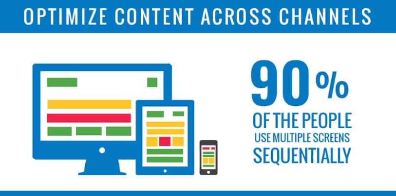
Overlapping layouts are similar to mosaics in that they’re organized by size, but the elements overlap each other rather than being stacked neatly one on top of another. Photo collages consist of an arrangement of photos or videos that is often more eye-catching and creative in order to represent a certain theme.
Layout plays into how professional your brand looks. Therefore, make sure you present it in the best way possible.
Colors
Of course, the colors used on your website are important to consider. If your business already has established color schemes, then it would be wise to maintain those when designing your site so as not to confuse your customers and make them think they’re visiting an entirely different company’s page. Otherwise, try out various combinations of complimentary shades in order to create a sense of cohesiveness throughout all parts of the design process – from text boxes down to images.
Author Bio
Jessica Thomas hails from a small town in Texas. She has a degree in Psychology but pursues her passion for writing. When not writing she likes to spend her time cooking and travel the world.

