
A busy website that doesn’t convert isn’t a marketing win — it’s an expensive billboard. The problem is almost never the amount of traffic. It’s the gap between arriving and acting.
There’s a particular kind of frustration that shows up once a firm finally gets its marketing working. The analytics look healthy. Visitor numbers are climbing. The SEO is paying off, the ads are running, and the content is landing. And yet the one number that pays the bills — qualified inquiries — barely moves.
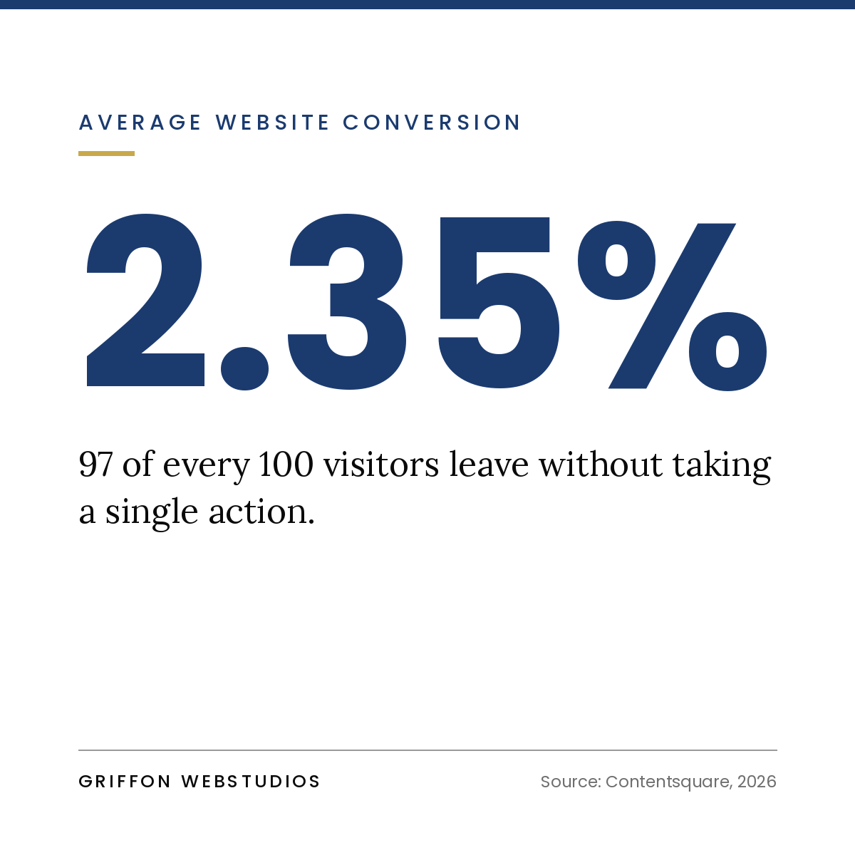
It’s a confusing place to be, because every instinct says get more traffic. So firms spend more on ads and publish more content, pouring water into a bucket without noticing the hole in the bottom. More traffic to a site that doesn’t convert just means a more expensive way to lose the same percentage of visitors.
The uncomfortable truth is that traffic is a vanity metric. The real question was never “how many people came?” It’s “how many people did we give a clear, compelling reason to act?” That’s a design and strategy problem, not a volume problem — and it’s almost always fixable.
The conversion gap, diagnosed
When a site gets visitors but no leads, the cause is usually one or more of seven specific failures. Read these as a diagnostic checklist for your own site.
1. A visitor can’t tell what you do or who it’s for in five seconds
When someone lands on your homepage, they make a snap judgment: Is this for me? Do these people solve my problem? If your headline is a clever tagline, a vague mission statement, or a wall of “we’re passionate about excellence,” the answer defaults to no, and they leave.
Premium clarity beats clever every time. The strongest service-firm headlines say plainly who you help and what outcome you deliver. The visitor should feel recognized — “this is exactly my situation” — within seconds, before they’ve consciously decided to keep reading.
2. There’s no obvious next step
Many sites are beautifully designed and completely directionless. A visitor finishes reading, feels mildly interested, and then… finds nothing compelling to pull them forward. No clear call to action, or a timid one buried in the footer, or five competing buttons that each point somewhere different.
A high-converting page is built around one primary action, repeated at natural decision points as the visitor scrolls. When everything is a call to action, nothing is. Decide what you most want a visitor to do, and make that path impossible to miss.
3. You’re asking for too much, too soon
A “Request a Quote” form with eleven fields is a wall, not a door. You’re asking a stranger who’s known you for ninety seconds to commit time, share detailed information, and brace for a sales pitch, all at once. Most won’t.
Friction is the silent killer of conversion. Every extra field, every unnecessary step, every moment of “wait, what happens after I click this?” sheds a percentage of people who were genuinely interested. Ask for the minimum you need to start a conversation, and make the commitment feel small.
4. There’s nothing to make a stranger trust you
Service firms sell something invisible: expertise and judgment a prospect can’t inspect before they buy. That makes trust the entire game, and trust has to be built on the page, fast.
Sites that convert show proof rather than just claim it: real results and outcomes, client names and logos, specific testimonials that name a situation rather than gush vaguely, credentials, and the faces of the actual humans a prospect would work with. A site with no proof asks visitors to take a leap of faith, and most people don’t leap.
5. You’re attracting the wrong visitors
Sometimes the traffic genuinely is the problem, not the amount, but the fit. If your content and ads pull in people browsing for free advice, students, or buyers far outside your price range, no amount of conversion polish will turn them into clients, because they were never prospects.
This is where measurement and conversion connect. If you can’t tell which channels bring your best clients versus your most clicks, you may be optimizing your whole site for the wrong audience. (We dig into this in Marketing Attribution After Cookies.)
6. The experience is slow, clunky, or broken on mobile
A site that loads slowly, jumps around as it renders, or falls apart on a phone bleeds conversions before a visitor reads a word. The majority of your traffic is likely on mobile (take a mobile friendly test), and patience there is measured in seconds. Every second of delay and every awkward tap-target is a quiet exit.
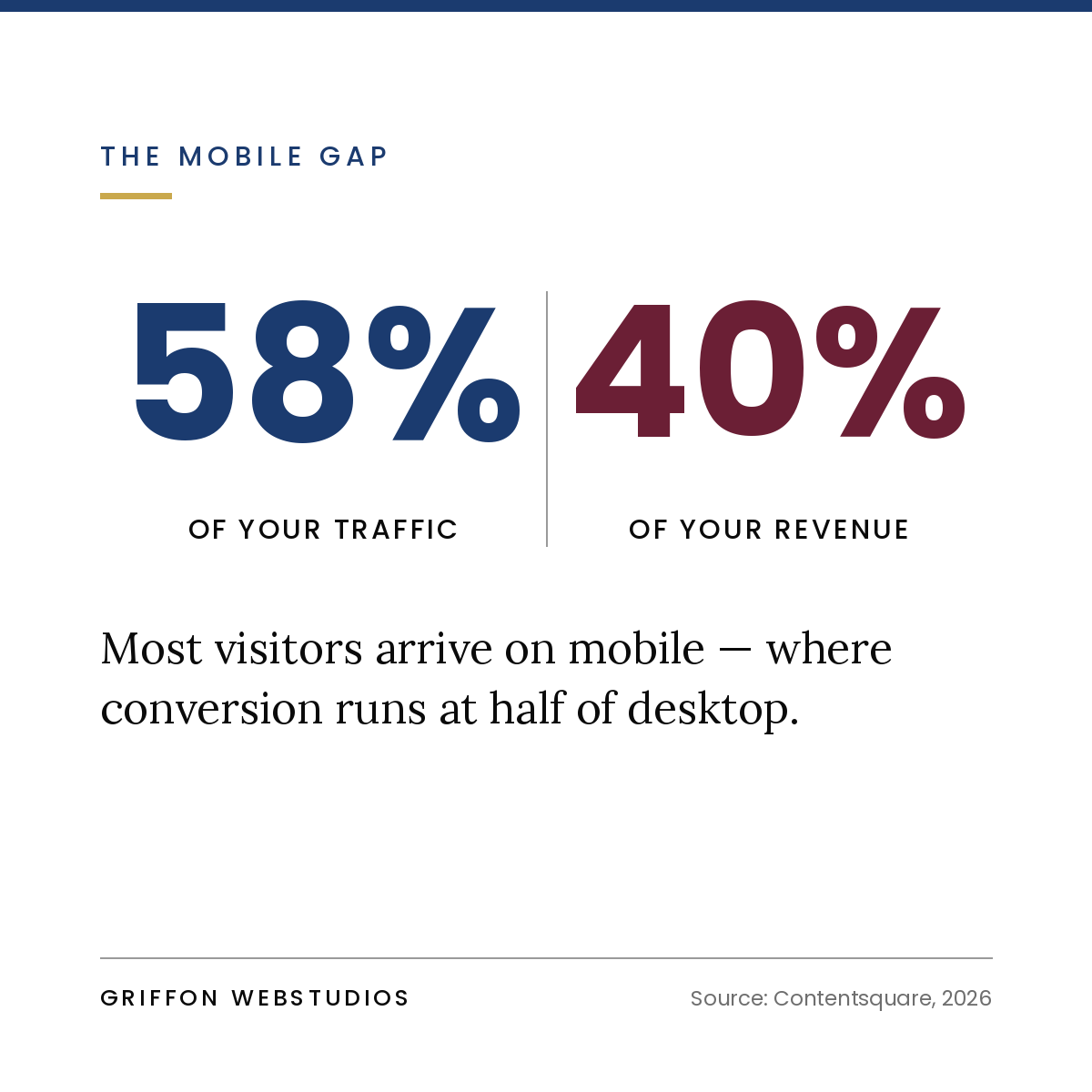
Performance isn’t a technical nicety, it’s a revenue input. A premium brand undermined by a sluggish, fiddly experience reads as careless, and carelessness is the opposite of what a service buyer is looking for.
7. There’s no path for the visitor who isn’t ready yet
Most visitors aren’t ready to book a call on their first visit. If your only call to action is “Contact Us” or “Get Started,” everyone who’s interested but not yet has exactly one option: leave and probably never return.
High-converting sites give the not-ready visitor a lower-commitment way to stay in your orbit, a useful guide, an assessment, a checklist, or a short email series in exchange for an email. You convert a fraction of cold visitors into known leads you can nurture, instead of losing 100% of them to the back button.
The real fix: conversion architecture, not decoration
Notice that almost none of those problems are about how the site looks. They’re about how it’s built to move someone — from arrival to recognition to trust to a small first commitment to a conversation.
That’s conversion architecture: designing the journey rather than decorating the pages. It treats every section as a step with a job to do — earn attention, build trust, handle an objection, reduce friction, prompt action — and arranges them in the order a real human actually makes a decision. Aesthetics still matter enormously, especially for a premium brand, but beautiful and persuasive are different skills, and a site needs both. A gorgeous site that doesn’t convert is a portfolio piece, not a business asset.
How to diagnose your own site this week
You can pressure-test your site without any tools:
- The five-second test. Show your homepage to someone unfamiliar with your business for five seconds, then ask what you do and who you help. If they can’t answer, your headline is the first problem.
- The squint test. Blur your eyes on each key page. Can you still spot the primary call to action? If it doesn’t stand out when blurred, it doesn’t stand out to a scanning visitor either.
- The friction count. Open your main inquiry form and count the fields and steps. Then ask which of those you truly need to start a conversation. Cut the rest.
- The proof audit. On your most important pages, count the concrete trust signals — real results, named testimonials, logos, faces. If it’s thin, that’s where hesitation is winning.
- The phone check. Go through your entire conversion path on your own phone, on a normal connection. Every moment that annoys you annoys your prospects even more.
Our Recommendation
If your website gets traffic but no leads, resist the urge to buy more traffic. You’d just be paying more to lose the same people at the same leak. The leverage lies in the conversion gap — the distance between a visitor arriving and a visitor acting — and closing it is a matter of clarity, trust, friction, and a deliberately designed path.
Get that right, and the traffic you already have starts producing leads it never did before. That’s not a bigger marketing budget. That’s the same budget finally doing its job.
At Griffon Webstudios, we design websites as conversion systems, not just beautiful pages — built around the journey from first visit to qualified inquiry. If your site is busy but quiet, let’s find the leak and fix it.