Your website is one of your most powerful marketing tools. It’s a 24/7 salesperson that works tirelessly to promote your business and generate leads. But what good is a website if it doesn’t convert those visitors into customers? If you’re not seeing the results you want, it might be time for a redesign. Keep reading for our guide on how to design a website that converts visitors into customers.
The Anatomy of a High-Converting Website
A high-converting website has several key components. First, it must have a clear value proposition that tells visitors what you do and why they should care. Second, it needs to have a strong call to action (CTA) that encourages visitors to take the next step, whether that’s signing up for your email list or scheduling a consultation. Finally, your website must be mobile-friendly so that people can access it no matter where they are or what device they’re using.
If your website is missing any of these elements, don’t worry—there’s still time to make changes. Read on for specific tips on how to add them to your site.
Include a Clear Value Proposition
Your value proposition is the first thing people will see when they land on your website, so it’s important to make a good impression. A strong value proposition should be clear, concise, and easy to understand. It should also explain what you do and why someone should care.
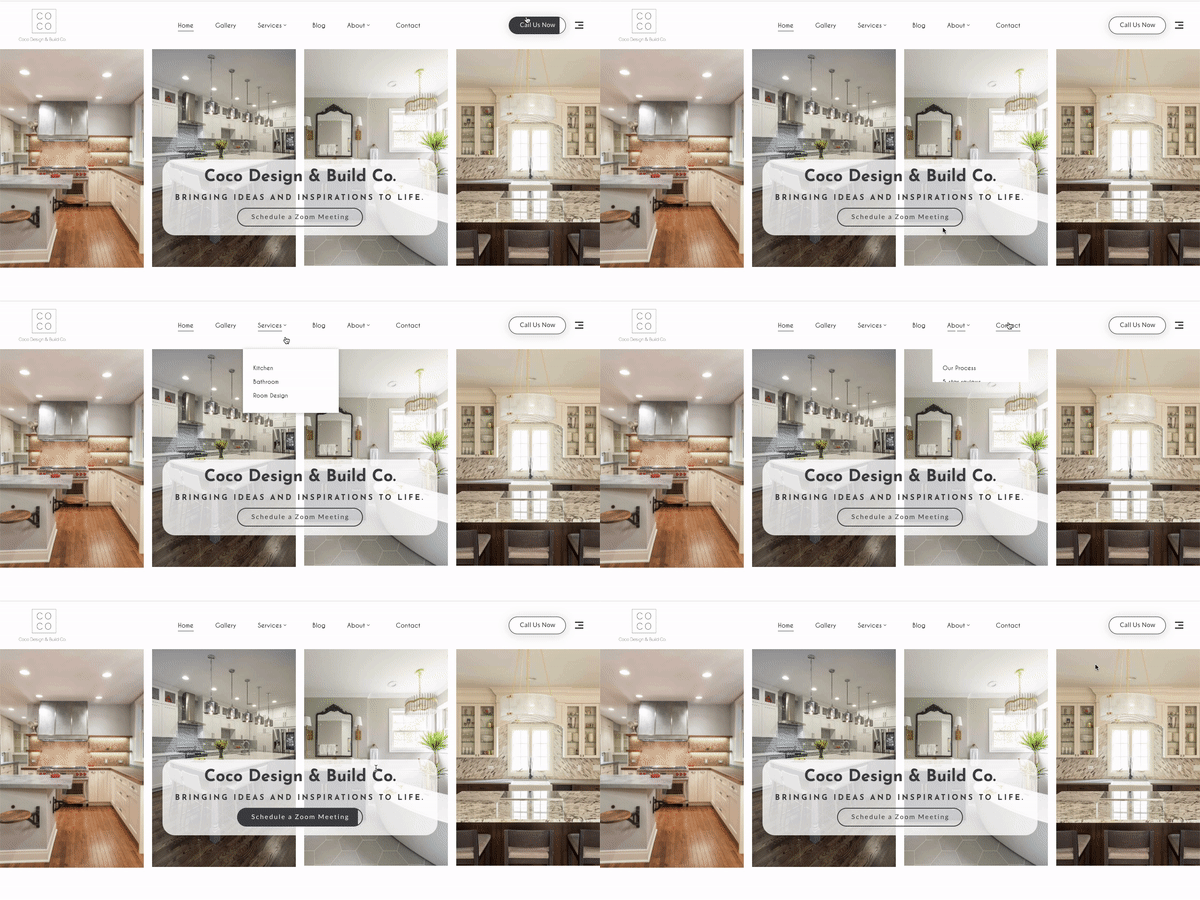
For example, if you’re an interior designer, your value proposition might be “Create beautiful, functional, and personalized spaces.”
If you’re not sure how to craft an effective value proposition, start by brainstorming all the ways your product or service can help solve someone’s problem. Once you have a list of potential benefits, narrow it down to the one or two that are most important and relevant to your target audience. From there, you can start crafting your value proposition using the following template:
[Insert Your Business Name] + [What You Do] + [Who You Help] = [The Transformation They Can Expect].
For example, Griffon Webstudios + SEO Services + Businesses Looking to Increase Their Online Visibility = More Traffic and More Customers.
Use Power Words in Your CTA
Your CTA is what tells visitors what you want them to do next—sign up for your email list, download your e-book, etc.—so it’s important to make it as effective as possible. One way to do this is by using power words in your CTA that elicit an emotional response from readers and encourage them to take action. For example, words like “join,” “save,” “discover,” and “learn” are all great options. You can also use phrases like “get started now” or “find out more” to nudge people in the right direction. Just make sure your CTA is clear and easy to understand so that people know exactly what they need to do next.
Make Your Website Mobile-Friendly
More than half of all web traffic now comes from mobile devices like smartphones and tablets, so it’s essential that your website is designed with mobile users in mind. Mobile-friendly websites are easy to navigate on small screens and load quickly—two things that are important for keeping people engaged with your site. If you’re not sure if your website is mobile-friendly, you can use Google’s free Mobile-Friendly Test Tool.
Simply enter your URL and Google will let you know if there are any issues with your site’s design or functionality on mobile devices. You can then make changes as needed so that everyone who visits your site has a positive experience, no matter what device they’re using.
By following these tips, you can design a website that is more likely to convert visitors into customers.


