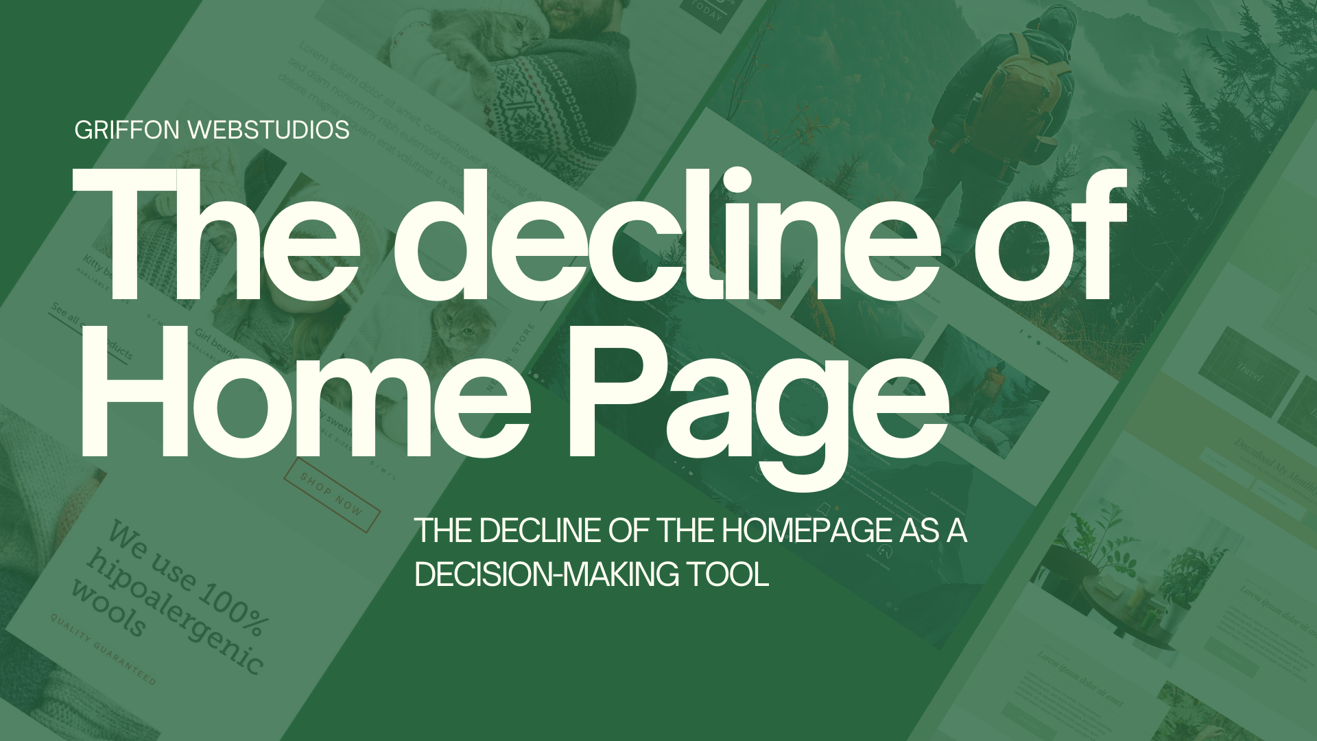
For a long time, the homepage was seen as the most important part of a website. It was where visitors landed first, got a sense of the brand, and decided what to do next.
The original belief, once valid, is slowly fading. These days, a lot of people never even see the homepage. And when they do, it usually doesn’t do what businesses expect. Most people don’t start on the homepage anymore. Traffic comes in from all over, not just through the front door.
People land on:
- product pages
- service pages
- blog articles
- comparison pages
- links shared in messages, search results, or AI summaries
People get to deeper parts of a site through search, social media, ads, or AI-driven links. The homepage is often skipped entirely. If you design only your homepage as the main place for decisions, you’re building for a path most people don’t take.
Decisions before loading
Even if someone does land on the homepage, they’ve usually started making decisions before they get there. By the time someone arrives, they often already know:
- what problem they’re trying to solve
- what type of solution they want
- how much effort they’re willing to invest
- whether they’re generally interested or just validating
The homepage is no longer the place where curiosity begins. It’s where expectations are either confirmed or challenged.
Homepages are still important
This doesn’t mean the homepage isn’t important. Its role has changed. Now, people judge homepages on just a few key things instead of expecting them to explain everything.
- clarity in seconds, not minutes
- whether they match what the visitor already believes
- how fast they show if the site is relevant or not
Users don’t read homepages word-for-word. They scan for quick confirmation. If they don’t find what they need right away, they leave before exploring further. The homepage now acts more as a place to verify information than as a starting point for exploring the site.
The “everything page” approach no longer works
Many homepages try to be all things at once:
- brand story
- service overview
- credibility builder
- navigation hub
- conversion driver
The result is often a cluttered homepage, which makes it hard for users to find what they need.
A homepage that tries to show everything at once usually fails to present any information clearly. Today’s users don’t want a full introduction to the business. They want to quickly see if the site matches their needs.
Internal priorities often shape homepage
Organizations often miss out on their homepage’s potential by making choices that reduce its effectiveness. Different teams want different things featured:
- Leadership wants brand story
- Sales wants offers
- Marketing wants campaigns
- Design wants creativity
The homepage often becomes a place for internal debates, instead of focusing on what users need. But users don’t care about internal structure. They care about answers.
When internal priorities take over, the homepage stops being useful to visitors. People leave.
Decision-making has moved downstream
Decisions now happen across many different touchpoints, not just on the homepage.
- AI summaries
- search result snippets
- review platforms
- social proof
- specific landing pages
The homepage is usually just one stop along the way, not the starting point.
Homepage first impressions are formed in just 50 milliseconds, with 94% of that perception driven by design.
Their job has shifted to:
- a trust validator
- a clarity filter
- a brand consistency check
People are more likely to convert on pages built for their specific needs, not on general introduction pages.
What this means for website strategy
The point isn’t to ignore your homepage. Just don’t overdo it.
- Each core page on your site should work on its own.
- Your messaging should show up across all pages, not just the homepage.
- Homepage content should match what users have already seen or learned elsewhere.
The homepage doesn’t have to do everything anymore. Every page can be an entry point.
The quiet shift many businesses are missing
Many teams still aren’t sure what will actually improve homepage performance. A better question is: “What role should the homepage actually play now?”
Griffon Webstudios sees this shift frequently in website redesigns and UX reviews. Businesses get better results when they focus less on the homepage and more on the real places users land and act. A site’s performance depends more on its overall structure than on the homepage alone.
The homepage hasn’t disappeared. It’s just been demoted.
Don’t treat the homepage as the only decision point. Make sure each key page can stand on its own. Keep your messaging consistent across the site so it aligns with what people have already seen elsewhere. Use the homepage to provide clarity and build trust, not to explain everything.