redesign-website

How to Redesign Your Website Without Destroying Your SEO

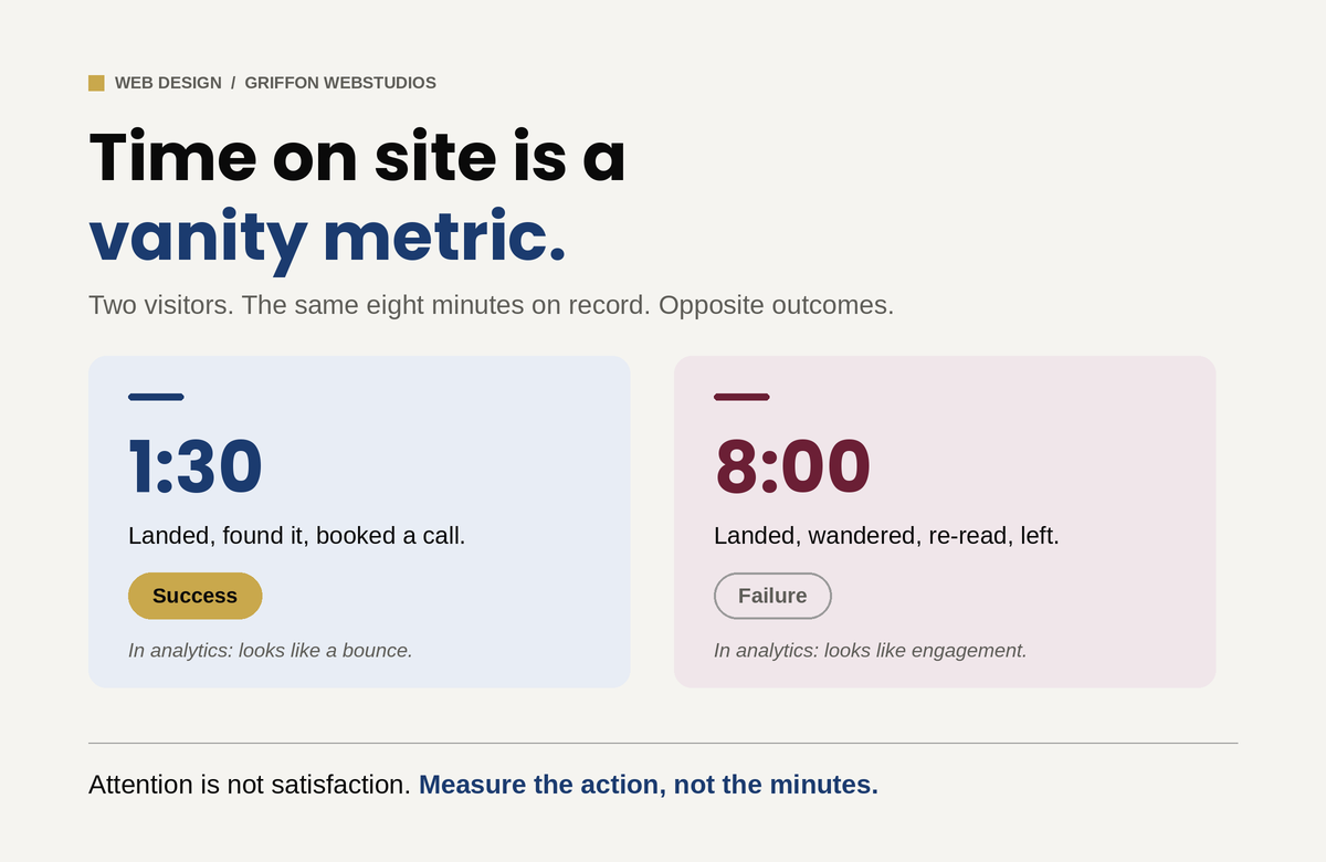
A redesign is the most common way a business quietly wrecks its own search traffic. The damage is almost always preventable, and it comes down to what you preserve, not what you change.

The new site launches. Everyone admires the cleaner look. Six weeks later organic traffic has fallen off a cliff, the leads have thinned out, and nobody connects the two events, because the redesign was a triumph and this is just some unrelated slump. It is not unrelated. A redesign is the single most common way a healthy website destroys its own search performance, and it happens for a simple reason: a redesign gets treated as a visual project when it is also, invisibly, a technical SEO project.

The site ends up looking better and ranking worse. (If your traffic has already dropped after a relaunch, diagnosing exactly what broke is a separate and solvable problem. This article is about not getting there in the first place.)

The good news is that almost none of this damage is necessary. Prevention is straightforward, and it is far cheaper than recovery. Here is how redesigns kill rankings, and how to keep yours intact.

Why a redesign quietly kills rankings

The root cause is rarely technical. It is organizational. The people designing the new site and the person responsible for its search performance usually never talk. The designers optimize for how the site looks and feels, which is their job. Nobody is assigned to protect what already ranks. So the things that carry your search equity, your URLs, your content, your internal links, and a stack of technical signals, get changed or discarded as a side effect of making the site prettier. The client finds out when the traffic craters, by which point the cause is weeks old and hard to trace.

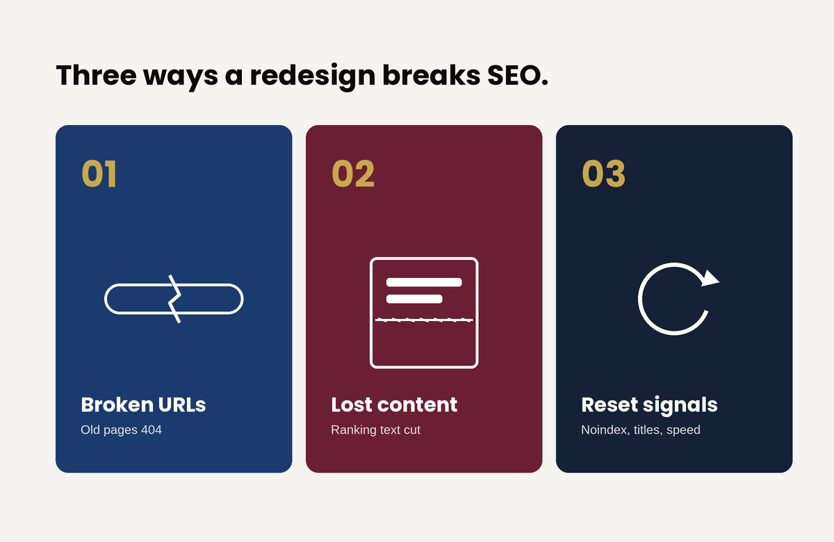
That single gap produces three failure modes. Each is common, each is preventable, and each stays invisible until it gets expensive.

Failure one: the URLs change and nobody maps the redirects

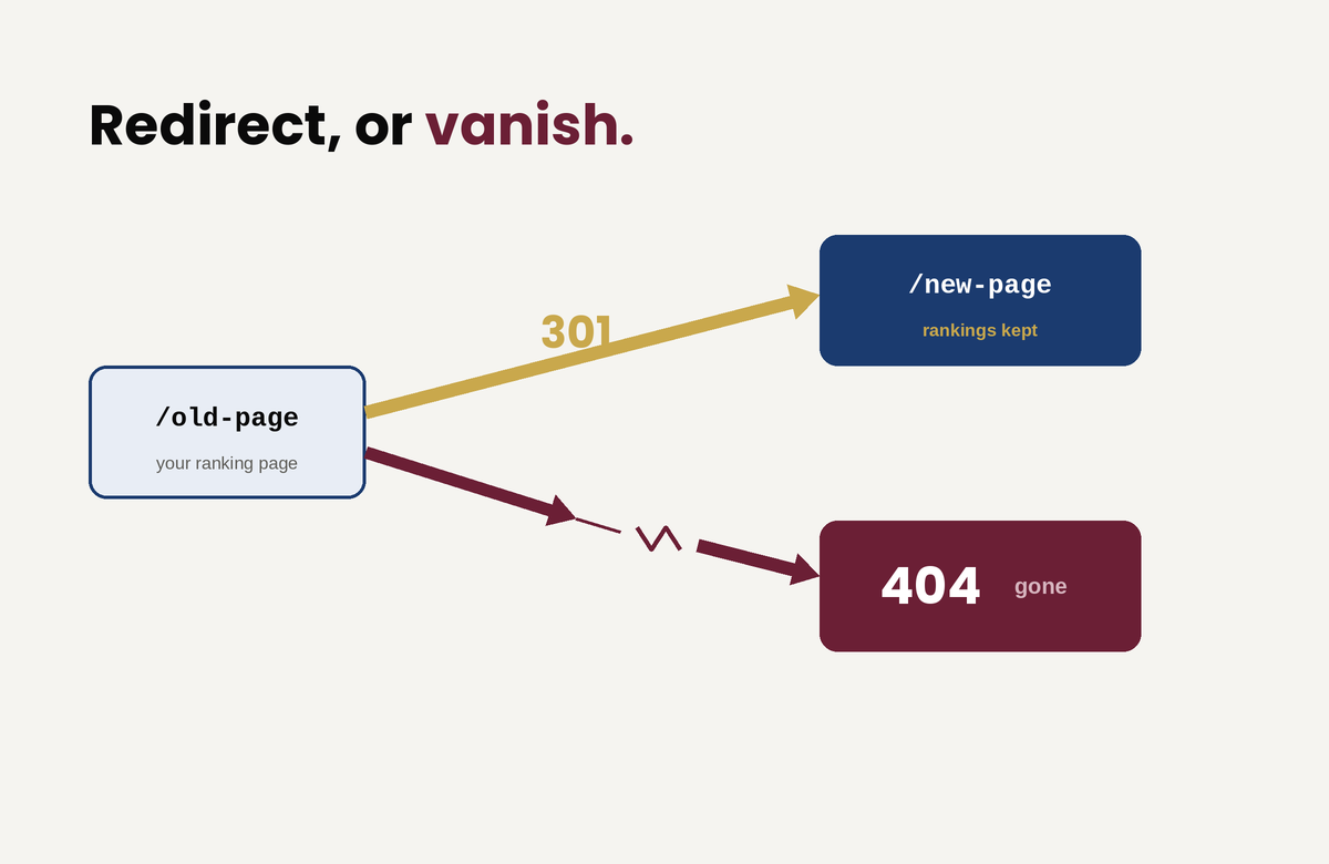
This is the most catastrophic and the most common. Every page that ranks lives at a specific URL, and everything that gives that page its ranking, Google’s index and every backlink pointing at it from across the web, is attached to that exact address. A redesign, especially one that moves to a new CMS or restructures the navigation, frequently changes those addresses. The product page that lived at one path now lives at another.

If the old URLs are not redirected to their new equivalents, every old address becomes a 404, the rankings attached to those addresses evaporate, and years of accumulated link equity is severed in an afternoon. The reassuring part, and the part most people have backwards, is that the redirect itself costs you nothing: Google is explicit that a permanent (301) redirect does not cause a loss in ranking signal. The danger is never the redirect. It is the missing redirect.

Recommendation:

So before launch, crawl the existing site, inventory every URL that earns traffic or holds links, and map each one to its new destination with a permanent redirect. Two traps wait here. The first is redirect chains, where an old URL points to a second URL that points to a third; Google recommends redirecting straight to the final destination and keeping any chain short. The second is worse and oddly common: redirecting every old URL to the new homepage. Google warns against this directly, because it collapses the distinct topical signals of all those pages into one, and that topical equity does not transfer, it disappears. A page about a specific service has to redirect to the equivalent page, not to the front door.

The safest move of all is to not create the problem. If your URLs can stay the same through the redesign, keep them. The lowest-risk redesign changes the design and leaves the addresses alone.

Failure two: the content gets “cleaned up” and the words that ranked vanish

Redesigns love whitespace and brevity. The instinct is to trim copy, replace blocks of text with imagery, and simplify pages down to something that breathes. The problem is that the text being trimmed is frequently the exact text that ranks. Google ranks a page on its content, so strip a page of the words it ranked for and it stops ranking for them. Replacing indexable copy with text baked into an image makes it worse, because Google reads that text poorly if at all.

This is not an argument against clean design. Good design and substantive content are not in conflict; a page can be clear, spacious, and still carry the words that earn its traffic. But before anyone cuts, someone has to know which content does the earning. Preserve the real copy on pages that rank, keep the heading structure and the terms those pages are known for, and never bury indexable text inside graphics. A cleaner design does not require less content. It requires better-organized content.

Failure three: the technical signals reset on launch

The third failure is a bundle of smaller ones that ship together on launch day. The most infamous: a developer correctly blocks the staging site from search engines, the new site goes live, and that block ships straight to production, telling Google to ignore the entire site. Google’s own guidance tells you to clear every temporary crawl block before the move, yet teams skip that step constantly.

The rest of the bundle stacks up fast. A new build regenerates your title tags and meta descriptions into bland theme defaults and wipes out the optimized ones.

  • It points canonical tags at the wrong page.
  • It leaves the new XML sitemap unsubmitted, or quietly drops the old one.
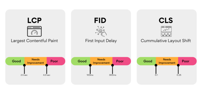
  • It loads a heavier, slower theme until Core Web Vitals collapse.
  • It discards your structured data.

And it flattens your internal linking until the architecture that once distributed authority across the site disappears. Almost none of this shows on the front end: a human visitor sees a flawless site, while a crawler sees a broken one. That gap is exactly why “it looks fine to me” is not a verdict on SEO.

The fix is a pre-launch checklist that carries every optimized signal across to the new build, and a post-launch crawl that catches whatever slipped through anyway.

How to redesign without the damage

A redesign that protects search equity follows an order. It is not complicated, but it has to be deliberate.

Benchmark before you touch anything. Record current rankings, organic traffic, your top pages, and your most-linked URLs. You cannot tell whether you broke something if you never wrote down what working looked like.

Build on a staging environment that is blocked from indexing but crawlable by you, so you can test the full site privately, and put removing that block on the launch checklist so it does not ship live.

Map every URL one-to-one. Keep the addresses that can stay, redirect the rest to their true equivalents with permanent redirects, allow no chains, and never funnel everything to the homepage.

Preserve the content and on-page signals that earn rankings: the substantive copy, the headings, the title tags and meta descriptions, the canonicals, the structured data, and the internal links.

Launch, then move immediately.

Submit the new sitemap through Search Console, request indexing of your key pages, crawl the live site to catch 404s, redirect chains, stray noindex tags, and broken canonicals, and then watch Search Console daily for the first couple of weeks and weekly after that.

One discipline saves more grief than any other: do not stack everything at once. Google’s standing advice is to change one thing at a time, because combining a redesign with a domain change and a content overhaul makes it almost impossible to tell which one broke things when something inevitably wobbles. If you can phase the work, phase it. (And if the redesign does involve moving to a new domain, that move has its own requirements, including Google’s Change of Address process.)

Finally, expect a temporary dip even when you do everything right. Google says plainly that rankings fluctuate during a move and that a medium-sized site can take weeks to fully settle in the index. That wobble is normal. Hold steady and resist the urge to start frantically changing things, because panic edits during the settling period only muddy the signal you need to read.

The one rule that prevents most of it

If you take nothing else from this: do not change URLs unless you have to, and redirect every single one you do change. Keep those redirects live for at least six months, and longer while they are still receiving any traffic from search. That one discipline, applied properly, prevents the large majority of redesign disasters before they start.

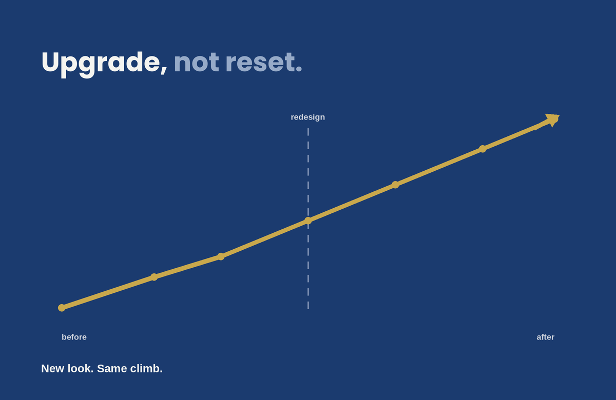
A redesign should be an upgrade, not a reset

The new site can look nothing like the old one and still keep every point of search equity it had. The two goals only conflict when nobody is responsible for the second one. The fix is not more technical skill on launch day. It is assigning someone to protect the site’s search performance from the very first mockup. It is treating that protection as a requirement of the project rather than a question raised after the traffic falls.

A redesign that respects both the design and the SEO is entirely achievable. You just have to plan it that way from the start.

good web design

Good Web Design Doesn’t Keep People on Your Site. It Gets Them to Act.

“Time on site” is a vanity metric that confuses engagement with confusion. Here is what design actually does to move a visitor from landing to converting, and the handful of elements that decide whether they stay long enough to.

“How do we keep people on the site longer?” is one of the most common questions a business owner asks about their website, and it is the wrong one. A visitor who lands, instantly finds what they came for, and books a call in ninety seconds is a triumph, and in your analytics their short session looks almost identical to a bounce. Meanwhile, a visitor wandering your site for eight minutes, clicking back and forth, re-reading the same page because they cannot find what they need, racks up the engagement numbers everyone celebrates and then leaves without doing anything. Time on site measures attention. It does not tell you whether that attention was satisfaction or confusion, and for most business websites those are opposite outcomes.

The goal of design is not to detain people. It is to move them: to confirm in seconds that they are in the right place, build enough trust to act, and remove every reason to leave before they convert. The visitors who “stay” in the way that matters stay because the design earned it, not because it trapped them. Here is what actually does that work.

The first few seconds decide most of it

A visitor forms an impression of your site in well under a second. Research summarized by the Nielsen Norman Group puts the first visual judgment at roughly 50 milliseconds, and NN/g’s own behavioral data shows that users routinely leave a page within 10 to 20 seconds unless something gives them a reason to stay. In that window they are answering three questions, fast and mostly subconsciously: What is this? Is it for me? What do I do next? If your homepage’s first screen does not answer all three, they leave, not because the rest of the site is bad, but because they never got a reason to scroll to it.

This is where clever loses to clear. A hero section with a vague slogan and a stock photo of people pointing at a laptop answers none of the three questions. A hero that states plainly what you do, who it is for, and what to do about it answers all three before the visitor has to think. The single highest-leverage design decision on most websites is not a color or a font. It is whether the first screen confirms relevance instantly. Everything downstream depends on the visitor getting past it.

Speed is not a technical detail, it is the first impression

Before a visitor can judge your design, the design has to load. Google’s research found that as page load time climbs from one second to three, the probability of a bounce rises by 32%, and that 53% of mobile visitors abandon a page that takes longer than three seconds. The ones who leave do so before they have seen a single thing you built. You can have the best-designed site in your market and lose most of its visitors to a delay they never forgave. Google’s own Core Web Vitals thresholds put the target for loading the main content at under 2.5 seconds.

But raw speed is only half of it. Perceived performance, meaning how fast the site feels, matters as much as the number on a speed test. A page that renders its above-the-fold content first feels instant even while the rest loads. A page where content jumps around as images and ads load in feels broken, and visitors do not trust broken. That specific problem has a name and a metric: Cumulative Layout Shift, one of the signals Google uses to score visual stability. Layout stability, progressive loading, and rendering what matters first are design and engineering decisions that directly determine whether anyone stays long enough to engage at all.

Hierarchy tells the eye where to go

Engagement is not decoration. It is whether the design tells a visitor where to look and what to do next. The human eye scans a page in predictable patterns, and good design works with them: the most important thing is the most visually prominent thing, contrast pulls attention to the action you want, and whitespace gives the eye somewhere to rest instead of drowning it.

The enemy here is equal weight. A page with ten things shouting at once (five calls to action, three pop-ups, a slider, a chat bubble) gives the visitor no idea what matters, and a visitor who cannot tell what matters does nothing. More options slow people down, and more competing elements dilute each other until none of them win. One clear primary action per screen, supported by a hierarchy that makes the path obvious, moves people. Clutter freezes them.

Every bit of friction is a reason to leave

Each form field you ask for, each decision you force, each ambiguous label is a small tax on the visitor’s effort and patience. The more choices and the more steps, the slower and less likely the action. Research from the Baymard Institute found that what actually drives form abandonment is not the number of steps but the number of fields: the average checkout asks for around 12 form fields when 7 or 8 would do, and trimming the excess measurably lifts completion. The same logic applies to any form on any site. A contact form with twelve fields converts worse than one with three, not because the visitor could not fill out twelve, but because each field is another moment to reconsider whether it is worth it.

The design that keeps people engaged is the one that asks the least of them. This is partly about respecting the visitor’s cognitive load: every extra element to process is mental effort, and mental effort is what makes people quit. Strip the form to what you actually need. Defer the complex stuff until after the visitor is committed. Make labels unambiguous so nobody has to guess. The instinct to add (another field, another step, another option) is almost always the wrong one. Subtraction is the underrated design skill.

Trust is what actually stops the back button

For a business website, the thing that keeps a visitor from leaving usually is not an animation or a clever interaction. It is whether they believe you. Visitors abandon sites that feel untrustworthy faster than they abandon sites that are merely plain, and design communicates trust before a word is read. Real photos instead of stock, visible reviews and credentials, clear and present contact information, and professional polish all act as proxies for competence: the visitor cannot evaluate your work directly, so they judge the signals around it.

This is why a clean, credible, slightly plain site routinely outperforms a flashy one that feels off. The flash raises a question the visitor cannot quite articulate: can I trust these people with my money? Design that answers yes, through evidence and polish rather than spectacle, is what keeps a serious buyer on the page long enough to act.

If it does not work on a phone, none of this matters

More than half of all web traffic is now mobile, and a design that engages on a desktop monitor and falls apart on a small screen loses the majority of its visitors. Tap targets too small to hit, text that requires zooming, a primary call to action stranded where a thumb cannot reach, a layout that scrolls sideways: each of these is an exit. The engagement question is a mobile question first and a desktop question second. Designing for the big screen and hoping the phone version survives is designing for the minority of your traffic.

Measure the right thing

If time on site is the wrong metric, what is the right one? The path, not the duration. Did the visitor scroll far enough to see what matters, which scroll depth tells you. Did they move toward the action, which the conversion path tells you. Did they come back and search again, which is the quiet signal that they did not find what they came for the first time. Getting the right visitors to the page is the job of search visibility; turning them into customers once they arrive is the job of design, and the two require different work.

A visitor reading deeply because your content is genuinely engaging and a visitor clicking around lost because your design is confusing can produce nearly identical time-on-site numbers. The first is success and the second is failure, and only by watching where attention goes, and whether it ends in an action, can you tell them apart. This is the same trap that catches businesses chasing raw traffic: more visitors rarely fix a problem that lives between the click and the contract. Optimize for the visitor finding what they came for, trusting you, and acting. The minutes take care of themselves.

The real question

How do we keep people on the site longer?” assumes attention is the goal. It is not. Attention is the cost a visitor pays to find out whether you can help them, and the best design spends as little of it as possible before delivering the answer and the next step. If your traffic is healthy but your site is not converting, the fix is rarely more visitors and almost always a website built to convert. And if the traffic itself has fallen, that is a separate diagnosis entirely. Stop trying to hold people. Earn the action that matters, remove every reason to leave before it, and the visitors worth keeping will stay exactly as long as they need to.

The Decline of the Homepage as a Decision-Making Tool

The Decline of the Homepage as a Decision-Making Tool

For a long time, the homepage was seen as the most important part of a website. It was where visitors landed first, got a sense of the brand, and decided what to do next.

The original belief, once valid, is slowly fading. These days, a lot of people never even see the homepage. And when they do, it usually doesn’t do what businesses expect. Most people don’t start on the homepage anymore. Traffic comes in from all over, not just through the front door.

People land on:

  • product pages
  • service pages
  • blog articles
  • comparison pages
  • links shared in messages, search results, or AI summaries

People get to deeper parts of a site through search, social media, ads, or AI-driven links. The homepage is often skipped entirely. If you design only your homepage as the main place for decisions, you’re building for a path most people don’t take.

Decisions before loading

Even if someone does land on the homepage, they’ve usually started making decisions before they get there. By the time someone arrives, they often already know:

  • what problem they’re trying to solve
  • what type of solution they want
  • how much effort they’re willing to invest
  • whether they’re generally interested or just validating

The homepage is no longer the place where curiosity begins. It’s where expectations are either confirmed or challenged.

Homepages are still important

This doesn’t mean the homepage isn’t important. Its role has changed. Now, people judge homepages on just a few key things instead of expecting them to explain everything.

  • clarity in seconds, not minutes
  • whether they match what the visitor already believes
  • how fast they show if the site is relevant or not

Users don’t read homepages word-for-word. They scan for quick confirmation. If they don’t find what they need right away, they leave before exploring further. The homepage now acts more as a place to verify information than as a starting point for exploring the site.

The “everything page” approach no longer works

Many homepages try to be all things at once:

  • brand story
  • service overview
  • credibility builder
  • navigation hub
  • conversion driver

The result is often a cluttered homepage, which makes it hard for users to find what they need.

A homepage that tries to show everything at once usually fails to present any information clearly. Today’s users don’t want a full introduction to the business. They want to quickly see if the site matches their needs.

Internal priorities often shape homepage

Organizations often miss out on their homepage’s potential by making choices that reduce its effectiveness. Different teams want different things featured:

  • Leadership wants brand story
  • Sales wants offers
  • Marketing wants campaigns
  • Design wants creativity

The homepage often becomes a place for internal debates, instead of focusing on what users need. But users don’t care about internal structure. They care about answers.

When internal priorities take over, the homepage stops being useful to visitors. People leave.

Decision-making has moved downstream

Decisions now happen across many different touchpoints, not just on the homepage.

  • AI summaries
  • search result snippets
  • review platforms
  • social proof
  • specific landing pages

The homepage is usually just one stop along the way, not the starting point.

Homepage first impressions are formed in just 50 milliseconds, with 94% of that perception driven by design.

Their job has shifted to:

  • a trust validator
  • a clarity filter
  • a brand consistency check

People are more likely to convert on pages built for their specific needs, not on general introduction pages.

What this means for website strategy

The point isn’t to ignore your homepage. Just don’t overdo it.

  • Each core page on your site should work on its own.
  • Your messaging should show up across all pages, not just the homepage.
  • Homepage content should match what users have already seen or learned elsewhere.

The homepage doesn’t have to do everything anymore. Every page can be an entry point.

The quiet shift many businesses are missing

Many teams still aren’t sure what will actually improve homepage performance. A better question is: “What role should the homepage actually play now?”

Griffon Webstudios sees this shift frequently in website redesigns and UX reviews. Businesses get better results when they focus less on the homepage and more on the real places users land and act. A site’s performance depends more on its overall structure than on the homepage alone.

The homepage hasn’t disappeared. It’s just been demoted.

Don’t treat the homepage as the only decision point. Make sure each key page can stand on its own. Keep your messaging consistent across the site so it aligns with what people have already seen elsewhere. Use the homepage to provide clarity and build trust, not to explain everything.

DESIGN TO CODE-1

Turning Stunning Web Design Into Flawless Code

Web development reaches its crucial stage when designers transfer their work to developers through the design handoff process. The phase marks the point where abstract concepts turn into concrete reality while transforming creative plans into functional user interactions. The transformation from design to development during this phase produces numerous obstacles that threaten to ruin carefully designed projects. This article examines the major challenges that developers face while presenting effective solutions to overcome them.

The Chasm Between Design and Development

A designer invests their time for multiple weeks to develop an aesthetically pleasing interface that perfectly represents brand values through pixel-perfect design. The development team receives this design from the designers with the understanding that they should produce code that perfectly matches the original design. The developers start analyzing the design files only to discover unclear specifications together with missing assets and ambiguous elements. The result? The final product drifts away from its initial design which produces negative reactions from designers and developers.

This failure to connect design with development occurs frequently throughout the industry instead of being an isolated exception.  The main cause stems from specification miscommunications and insufficient asset sharing and most importantly from poor designer-developer coordination.

Bridging the Communication Gap

Communication represents the fundamental hurdle which causes most handoff problems. Designers and developers share a single objective but maintain separate spaces where they use communication methods which share similarities but have separate linguistic patterns.

Consider the term “padding.” A designer views padding as design space surrounding elements for better visual appeal while a developer sees it as a specific CSS property requiring numerical input.  Such terms create confusion when they remain undefined between different stakeholders.


Strategies for Effective Communication:

  1. Early Collaboration: Developers should join the design process from its initial beginning. The developers’ expertise helps designers make decisions which both boost project feasibility and reduce development complexity. 
  1. Regular Check-ins: Both teams must participate in scheduled meetings that enable progress updates and concern resolution and necessary adjustments. This fosters a culture of continuous feedback and mutual understanding.
  1. Unified Terminology: Develop a shared glossary of terms and components. A designer referring to a “carousel” should have the developer visualize the exact same functionality.


Ambiguous design specifications create numerous risks during the development process.

A design that appears beautiful will fail to deliver its intended effect when designers fail to provide exact specifications. Design file ambiguities force developers to guess which design elements the designer intended leading to potential design discrepancies.

Consider a button featuring a gradient overlay. A developer implementing a flat color button instead of a gradient might disrupt both visual structure and user journey without proper design direction.


Mitigation Measures:

  1. Detailed Documentation: Each design component should include complete documentation that describes its dimensions as well as color codes and both font styles and interactive responses.
  1. Interactive Prototypes: Designers should use prototyping tools to generate interactive interfaces for developers. Developers receive an actual representation of user interactions together with transitions through this method.
  1. Design Systems: Organizations should use a centralized design component repository alongside guidelines for implementation. This central resource acts as the authoritative reference point that maintains uniformity throughout the entire system.


Asset Management: Ensuring Completeness

The process of delivering assets stands as a frequently disregarded step in the handover procedure. Development delays because of missing or incorrectly formatted assets may force designers to reduce design fidelity to ensure project completion.

An e-commerce platform depends heavily on product images which serve as its core feature. The user experience suffers when developers use placeholders or low-quality images instead of high-resolution alternatives because they lack sufficient image resources.


Best Practices for Asset Delivery:

  1. Organized Asset Libraries: Asset folders should be structured consistently through logical organization which includes separate sections for icons, images and logos and uses uniform naming conventions.
  1. Multiple Formats: Assets should exist in SVG, PNG and JPEG formats to accommodate multiple use scenarios and resolution requirements.
  1. Asset Checklists: Checklists should be implemented before the handoff to verify that no asset remains unaccounted for. The methodical approach helps prevent missed elements during this stage.


Embracing a Culture of Continuous Collaboration

The design handover needs to be recognized as an ongoing partnership rather than a single occurrence. After handing off projects, designers should stay involved to explain and modify designs according to developer feedback while addressing unexpected development issues.

Think of it as a relay race. The baton (design) is passed, but the runner (designer) doesn’t leave the track. The designer continues to follow the same track while monitoring the baton reaches its destination correctly.

Fostering Post-Handoff Synergy:

  • Open Channels: Establish communication tools which enable developers to ask questions easily and designers to answer them promptly.
  • Joint Testing Sessions: Both teams must conduct joint testing sessions to verify the implementation matches the design while addressing immediate alignment issues.
  • Feedback Loops: Following project completion the team should conduct retrospectives to evaluate successes and failures while identifying improvements for future handoff procedures.

Crafting Cohesive Digital Experiences

The transition between design and development demands more than technical expertise because it needs both empathy and understanding together with teamwork.

Our experience at Griffon Webstudios demonstrates that better designer-developer collaboration leads to improved project outcomes. The creation of exceptional websites requires teamwork because our process depends on open dialogue combined with clear specifications and shared ownership.

e-commerce strategy

Enhance Your E-Commerce Strategy with Product Schema

Selling items online is a saturated market. That is a fact. However, it doesn’t mean you cannot succeed. The reality is most people who create a small business online don’t have the time, effort, or know-how to actually stand out in the market – leaving a massive gap in that saturation for dedicated companies to succeed.

Your e-commerce strategy must be based on taking every advantage you can to deliver quality products to your target audience in a way that solidifies your brand presence. One of the most overlooked tools for this is developing Product Schema.

What is Product Schema?

The idea of product schema is simple. You are adding structured information to your website and products to help search engines better identify your offerings. Think of this like a catalog sheet giving all the details people want or a translator conveying your wishes in a different language.

The more you make it easy for search engines to understand your online presence, the better they can interpret your website and give you a higher rank. With product schema, this idea goes a bit further. Search engines can generate your results without forcing visitors to go to your website. They can see product pricing, reviews, sizes, and other details based solely on their search engine request.

When implemented well, your product schema helps you stand out in search results as rich snippets that drive user engagement. They increase your CTR (click-through rate) simply by answering questions like:

  • Do you have products available?
  • What price are they at?
  • What colors can be purchased?
  • What reviews have you received?
  • And similar inquiries.

How to Implement Product Schema

The actual practice of adding product schema only requires a little technical knowledge. You can save yourself a lot of time and hassle by having our experts at Griffon Webstudios do the work for you like:

  • Adding required properties such as product name, price, availability, and reviews so Google can quickly see them and provide such details to users based on their inquiries.
  • Following specific Google guidelines such as JSON-LD schema markup formats so all your structured information is well understood and free from errors.
  • Testing and retesting all the information integrated into your product schema through tools like Google’s Rich Results Test to verify it is correct and not missing any elements.
  • Confirming results and monitoring the impact by tracking different metrics like CTRs, impressions, and overall traffic.

Adapting to your e-commerce strategy requires real-time monitoring. You never know when one little detail here or a review there can make all the difference to your target audience and search engine rank.

Conclusion

Your e-commerce strategy is a living, breathing puzzle. It must be tailored to your unique needs and the desires of your audience. You want a professional, experienced hand at the wheel to ensure you’re taking advantage of every opportunity you can, including product schema.

Learn more about how you can implement this type of advantage by reaching out to our team at Griffon Webstudios. We have the experience you need based on our years of adapting and growing in the highly competitive NYC market. Call us today to discuss how we can help your e-commerce business.

How Effective Web Design Contributes to Successful Brand Building

How Effective Web Design Contributes to Successful Brand Building

If you want to remain competitive in today’s marketplace, you must have a digital presence. Even essential services like electric companies or waste management services rely on websites for better customer interactions and updates on outages or storm damage.

As a business, you want a centralized location that differentiates your operations from the competition. Where brand building is cultivating a consistent message using images, videos, and copy to support your initiatives, you are able to better manage customer relationships. Through brand building, you are fostering trust that you are who you say you are and can deliver on your organization’s promises.

Web Design in Branding

One of the most crucial tools in this initiative is a website. Web design is more than where you put the contact form for your customers. When the website is professionally designed, mobile responsive, and streamlined for your brand identity, it creates a memorable experience that ensures your visitors, clients, stakeholders, and anyone else pass on to their friends, family, coworkers, and acquaintances online and off.

At the core of this is branding. You want consistent logos, colors, and copy that reinforce your values. Every single element on your digital profile must be aligned with your branding. From the typography you use on an FAQ page to the layout for mobile users, you want to create a narrative that informs people about your business, encourages long-term engagement, and converts leads to loyal brand ambassadors.

The Perfect Balance

So, how does a web design team like ours at Griffon Webstudios accomplish this balancing act between brand and web design?

  • Help create the framework for your business to establish a strong brand identity that stands out from the competition, so you get more visitation.
  • Build trust and credibility through a professional, mobile responsive design demonstrating your active online community participation.
  • Enhances your target audience’s experience with your brand by shaping how they interact with the unique attributes and values you wish to present (consistent visuals, intuitive navigation, etc.).
  • Strengthening the connection between you and the audience by focusing on a positive experience through your website (aligned with your branding).

There are plenty of other examples, like driving your marketing goals through consistency and brand recognition. The better you can help support those positive emotions viewers have about your website, the more likely they will “recall” your brand in an effective way when they need your products or services.

66% of people prefer to look at a beautifully designed website if given 15 minutes to consume content- WebFX

At the end of the day, it all comes back to ensuring your brand is represented professionally, cleanly, and user-friendly. This way, prospective partners and clients can access the information they need to complete a sale or initiate a conversation.

The Challenge

The challenge is that the online world is constantly evolving. You never know when a passing digital trend becomes an industry standard. In these cases, you do not want to leave your branding initiatives to someone without the experience needed for a rewarding online experience.

If you want a fully supported website aligned with your current brand-building identity and online presence, reach out to our team at Griffon Webstudios. We operate in the heart of New York and are acutely aware of the importance brand plays in developing a fully immersive website. Give us a call today, and let’s schedule a consultation for your needs!

The Power and Impact of Generative AI in Website Development

The Power and Impact of Generative AI in Website Development

It may feel like technology is moving faster than ever, but once you get a decent grasp of how things are changing, you unlock incredible new opportunities for growth. One of the most significant advances in current years relates to using AI (artificial intelligence) in all forms of content creation and design applications.

AI has the power to uncover new worlds of integrating strategic SEO, crafting compelling copy for your ads or header text, or even adjusting the content in real-time in response to your customers. It all comes down to how you leverage this tech for optimal website development that will define future digital experiences.

When Digital Design Met Generative Brilliance

Every story starts somewhere. Ours began when a newcomer nudged the traditional boundaries of website development: generative AI. Think of it as the paintbrush that never runs out of paint.

Generative AI crafts from patterns and existing designs, fashioning something utterly new and breathtaking. It’s not merely about efficiency. This strange new innovation is more about the kind of creativity that only emerges when technology mirrors human intuition.

To put it simply, you use a tool to input text or “prompts,” and the generative AI spits back information and content based on your ideas. You can ask an AI to “write a book in the tone of Stephen King about a doll that never sleeps and tries to control the kids who own it” and get a great outline that rivals the horror writing master.

61% in Forbes Insights report use Al in web development processes.

How Generative AI Changes Web Development

It makes sense to see generative AI taking over web development. The rise in ecommerce businesses and the massive need for online interactivity for modern brands have shifted consumer interest to the digital world. Some of the more “in your face” changes happening to website development because of AI include:

1. Web Templates/Structure

Many websites are based on similar structures. This is no different than how most books and movies are based on a three-act story. With AI algorithms in place, you can get automated site design suggestions and branding advice that translate perfectly into modern websites and provide designers with an easy-to-follow list of tasks that streamlines operations for a quality final outcome.

2. Automated Content Creation

This is probably where generative AI is having the most impact. When you can ask an AI to spit out an entire month’s worth of social media posts or the content for a landing page with a strong sales funnel, you drastically reduce your website development time to market. You can train AI to write in any language with different parameters that you need to customize the final result.

3. UI/UX

Generative AI can be combined with user data to audit your layout, design, and content. This in-depth UX analysis offers specific insights from heatmaps to accessibility issues in the overall flow of your website. Instead of missing a few things here and there, you can rely on powerful artificial intelligence to fill in the missing gaps that lead to premium user experiences.

Challenges: The Double-Edged Sword of Innovation

Of course, every revolution comes with its shadows. There’s an art to ensuring generative AI doesn’t lead to a monochrome of designs, a homogenization of creativity. Furthermore, striking a balance between hyper-personalization and maintaining the sanctity of user privacy is crucial. The digital age’s dance is one of innovation and introspection.

One of the essential challenges is accurate data and reliable content originality. AI will sometimes “make up” facts and figures that must be checked, or you lose accuracy. There is also the argument that AI-generated copy lowers your Google rank. As long as you have a human element double-checking the work, you should experience incredible benefits from this new technology.

Wrapping it Up

The fusion of generative AI and website development is reminiscent of two dancers, effortlessly synchronized, moving to a rhythm that feels both familiar and avant-garde. It’s a partnership that promises a digital future that’s not just seen, but felt.

Whether you want to integrate keywords into your website content, rely on automated templates, or insert local references to bolster your page rank, generative AI is not going anywhere anytime soon. A good way to stand out is to work with a development team that compliments their creativity, originality, and workflow with AI, but doesn’t rely on it as the end all, be all of solutions.

At Griffon Webstudios, we don’t just create websites – we craft digital experiences. If quality, innovation, and memorable website design are what you seek, let’s embark on this journey together.

The Integration of AI and Machine Learning in Web Development

The Integration of AI and Machine Learning in Web Development

The world of web development is undergoing a groundbreaking transformation thanks to the integration of Artificial Intelligence (AI) and Machine Learning (ML) technologies. With over 100 million users harnessing the power of AI through ChatGPT, it’s evident that the potential of AI in web design and development is skyrocketing.

According to statistics, the AI industry is projected to exceed $15 trillion by 2030. Such a massive impact on our economy and the overall look and feel of the internet is going to shift how websites are designed and developed to engage target consumers.

The Impact of AI in Web Development

AI has streamlined web design processes, allowing designers to work smarter and faster. Automated layout and template generation have become a reality by utilizing AI algorithms. Web designers can now access AI-powered design recommendations, which provide valuable insights and suggestions, saving both time and effort.

14% increase in global GDP by 2030 is forecasted with the advancements of ML and AI. Source- WSJ

Another significant impact of AI in web development is improving user experience. With AI’s ability to analyze user data and behavior, websites can offer personalized content and recommendations. This level of customization enhances user engagement and boosts conversions and customer satisfaction. Intelligent 24/7 chatbots and virtual assistants powered by AI are now commonplace, providing instant and accurate responses to user queries and creating a seamless browsing experience.

Leveraging Machine Learning for Web Development

Machine Learning (ML) plays a pivotal role in the world of web development, enabling advanced data analysis and unlocking valuable insights. By utilizing predictive analytics, ML algorithms decode intricate user behavior patterns, providing businesses with a profound understanding.

Real-time data processing and insights allow organizations to make informed decisions, optimize user experiences, and curate bespoke content tailored to individual preferences.

62% of customers are willing to submit their data to AI for a better business and user experience.

Moreover, AI-driven advancements are revolutionizing the landscape of search engine optimization (SEO). Using sophisticated machine learning algorithms, AI empowers search engines to comprehend user queries with greater precision, delivering highly relevant search results.

The tangible outcome of this optimization effort is heightened website visibility and enhanced organic search rankings. In addition, AI streamlines the SEO optimization process, enabling web developers to allocate their time and attention to other critical facets of website development.

AI-Driven Web Development Tools and Frameworks

Content Management Systems (CMS) are a prime example of AI-driven web development tools. These systems utilize AI to facilitate content creation, management, and dynamic adaptation based on user preferences. AI-powered CMS streamlines workflows, enhances content creation, and provides a personalized user experience, all while optimizing efficiency.

Automated testing and debugging are essential aspects of web development, and AI-driven tools are game-changers in this field. AI algorithms can identify errors and bugs, significantly reducing the time and effort required for testing and quality assurance. This ensures that websites are launched faster and with minimal issues, resulting in improved user satisfaction.

Future Possibilities and Challenges

As the frontiers of AI and ML continue to expand, the realm of web development teams with boundless possibilities lies ahead. The deployment of deep learning and neural networks is poised to assume a pivotal role, endowing websites with intelligent and adaptable functionalities. Moreover, integrating Internet of Things (IoT) devices will give rise to a seamlessly connected ecosystem, where websites effortlessly interact with smart devices.

The fusion of AI and Machine Learning has ignited a transformation in web development, empowering the creative vision of designers and developers to forge websites that are not only more efficient but also tailored to the unique needs of each user.

By harnessing the immense potential that AI and ML offer, web developers gain access to a gateway of untapped opportunities, enabling them to elevate user experiences and perpetually propel themselves to the vanguard of technological advancements.

Unleash you website's potential

Unleash Your Website’s Potential: A Straightforward Guide for Business Owners

So, you’re a busy business owner with a website that could use a little love? Great! Let’s dive into the world of Core Web Vitals and why they matter, even for non-tech-savvy folks like you. It’s time to make your website faster, more engaging, and more user-friendly – all while having a little fun! Let’s break down this guide into easy-to-understand sections so that you can boost your website’s ranking without breaking a sweat.

What’s the Deal with Core Web Vitals?

Google has introduced a new ranking factor called Core Web Vitals. Think of them as a report card for your website. They measure three crucial aspects: speed, search quality, and user experience (UX) on mobile devices. The better your scores, the higher your website can rank on search engine results pages (SERPs). And higher rankings mean more visibility, more customers, and more business. It’s a win-win!

Here’s what Core Web Vitals measure:

1. Largest Contentful Paint (LCP) – How fast does your main page content show up? In other words, how long does it take for the largest element on your page to load? A good LCP score is under 2.5 seconds.

2. First Input Delay (FID) – Is your page layout steady after it appears? This metric measures the time it takes for your site to become interactive and responsive to user input. Aim for an FID score of 100 milliseconds or less.

3. Cumulative Layout Shift (CLS) – How quickly does your page react to users poking around? CLS measures the visual stability of your site, focusing on unexpected layout shifts. A good CLS score is 0.1 or lower.

Core Web Vitals

Ready to boost your website’s ranking? Follow these simple steps:

Step 1 – Check Your Core Web Vitals

First things first, head over to Google Search Console. This nifty tool shows you how your website is doing in search results. If you’ve got Search Console set up, you can quickly access your site’s live Core Web Vitals reports.

Take a look at your scores. If you see mostly “good URLs,” you’re doing well and can breathe a sigh of relief. If not, it’s time to roll up your sleeves and optimize those Core Web Vitals for better search engine rankings.

Step 2 – Find Slowpokes on Your Website

Slow pages can drag your whole site down, harming your website’s overall performance and user experience. That’s why it’s crucial to identify any pages with “poor” or “needs improvement” scores.

If your site is new with low traffic, Google might group similar pages together in a URL group, making it easier for you to fix issues across multiple pages at once. Focus on these groups to maximize your optimization efforts.

87%. A study of 6,500 US Ecommerce sites revealed that 87% would fail a Core Web Vitals assessment today. 30% would pass for Cumulative Layout Shift, 38% would pass for Largest Contentful Paint, and 93% would pass First Input Delay.

Step 3 – Keep an Eye on Your Site

Now that you’ve discovered which pages need some TLC, it’s essential to monitor your website regularly to spot performance changes as soon as possible. You’ll want to keep a close eye on the following:

1. Pages with low Core Web Vitals: Track the progress of your optimization efforts.

2. High-traffic pages, such as your homepage: These pages are crucial for your website’s success and deserve extra attention.

3. Comparable competitor sites: Keeping tabs on your competition allows you to compare your performance and set benchmarks.

Step 4 – Test, Test, Test!

Running performance tests on slow pages is the key to finding out what’s causing those “needs improvement” or “poor” Core Web Vitals scores. Use tools like Google PageSpeed Insights, Lighthouse, or WebPageTest to get detailed insights

The Result

Patience is a virtue when it comes to evaluating the results of your optimizations. Keep in mind that it can take up to 30 days for the full effect of your improvements to become apparent once they are implemented and live on your website. This delay is due to the time it takes for search engines to crawl and re-evaluate your site, as well as for user behavior data to be collected and analyzed.

During this waiting period, resist the temptation to tinker with your site further. Instead, monitor your website’s performance and track changes in your Core Web Vitals scores. Remember that fluctuations in your site’s ranking and user engagement can be influenced by various factors, so it’s essential to focus on long-term trends rather than short-term variations.

Once you’ve observed the impact of your initial optimizations, take a moment to celebrate your success. Then, it’s time to get back to work! Use the insights you’ve gained from assessing your improvements to identify other areas of your website that could benefit from optimization.

As you continue to fine-tune your site, consider the following:

1. Prioritize optimizations with the most significant potential impact on your Core Web Vitals scores.

2. Look for opportunities to streamline and enhance your site’s design, content, and functionality to provide an even better user experience.

3. Keep an eye on your competitors and stay informed about industry trends and best practices in web design, SEO, and digital marketing.

By maintaining a proactive and iterative approach to optimizing your website, you’ll be well-positioned to achieve long-term success and stay ahead of your competition. And remember, even small changes can yield significant improvements in your website’s performance, user experience, and search engine rankings. So keep pushing forward, and watch your website flourish!

How to Design a Website That Converts Visitors into Customers

How to Design a Website That Converts Visitors into Customers

Your website is one of your most powerful marketing tools. It’s a 24/7 salesperson that works tirelessly to promote your business and generate leads. But what good is a website if it doesn’t convert those visitors into customers? If you’re not seeing the results you want, it might be time for a redesign. Keep reading for our guide on how to design a website that converts visitors into customers.

The Anatomy of a High-Converting Website

A high-converting website has several key components. First, it must have a clear value proposition that tells visitors what you do and why they should care. Second, it needs to have a strong call to action (CTA) that encourages visitors to take the next step, whether that’s signing up for your email list or scheduling a consultation. Finally, your website must be mobile-friendly so that people can access it no matter where they are or what device they’re using.

If your website is missing any of these elements, don’t worry—there’s still time to make changes. Read on for specific tips on how to add them to your site.

Include a Clear Value Proposition

Your value proposition is the first thing people will see when they land on your website, so it’s important to make a good impression. A strong value proposition should be clear, concise, and easy to understand. It should also explain what you do and why someone should care.

For example, if you’re an interior designer, your value proposition might be “Create beautiful, functional, and personalized spaces.”

If you’re not sure how to craft an effective value proposition, start by brainstorming all the ways your product or service can help solve someone’s problem. Once you have a list of potential benefits, narrow it down to the one or two that are most important and relevant to your target audience. From there, you can start crafting your value proposition using the following template:


[Insert Your Business Name] + [What You Do] + [Who You Help] = [The Transformation They Can Expect].


For example, Griffon Webstudios + SEO Services + Businesses Looking to Increase Their Online Visibility = More Traffic and More Customers.


Use Power Words in Your CTA

Your CTA is what tells visitors what you want them to do next—sign up for your email list, download your e-book, etc.—so it’s important to make it as effective as possible. One way to do this is by using power words in your CTA that elicit an emotional response from readers and encourage them to take action. For example, words like “join,” “save,” “discover,” and “learn” are all great options. You can also use phrases like “get started now” or “find out more” to nudge people in the right direction. Just make sure your CTA is clear and easy to understand so that people know exactly what they need to do next.

Make Your Website Mobile-Friendly

More than half of all web traffic now comes from mobile devices like smartphones and tablets, so it’s essential that your website is designed with mobile users in mind. Mobile-friendly websites are easy to navigate on small screens and load quickly—two things that are important for keeping people engaged with your site. If you’re not sure if your website is mobile-friendly, you can use Google’s free Mobile-Friendly Test Tool.

Simply enter your URL and Google will let you know if there are any issues with your site’s design or functionality on mobile devices. You can then make changes as needed so that everyone who visits your site has a positive experience, no matter what device they’re using.

By following these tips, you can design a website that is more likely to convert visitors into customers.