“Time on site” is a vanity metric that confuses engagement with confusion. Here is what design actually does to move a visitor from landing to converting, and the handful of elements that decide whether they stay long enough to.
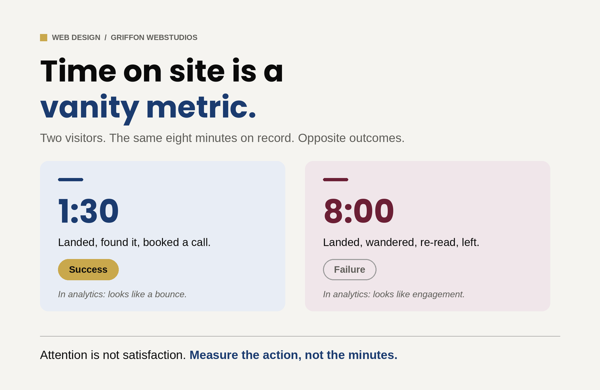
“How do we keep people on the site longer?” is one of the most common questions a business owner asks about their website, and it is the wrong one. A visitor who lands, instantly finds what they came for, and books a call in ninety seconds is a triumph, and in your analytics their short session looks almost identical to a bounce. Meanwhile, a visitor wandering your site for eight minutes, clicking back and forth, re-reading the same page because they cannot find what they need, racks up the engagement numbers everyone celebrates and then leaves without doing anything. Time on site measures attention. It does not tell you whether that attention was satisfaction or confusion, and for most business websites those are opposite outcomes.
The goal of design is not to detain people. It is to move them: to confirm in seconds that they are in the right place, build enough trust to act, and remove every reason to leave before they convert. The visitors who “stay” in the way that matters stay because the design earned it, not because it trapped them. Here is what actually does that work.
The first few seconds decide most of it
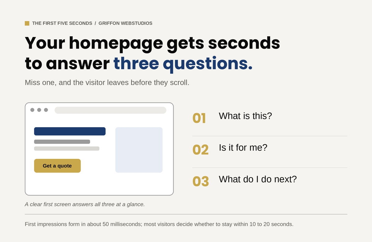
A visitor forms an impression of your site in well under a second. Research summarized by the Nielsen Norman Group puts the first visual judgment at roughly 50 milliseconds, and NN/g’s own behavioral data shows that users routinely leave a page within 10 to 20 seconds unless something gives them a reason to stay. In that window they are answering three questions, fast and mostly subconsciously: What is this? Is it for me? What do I do next? If your homepage’s first screen does not answer all three, they leave, not because the rest of the site is bad, but because they never got a reason to scroll to it.
This is where clever loses to clear. A hero section with a vague slogan and a stock photo of people pointing at a laptop answers none of the three questions. A hero that states plainly what you do, who it is for, and what to do about it answers all three before the visitor has to think. The single highest-leverage design decision on most websites is not a color or a font. It is whether the first screen confirms relevance instantly. Everything downstream depends on the visitor getting past it.
Speed is not a technical detail, it is the first impression
Before a visitor can judge your design, the design has to load. Google’s research found that as page load time climbs from one second to three, the probability of a bounce rises by 32%, and that 53% of mobile visitors abandon a page that takes longer than three seconds. The ones who leave do so before they have seen a single thing you built. You can have the best-designed site in your market and lose most of its visitors to a delay they never forgave. Google’s own Core Web Vitals thresholds put the target for loading the main content at under 2.5 seconds.
But raw speed is only half of it. Perceived performance, meaning how fast the site feels, matters as much as the number on a speed test. A page that renders its above-the-fold content first feels instant even while the rest loads. A page where content jumps around as images and ads load in feels broken, and visitors do not trust broken. That specific problem has a name and a metric: Cumulative Layout Shift, one of the signals Google uses to score visual stability. Layout stability, progressive loading, and rendering what matters first are design and engineering decisions that directly determine whether anyone stays long enough to engage at all.
Hierarchy tells the eye where to go
Engagement is not decoration. It is whether the design tells a visitor where to look and what to do next. The human eye scans a page in predictable patterns, and good design works with them: the most important thing is the most visually prominent thing, contrast pulls attention to the action you want, and whitespace gives the eye somewhere to rest instead of drowning it.
The enemy here is equal weight. A page with ten things shouting at once (five calls to action, three pop-ups, a slider, a chat bubble) gives the visitor no idea what matters, and a visitor who cannot tell what matters does nothing. More options slow people down, and more competing elements dilute each other until none of them win. One clear primary action per screen, supported by a hierarchy that makes the path obvious, moves people. Clutter freezes them.
Every bit of friction is a reason to leave
Each form field you ask for, each decision you force, each ambiguous label is a small tax on the visitor’s effort and patience. The more choices and the more steps, the slower and less likely the action. Research from the Baymard Institute found that what actually drives form abandonment is not the number of steps but the number of fields: the average checkout asks for around 12 form fields when 7 or 8 would do, and trimming the excess measurably lifts completion. The same logic applies to any form on any site. A contact form with twelve fields converts worse than one with three, not because the visitor could not fill out twelve, but because each field is another moment to reconsider whether it is worth it.
The design that keeps people engaged is the one that asks the least of them. This is partly about respecting the visitor’s cognitive load: every extra element to process is mental effort, and mental effort is what makes people quit. Strip the form to what you actually need. Defer the complex stuff until after the visitor is committed. Make labels unambiguous so nobody has to guess. The instinct to add (another field, another step, another option) is almost always the wrong one. Subtraction is the underrated design skill.
Trust is what actually stops the back button
For a business website, the thing that keeps a visitor from leaving usually is not an animation or a clever interaction. It is whether they believe you. Visitors abandon sites that feel untrustworthy faster than they abandon sites that are merely plain, and design communicates trust before a word is read. Real photos instead of stock, visible reviews and credentials, clear and present contact information, and professional polish all act as proxies for competence: the visitor cannot evaluate your work directly, so they judge the signals around it.
This is why a clean, credible, slightly plain site routinely outperforms a flashy one that feels off. The flash raises a question the visitor cannot quite articulate: can I trust these people with my money? Design that answers yes, through evidence and polish rather than spectacle, is what keeps a serious buyer on the page long enough to act.
If it does not work on a phone, none of this matters
More than half of all web traffic is now mobile, and a design that engages on a desktop monitor and falls apart on a small screen loses the majority of its visitors. Tap targets too small to hit, text that requires zooming, a primary call to action stranded where a thumb cannot reach, a layout that scrolls sideways: each of these is an exit. The engagement question is a mobile question first and a desktop question second. Designing for the big screen and hoping the phone version survives is designing for the minority of your traffic.
Measure the right thing
If time on site is the wrong metric, what is the right one? The path, not the duration. Did the visitor scroll far enough to see what matters, which scroll depth tells you. Did they move toward the action, which the conversion path tells you. Did they come back and search again, which is the quiet signal that they did not find what they came for the first time. Getting the right visitors to the page is the job of search visibility; turning them into customers once they arrive is the job of design, and the two require different work.
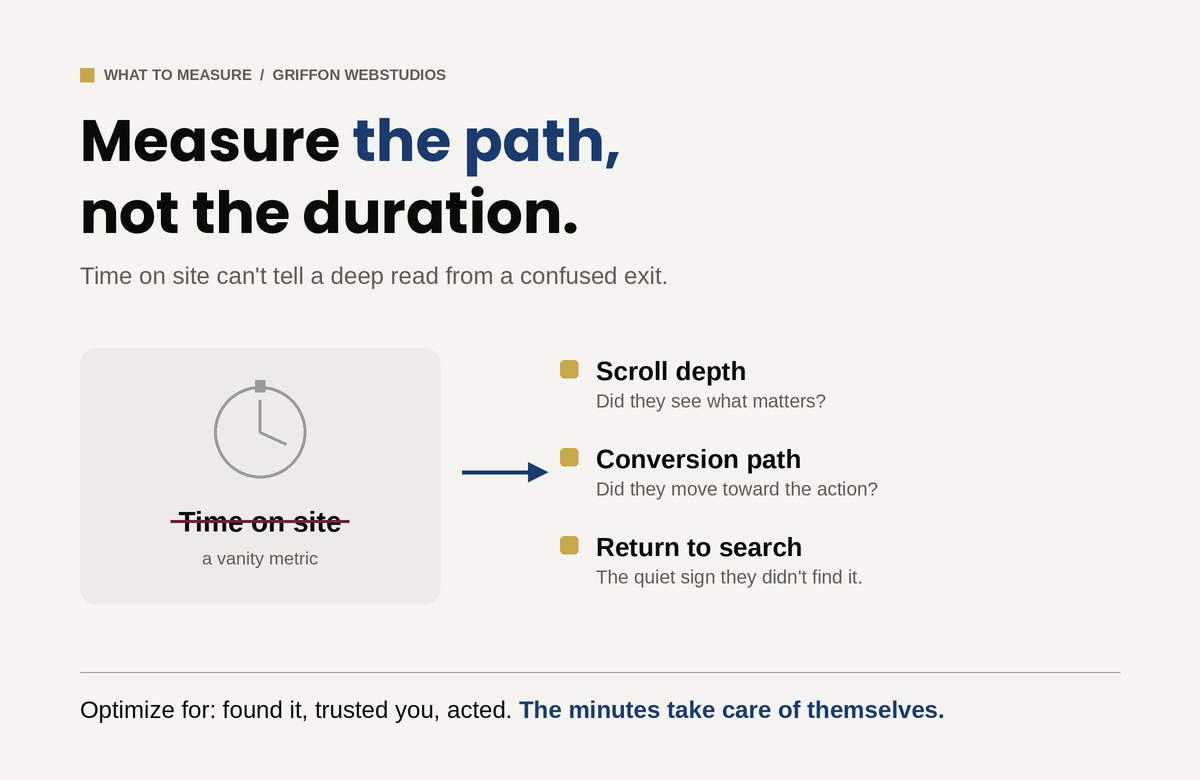
A visitor reading deeply because your content is genuinely engaging and a visitor clicking around lost because your design is confusing can produce nearly identical time-on-site numbers. The first is success and the second is failure, and only by watching where attention goes, and whether it ends in an action, can you tell them apart. This is the same trap that catches businesses chasing raw traffic: more visitors rarely fix a problem that lives between the click and the contract. Optimize for the visitor finding what they came for, trusting you, and acting. The minutes take care of themselves.
The real question
“How do we keep people on the site longer?” assumes attention is the goal. It is not. Attention is the cost a visitor pays to find out whether you can help them, and the best design spends as little of it as possible before delivering the answer and the next step. If your traffic is healthy but your site is not converting, the fix is rarely more visitors and almost always a website built to convert. And if the traffic itself has fallen, that is a separate diagnosis entirely. Stop trying to hold people. Earn the action that matters, remove every reason to leave before it, and the visitors worth keeping will stay exactly as long as they need to.